IT課程 CSS基礎 024_邊框、輪廓、陰影
邊框
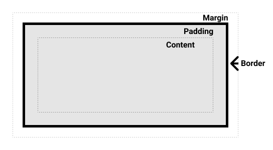
CSS 中的邊框(Borders)是用於在元素周圍創建可視化邊界的重要樣式屬性。
邊框屬性
border-width: 設置邊框的寬度。border-style: 設置邊框的樣式(solid:實線、dotted:虛線、dashed:點線、double:雙線、groove:凹槽、ridge:凸起、inset:凹陷、outset:凸出、none:無邊框)。border-color: 設置邊框的顏色。
示例:
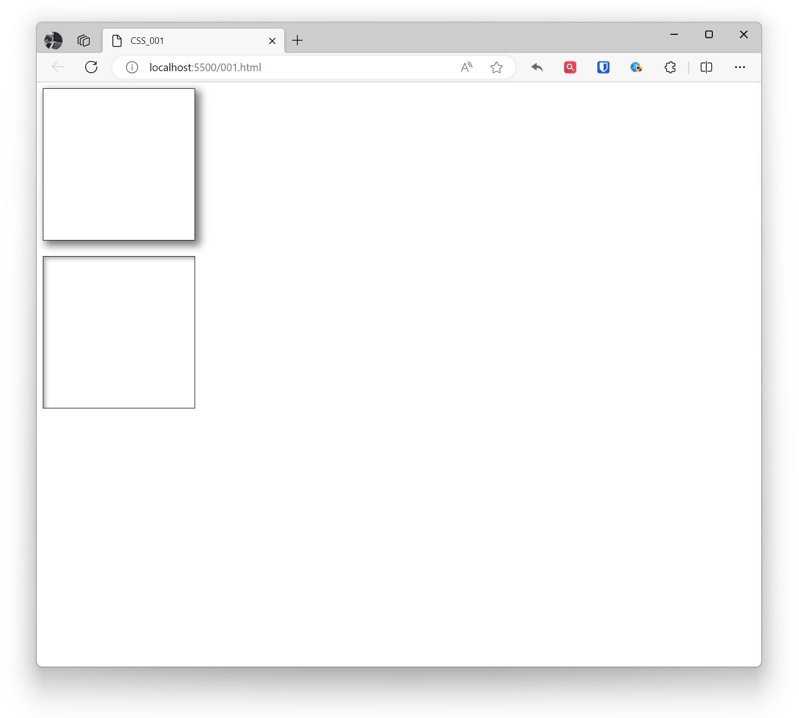
.example1 { border-width: 2px; border-style: solid; border-color: #333; width: 200px; height: 200px; } .example2 { border: 2px solid #333; /* 簡寫屬性 */ width: 200px; height: 200px; } <div class="example1"></div> <br> <div class="example2"></div>效果:
邊框方向
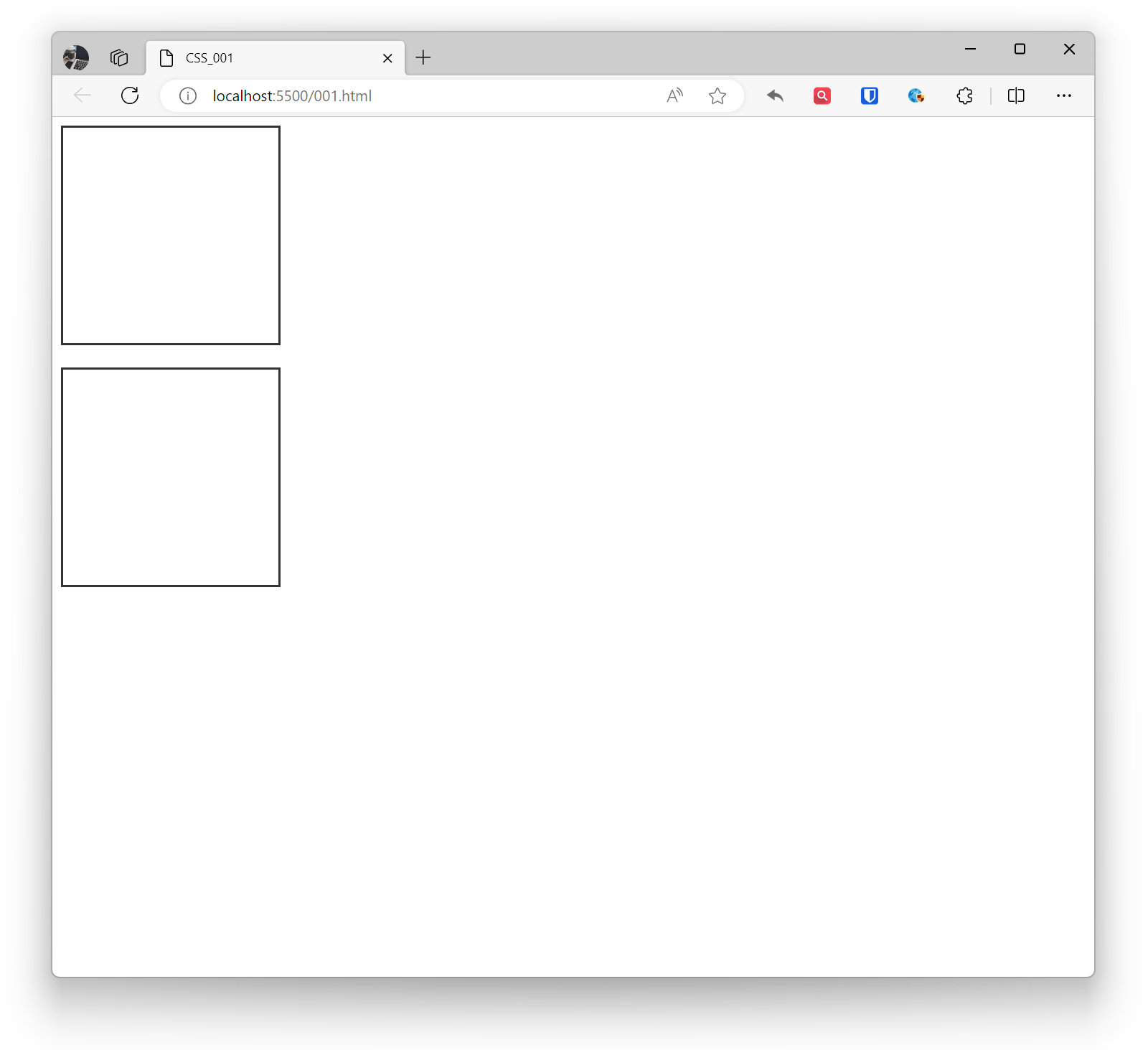
border-top, border-right, border-bottom, border-left: 分別設置頂部、右側、底部、左側的邊框。
示例:
.example1 { border-top: 2px solid #333; border-right: 1px dashed #555; border-bottom: 3px solid #777; border-left: 1px dotted #999; width: 200px; height: 200px; } <div class="example1"></div>效果:
圓角
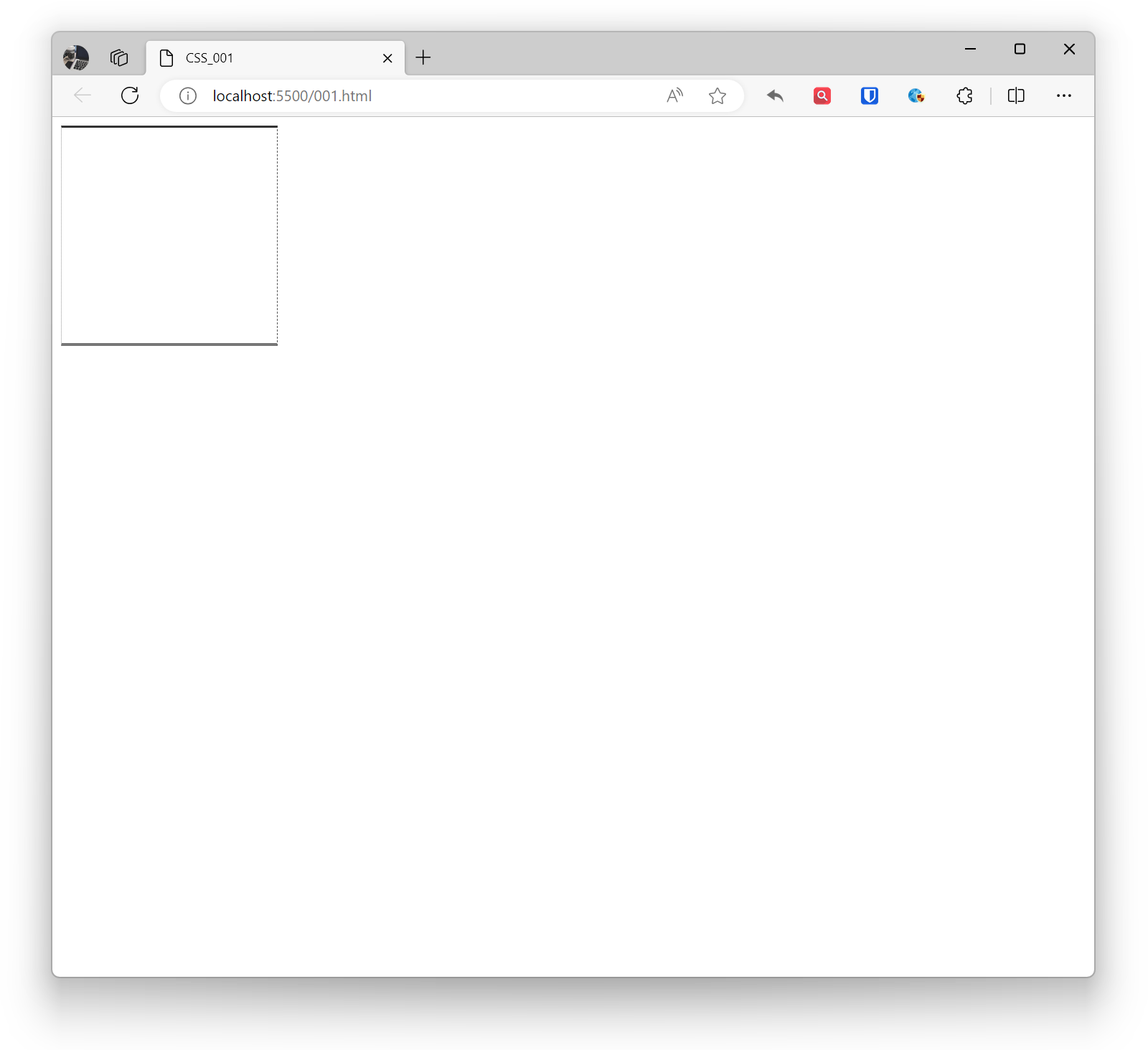
border-radius: 設置邊框的圓角。
示例:
.example1 { border-radius: 10px; /* 所有角都有10px的圓角 */ border: 1px solid black; width: 200px; height: 200px; } .example2 { border-top-left-radius: 10px; border-top-right-radius: 20px; border-bottom-left-radius: 30px; border-bottom-right-radius: 40px; border: 1px solid black; width: 200px; height: 200px; } <div class="example1"></div> <br> <div class="example2"></div>效果:

陰影
CSS中的陰影(box-shadow)是一種在元素周圍創建陰影效果的屬性。陰影可以用於增強元素的立體感,使頁面看起來更加生動。通過在 box-shadow 值前添加 inset 關鍵字,可以創建內部陰影。可以使用逗號分隔多個 box-shadow 值來添加多個陰影效果。如果元素有圓角,陰影將相應地應用在圓角上。
陰影可以有多個參數,包括水平偏移、垂直偏移、模糊半徑、陰影顏色等。
- 水平偏移(horizontal offset):陰影水平方向的偏移量。
- 垂直偏移(vertical offset):陰影垂直方向的偏移量。
- 模糊半徑(blur radius):陰影的模糊程度。
- 擴散半徑(spread radius):陰影的尺寸,正值擴大,負值縮小。
- 陰影顏色:陰影的顏色。
示例:
.base { border: 1px solid black; width: 200px; height: 200px; } .example1 { box-shadow: 5px 5px 10px 2px rgba(0, 0, 0, 0.5); } .example2 { box-shadow: inset 3px 3px 5px rgba(0, 0, 0, 0.3); } <div class="base example1"></div> <br> <div class="base example2"></div>效果:
輪廓
CSS中的輪廓(outline)是一個可以添加到元素周圍的可見邊框,通常用於強調元素的外部邊緣。輪廓不會影響佈局,不會改變元素的大小或位置。輪廓通常用於表單元素的焦點可視化、鏈接的活動狀態等。
- outline-color:設置輪廓的顏色。
- outline-style:設置輪廓的樣式。
- outline-width:設置輪廓的寬度。
- outline-offset:設置輪廓偏移屬性,輪廓與邊框的間隔。
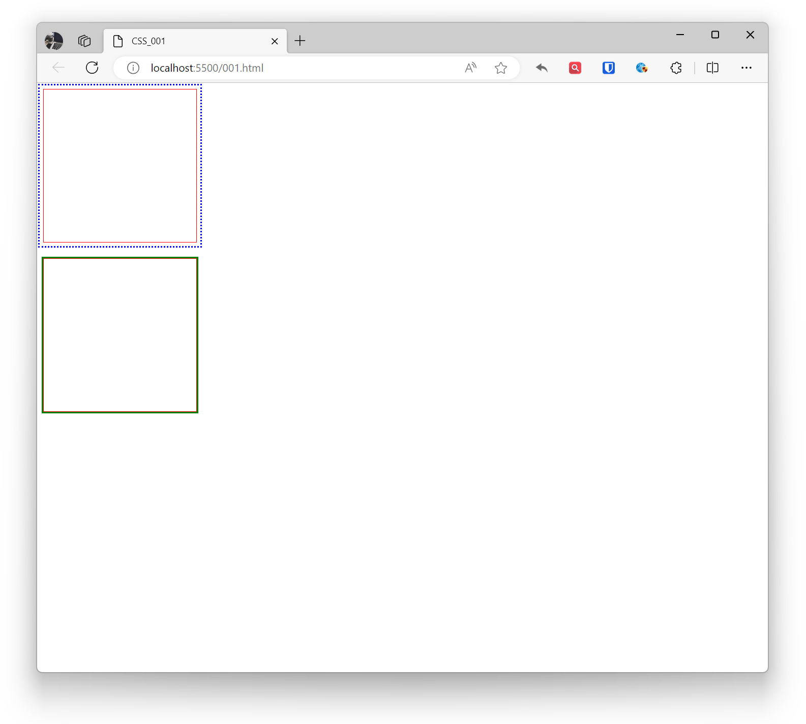
示例:
.example1 { outline-color: blue; outline-style: dotted; outline-width: 2px; outline-offset: 5px; border: 1px solid red; width: 200px; height: 200px; } .example2 { outline: 2px solid green; border: 1px solid red; width: 200px; height: 200px; } <div class="example1"></div> <br> <div class="example2"></div>效果: