IT Course CSS Basics 024_Borders, Outlines, Shadows
Borders
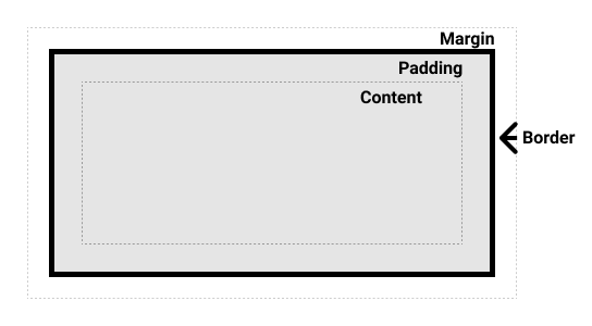
Borders in CSS are important style properties used to create visual boundaries around elements.
Border Properties
border-width: Sets the width of the border.border-style: Sets the style of the border (solid, dotted, dashed, double, groove, ridge, inset, outset, none).border-color: Sets the color of the border.
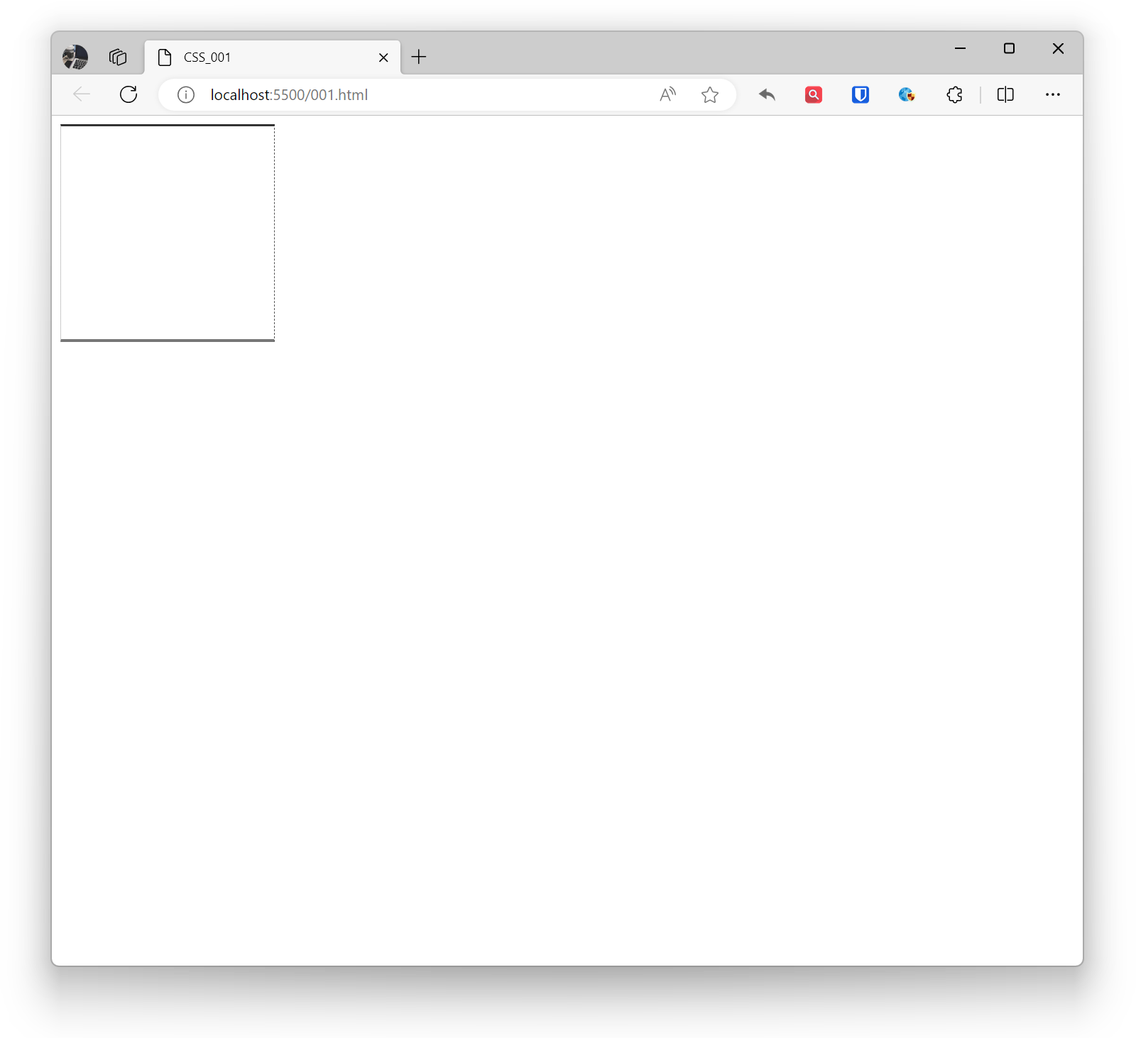
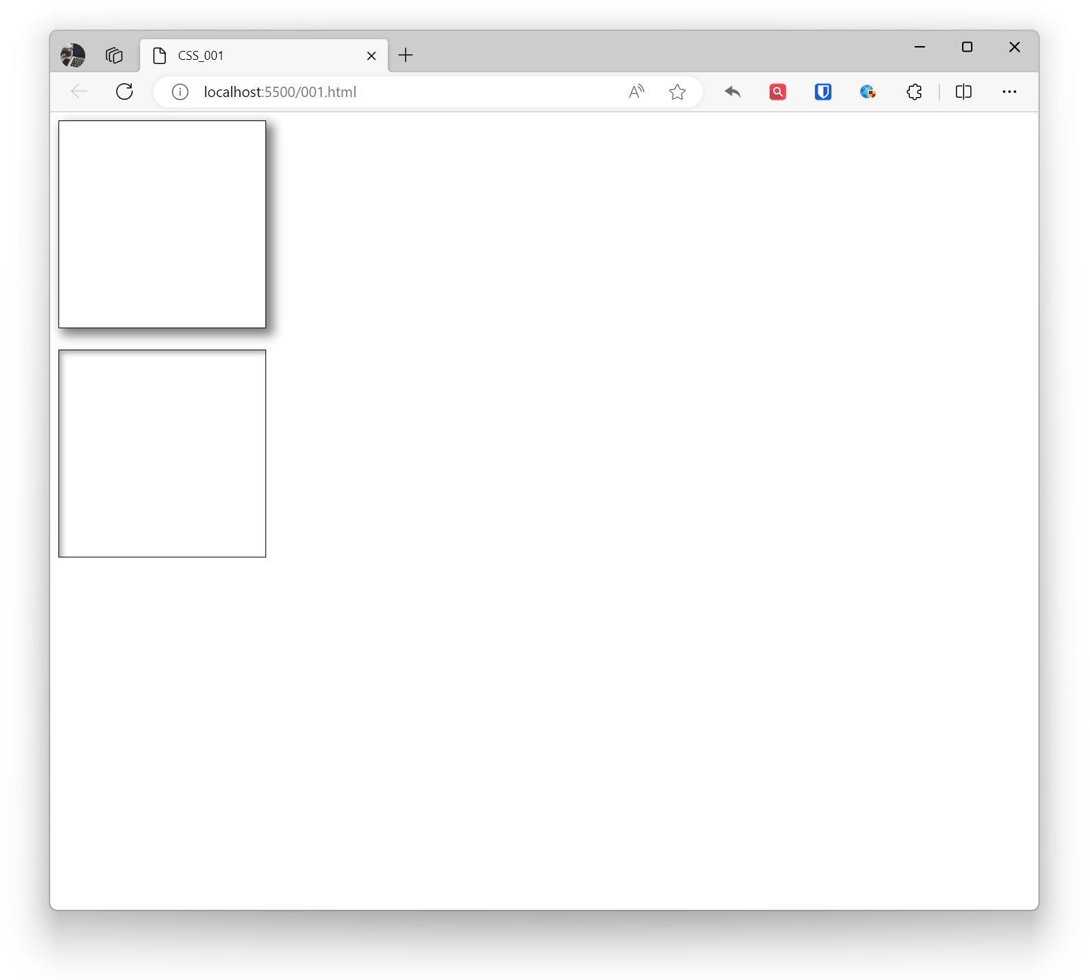
Example:
.example1 { border-width: 2px; border-style: solid; border-color: #333; width: 200px; height: 200px; } .example2 { border: 2px solid #333; /* Shorthand property */ width: 200px; height: 200px; } <div class="example1"></div> <br> <div class="example2"></div>Effect:
Border Direction
border-top, border-right, border-bottom, border-left: Set the top, right, bottom, and left borders respectively.
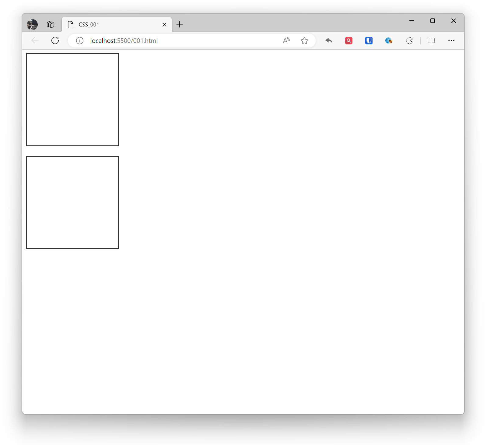
Example:
.example1 { border-top: 2px solid #333; border-right: 1px dashed #555; border-bottom: 3px solid #777; border-left: 1px dotted #999; width: 200px; height: 200px; } <div class="example1"></div>Effect:
Rounded Corners
border-radius: Sets the rounded corners of the border.
Example:
.example1 { border-radius: 10px; /* All corners have 10px rounded corners */ border: 1px solid black; width: 200px; height: 200px; } .example2 { border-top-left-radius: 10px; border-top-right-radius: 20px; border-bottom-left-radius: 30px; border-bottom-right-radius: 40px; border: 1px solid black; width: 200px; height: 200px; } <div class="example1"></div> <br> <div class="example2"></div>Effect:

Shadows
Box-shadow in CSS is a property that creates shadow effects around elements. Shadows can be used to enhance the three-dimensional appearance of elements, making pages look more vivid. By adding the inset keyword before the box-shadow value, you can create inner shadows. Multiple box-shadow values can be separated by commas to add multiple shadow effects. If the element has rounded corners, shadows will be applied to the rounded corners accordingly.
Shadows can have multiple parameters, including horizontal offset, vertical offset, blur radius, shadow color, etc.
- Horizontal offset: The horizontal offset of the shadow.
- Vertical offset: The vertical offset of the shadow.
- Blur radius: The blur level of the shadow.
- Spread radius: The size of the shadow, positive values expand, negative values shrink.
- Shadow color: The color of the shadow.
Example:
.base { border: 1px solid black; width: 200px; height: 200px; } .example1 { box-shadow: 5px 5px 10px 2px rgba(0, 0, 0, 0.5); } .example2 { box-shadow: inset 3px 3px 5px rgba(0, 0, 0, 0.3); } <div class="base example1"></div> <br> <div class="base example2"></div>Effect:
Outlines
Outline in CSS is a visible border that can be added around elements, usually used to emphasize the outer edge of elements. Outlines do not affect layout and do not change the size or position of elements. Outlines are commonly used for focus visualization of form elements, active states of links, etc.
- outline-color: Sets the color of the outline.
- outline-style: Sets the style of the outline.
- outline-width: Sets the width of the outline.
- outline-offset: Sets the outline offset property, the gap between the outline and the border.
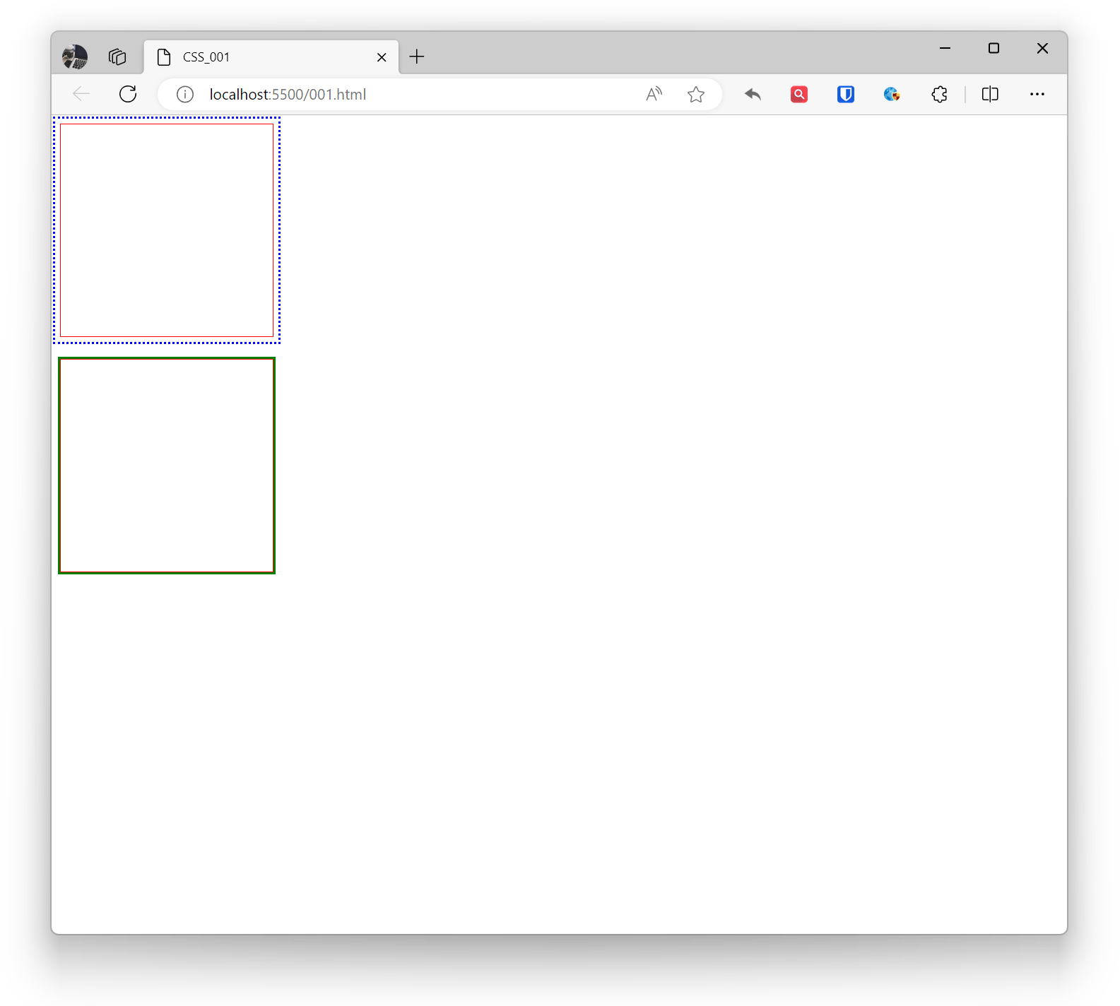
Example:
.example1 { outline-color: blue; outline-style: dotted; outline-width: 2px; outline-offset: 5px; border: 1px solid red; width: 200px; height: 200px; } .example2 { outline: 2px solid green; border: 1px solid red; width: 200px; height: 200px; } <div class="example1"></div> <br> <div class="example2"></div>Effect: