IT Course HTML Basics 015_HTML5 New Features
HTML5 New Features
HTML5 is the latest version of HTML, introducing many new tags, attributes, and features that greatly enhance web functionality and interactivity.
Some interesting new features in HTML5:
- The canvas element for drawing
- Video and audio elements for media playback
- Better support for local offline storage
- New special content elements like article, footer, header, nav, section
- New form controls like calendar, date, time, email, url, search
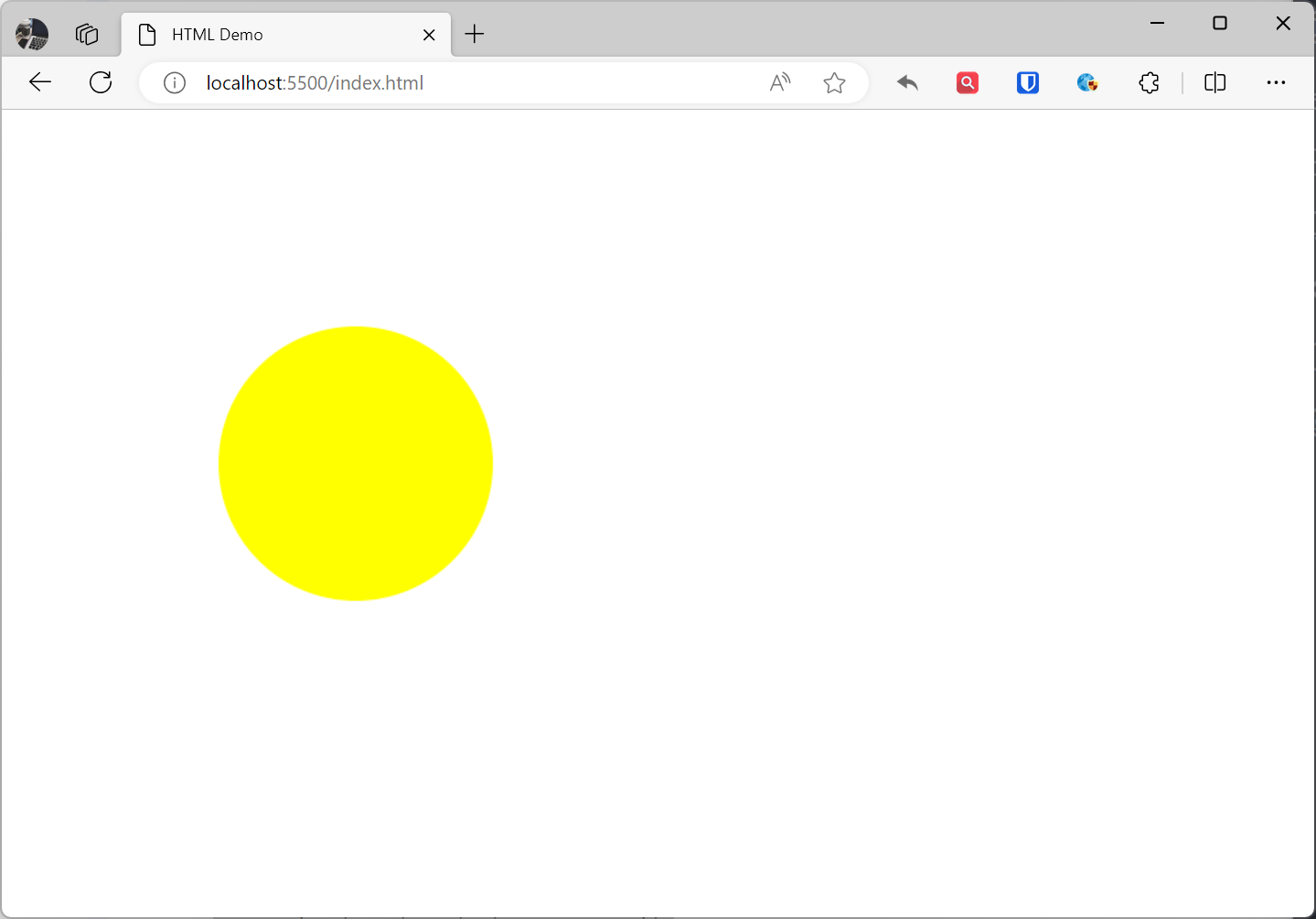
<canvas>
The HTML5 <canvas> element is used to draw graphics on web pages. The <canvas> element is based on JavaScript’s drawing API and can be used to create various graphics, including charts, graphics, animations, etc.
Example:
<canvas width="500" height="500"> Your browser does not support the HTML5 canvas tag.</canvas><script> const canvas = document.querySelector("canvas"); // Get drawing context const ctx = canvas.getContext("2d"); // Draw circle ctx.beginPath(); ctx.arc(250, 250, 100, 0, 2 * Math.PI); ctx.fillStyle = "yellow"; ctx.fill();</script>Effect:
<svg>
The HTML5 SVG element is used to create SVG graphics on web pages. SVG graphics are XML-based vector graphics that can scale losslessly, suitable for various purposes including:
SVG elements include:
<svg>element: Defines the root element of SVG graphics.<path>element: Defines path shapes.<rect>element: Defines rectangle shapes.<circle>element: Defines circle shapes.<ellipse>element: Defines ellipse shapes.<line>element: Defines lines.<polygon>element: Defines polygons.<polyline>element: Defines polylines.<text>element: Defines text.<g>element: Defines groups for grouping SVG elements together.<defs>element: Defines global attributes that can be applied to multiple SVG elements.
Example:
<svg width="500" height="500"> <circle cx="250" cy="250" r="100" fill="yellow" /></svg>Effect:
SVG and Canvas are both tools for creating graphics on web pages. They each have their own advantages and disadvantages, suitable for different scenarios.
SVG is XML-based vector graphics that can scale losslessly. This means SVG graphics can be displayed at any size without losing quality. SVG graphics can also be manipulated and animated using CSS and JavaScript.
Canvas is a JavaScript-based drawing API that can create bitmap graphics. This means Canvas graphics cannot scale losslessly, but can create more complex graphics using JavaScript. Canvas graphics can also be manipulated and animated using JavaScript.
Specific differences between SVG and Canvas:
| Feature | SVG | Canvas |
|---|---|---|
| Image Type | Vector | Bitmap |
| Scaling | Lossless | Lossy |
| Graphic Types | Rectangle, circle, path, etc. | Any |
| Manipulation | CSS, JavaScript | JavaScript |
| Animation | CSS, JavaScript | JavaScript |
| File Size | Usually smaller | Usually larger |
| Accessibility | Excellent | Average |
-
SVG is suitable for:
- Graphics that need lossless scaling, such as icons, logos, illustrations
- Graphics that need manipulation and animation with CSS and JavaScript
-
Canvas is suitable for:
- Scenarios requiring complex graphics, such as games, animations
- Scenarios requiring complex operations with JavaScript
HTML5 Forms
HTML5 introduces some new input types and attributes to enhance form functionality and usability.
New Form Elements:
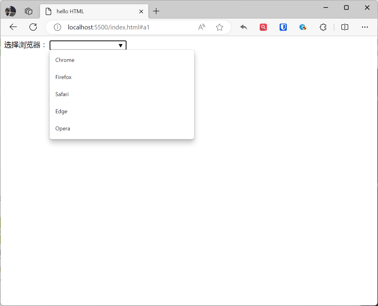
<datalist>element: Used for predefined option lists for<input>elements.
Example:
<label for="browser">Choose browser:</label><input list="browsers" id="browser" name="browser" autocomplete="off"><datalist id="browsers"> <option value="Chrome"> <option value="Firefox"> <option value="Safari"> <option value="Edge"> <option value="Opera"></datalist>Effect:
| Element | Description |
|---|---|
<datalist> | Defines a predefined option list for <input> elements. |
<output> | Represents the result of a calculation. |
<keygen> | Creates a key pair for forms, typically used for key exchange. |
<progress> | Defines a progress bar for any type of task. |
<meter> | Measures a scalar value or fraction within a known range. |
New Form Attributes:
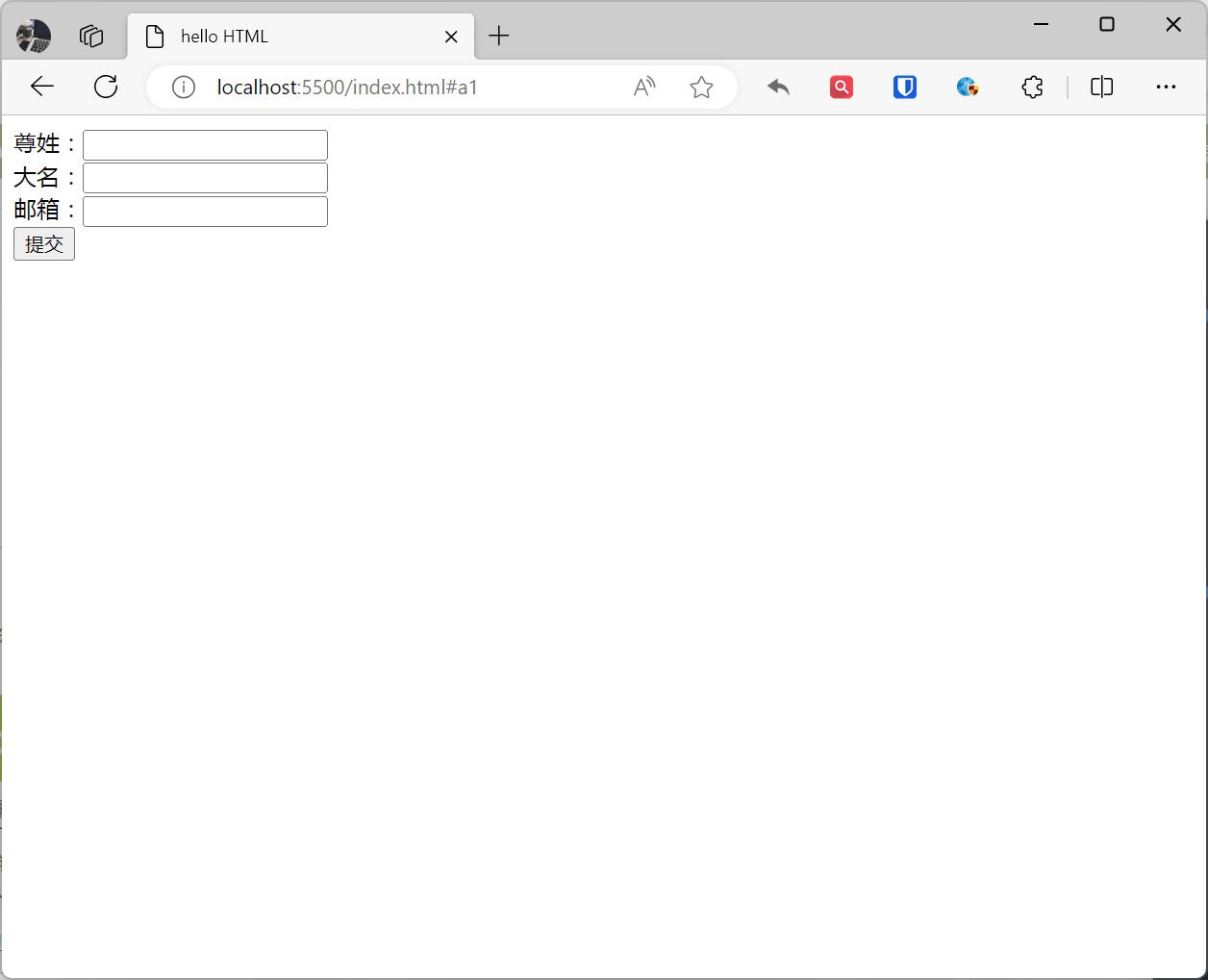
<form>/<input>autocomplete attribute: Specifies whether form or input fields should have autocomplete functionality. When users start typing in an autocomplete field, the browser should display filled-in options.
Example:
<form action="demo-form.php" autocomplete="on"> First name:<input type="text" name="fname"><br> Last name:<input type="text" name="lname"><br> Email:<input type="email" name="email" autocomplete="off"><br> <input type="submit"></form>Effect:
| Attribute | Description |
|---|---|
autocomplete | Specifies whether input fields should enable autocomplete. |
novalidate | Prevents browser validation of forms. |
form | Specifies the form that an <input> element belongs to, associating it with a specific form. |
formaction | Specifies the URL to use when submitting the form. |
formenctype | Specifies the encoding type to use when submitting the form (e.g., application/x-www-form-urlencoded or multipart/form-data). |
formmethod | Specifies the HTTP method to use when submitting the form (e.g., get or post). |
formnovalidate | Disables browser form validation when submitting. |
formtarget | Specifies the target window or frame to open after form submission. |
height | Sets the height of <input type="image"> elements. |
width | Sets the width of <input type="image"> elements. |
list | Specifies the id of the <datalist> element associated with <input> or <textarea> elements. |
min | Specifies the minimum value of <input> elements. |
max | Specifies the maximum value of <input> elements. |
pattern | Defines a regular expression for validating input fields when submitting forms. |
placeholder | Provides a short hint for input fields, displayed only when the field is empty. |
required | Specifies whether an input field is required. |
step | Specifies the valid number interval for <input> elements. |
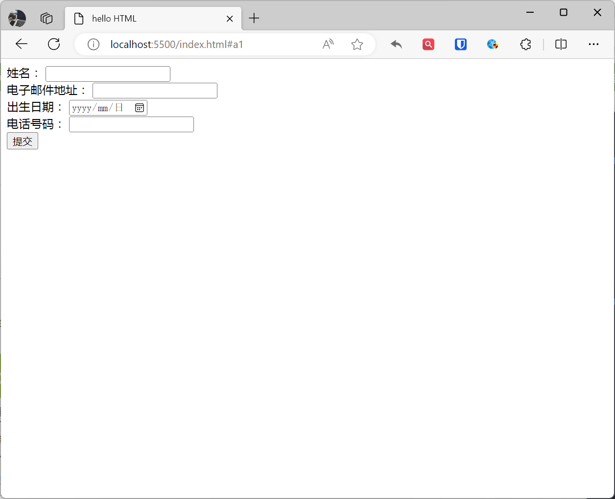
New input Types:
<form action="/submit" method="post"> <label for="name">Name:</label> <input type="text" id="name" required /> <br> <label for="email">Email Address:</label> <input type="email" id="email" required /> <br> <label for="birthday">Date of Birth:</label> <input type="date" id="birthday" required /> <br> <label for="phone">Phone Number:</label> <input type="tel" id="phone" required /> <br> <input type="submit" value="Submit" /></form>Effect:
| Type | Purpose |
|---|---|
| color | For inputting color values. |
| date | For inputting date values. |
| datetime-local | For inputting date and time values. |
| For inputting email addresses. | |
| file | For uploading files. |
| month | For inputting month values. |
| number | For inputting numeric values. |
| range | For inputting range values. |
| search | For inputting search strings. |
| tel | For inputting phone numbers. |
| time | For inputting time values. |
| url | For inputting URL addresses. |
[!Summary]
| Element | Purpose | Recommended |
|---|---|---|
| New Elements | ||
<canvas> | Defines graphics such as charts and other images. This tag is based on JavaScript’s drawing API. | Recommended |
<audio> | Defines audio content | Recommended |
<video> | Defines video (video or movie) | Recommended |
<source> | Defines multimedia resources for <video> and <audio> | Recommended |
<track> | Defines subtitles or translations for audio or video | Recommended |
<datalist> | Defines option lists. Use with input elements to define possible input values. | Recommended |
<keygen> | Specifies a key pair generator field for forms. | Recommended |
<output> | Defines different types of output, such as script output. | Recommended |
<article> | Defines independent content areas on a page. | Recommended |
<aside> | Defines sidebar content for a page. | Recommended |
<bdi> | Allows you to set a text segment to break away from its parent element’s text direction. | Recommended |
<dialog> | Defines a dialog box. | Recommended |
<figure> | Defines areas containing images or other visual content. | Recommended |
<footer> | Defines the footer area of a page or section. | Recommended |
<header> | Defines the header area of a page or section. | Recommended |
<main> | Defines the main content area of a page. | Recommended |
<mark> | Defines important or highlighted text. | Recommended |
<meter> | Defines progress or value ranges. | Recommended |
<nav> | Defines navigation areas of a page or section. | Recommended |
<progress> | Defines a progress bar. | Recommended |
<time> | Defines dates or times. | Recommended |
<wbr> | Allows inserting breakable characters in text. | Recommended |
| Deprecated or Not Recommended Elements | ||
<acronym> | Defines acronyms. Consider using <abbr> element instead. | Recommended |
<applet> | Defines Java applets. Consider using JavaScript or other modern technologies instead. | Not Recommended |
<basefont> | Sets the default font size and color for all text on a page. Consider using CSS for text styling. | Not Recommended |
<big> | Sets the font size of text. Consider using CSS for text styling. | Not Recommended |
<center> | Forces text center alignment. Consider using CSS for text alignment. | Not Recommended |
<dir> | Defines directory lists. Consider using <ul> element instead. | Not Recommended |
<font> | Sets text font size, color, style, etc. Consider using CSS for text styling. | Not Recommended |
<frame> | Defines frames. Consider using iframe element instead. | Not Recommended |
<frameset> | Defines framesets. Consider using iframe element instead. | Not Recommended |
<noframes> | Provides alternative content for browsers that don’t support frames. Consider using JavaScript to detect frame support and show/hide content accordingly. | Not Recommended |
<strike> | Sets strikethrough text. Consider using CSS for text styling. | Not Recommended |
<tt> | Sets monospace font for text. Consider using CSS for text fonts. | Not Recommended |