IT Course CSS Basics 031_Grid Layout
Grid Layout
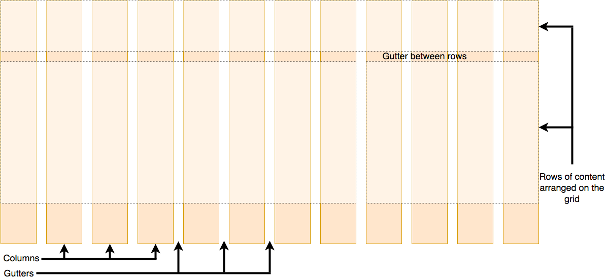
A grid is a layout mode consisting of a series of horizontal and vertical lines. With a grid, we can arrange design elements, helping us design pages with elements that have fixed positions and widths, making our website pages more uniform.
A grid typically has many columns and rows, as well as gaps between rows and columns, which are generally called gutters.
Basic Concepts
Grid layout consists of the following basic concepts:
- Grid container: Grid layout consists of grid containers and grid items. A grid container is a container that places grid items into the grid. A grid container can be any element, but usually a
divelement is used. - Grid item: A grid item is an element placed in a grid container. A grid item can be any element, but usually a
divelement is used. - Grid line: Grid lines are lines that divide the grid container into rows and columns. Grid lines can be horizontal or vertical.
- Grid column: Grid columns are vertical lines in the grid container.
- Grid row: Grid rows are horizontal lines in the grid container.
Common Properties
Grid Container Properties
Grid containers have the following properties to control grid layout:
display: Sets the display mode of the grid container. The grid container must be set todisplay: gridordisplay: inline-gridto use grid layout.grid-template-columns: Sets the number of columns and column width of the grid container (usingfr,px,emand other units).grid-template-rows: Sets the number of rows and row height of the grid container (usingfr,px,emand other units).grid-template: Sets bothgrid-template-columnsandgrid-template-rows.grid-auto-columns: Sets the column width of the grid container.grid-auto-rows: Sets the row height of the grid container.
Grid Item Properties
Grid items have the following properties to control the layout of grid items in the grid:
grid-column: Sets the column where the grid item is located.grid-row: Sets the row where the grid item is located.grid-column-start: Sets the starting position of the grid item in the column.grid-column-end: Sets the ending position of the grid item in the column.grid-row-start: Sets the starting position of the grid item in the row.grid-row-end: Sets the ending position of the grid item in the row.grid-area: Sets the area where the grid item is located.grid-gap: Sets the spacing between grid lines.
Grid Layout
Define fixed and adaptive column widths and row heights
Example:
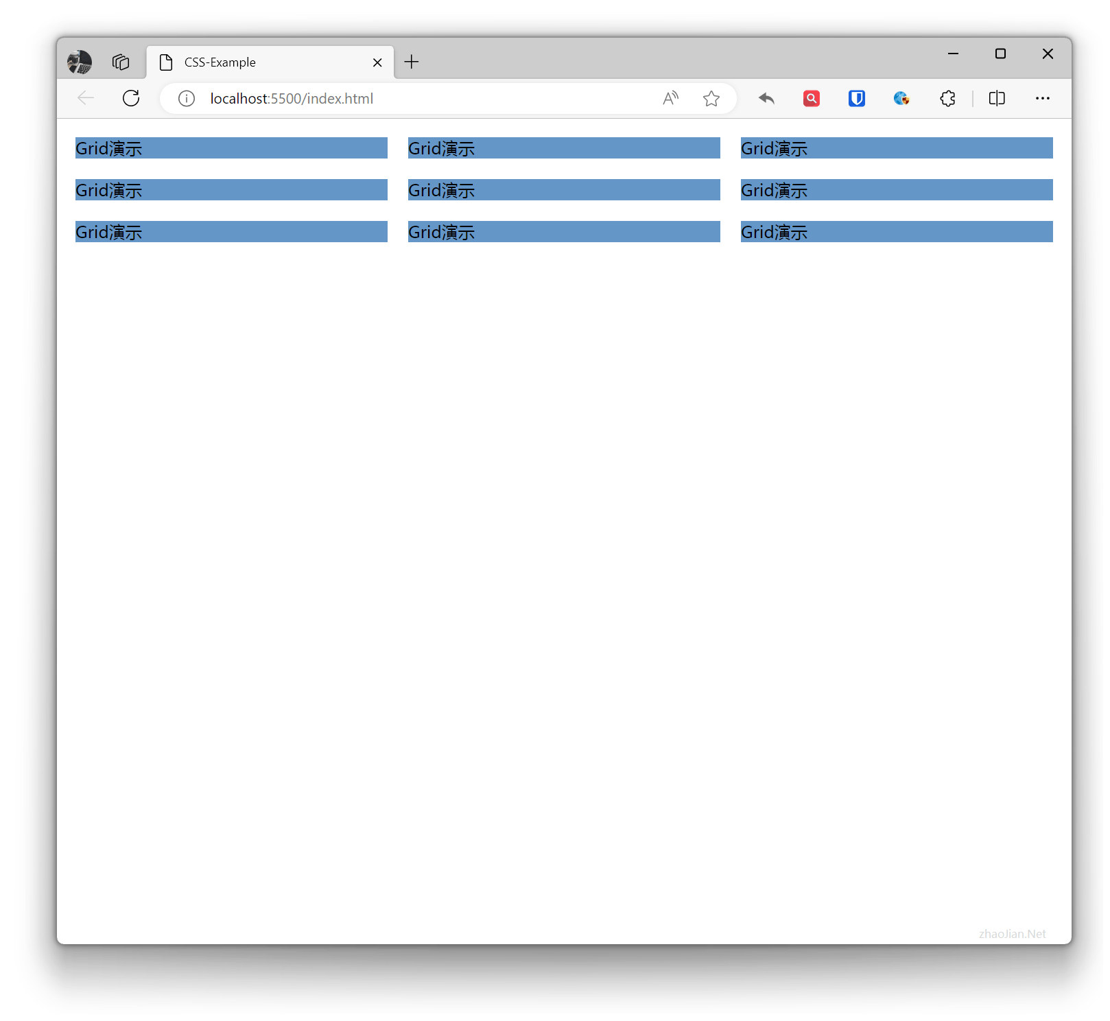
.grid-example{ display: grid; grid-template-columns: 100px 200px auto; /* First column 100px, second column 200px, remaining space allocated to adaptive column */ grid-template-rows: 100px 200px auto; /* First row 100px, second row 200px, remaining space allocated to adaptive row */}.item{ margin: 10px; background-color: rgb(100, 150, 200);} <div class="grid-example"> <div class="item">Grid Demo</div> <div class="item">Grid Demo</div> <div class="item">Grid Demo</div> <div class="item">Grid Demo</div> <div class="item">Grid Demo</div> <div class="item">Grid Demo</div> <div class="item">Grid Demo</div> <div class="item">Grid Demo</div> <div class="item">Grid Demo</div> </div>Effect:
 Using percentages to define column width and row height
Example:
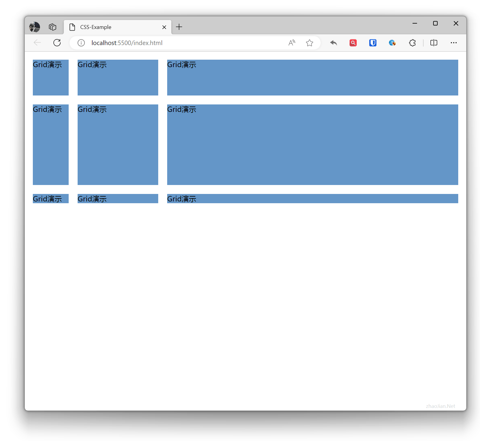
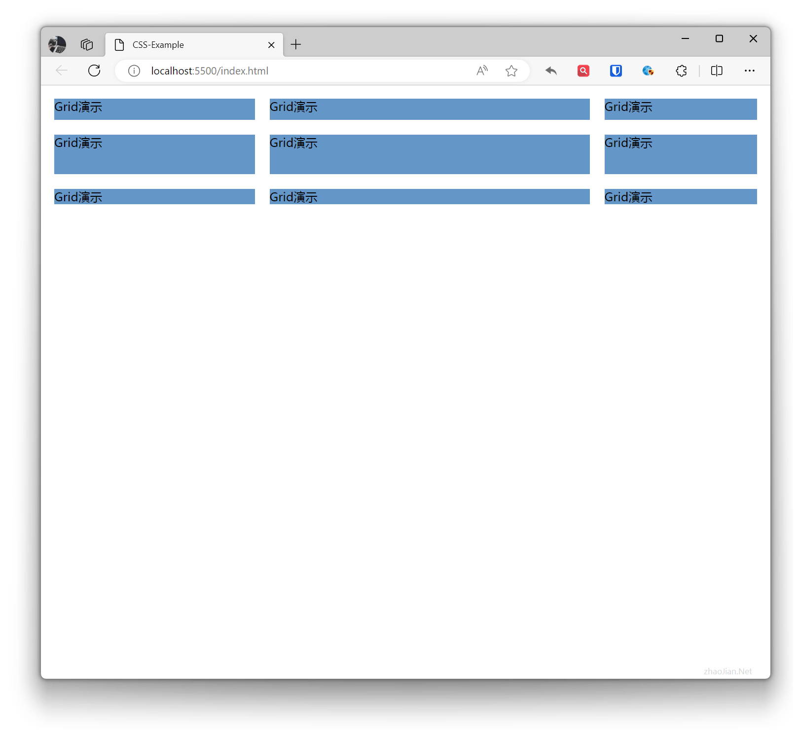
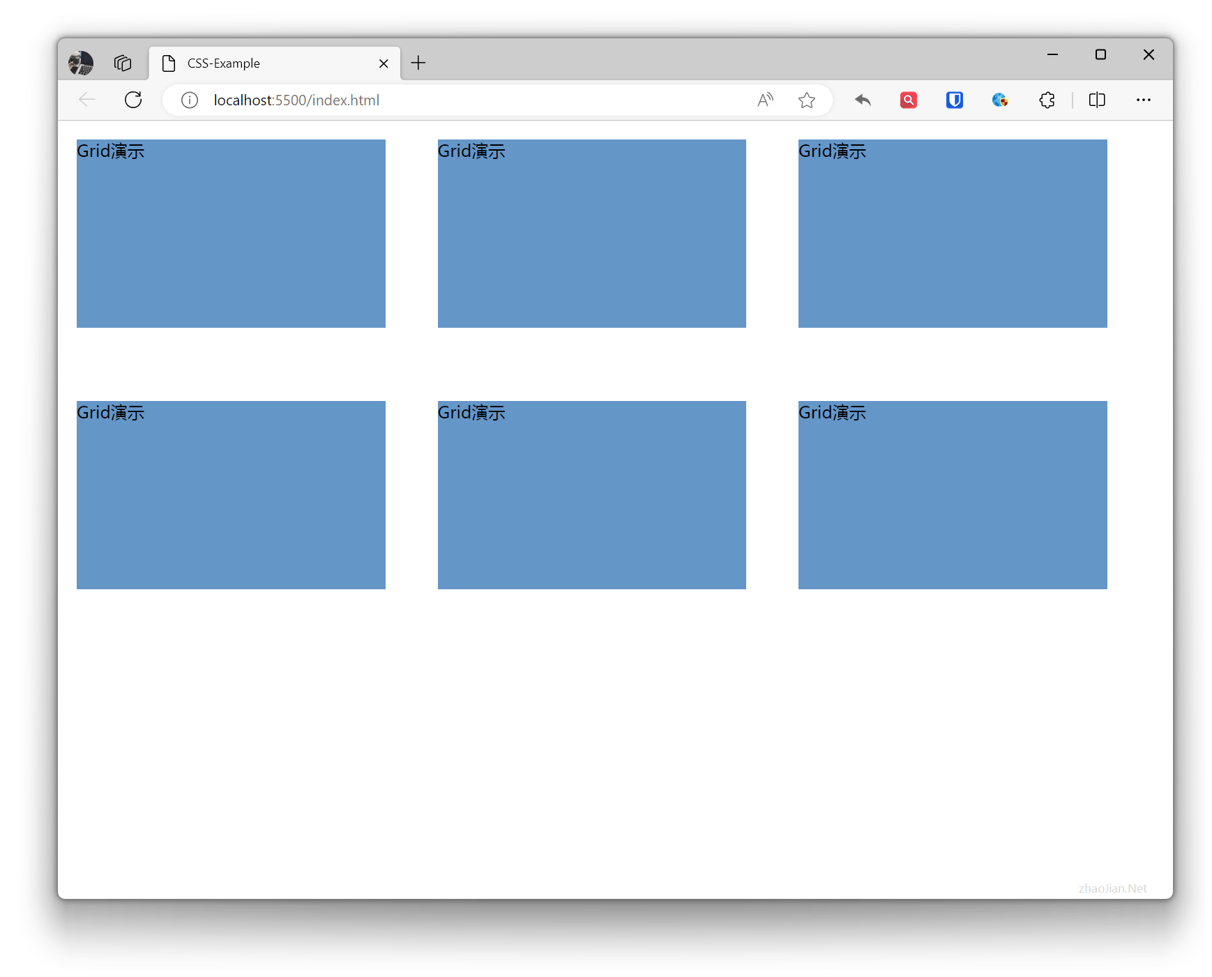
.grid-example{ display: grid; grid-template-columns: 30% 2fr 1fr; /* First column takes 30%, second column takes two parts of remaining space, third column takes one part of remaining space */ grid-template-rows: 30% 2fr 1fr; /* First row takes 30%, second row takes two parts of remaining space, third row takes one part of remaining space */}.item{ margin: 10px; background-color: rgb(100, 150, 200);} <div class="grid-example"> <div class="item">Grid Demo</div> <div class="item">Grid Demo</div> <div class="item">Grid Demo</div> <div class="item">Grid Demo</div> <div class="item">Grid Demo</div> <div class="item">Grid Demo</div> <div class="item">Grid Demo</div> <div class="item">Grid Demo</div> <div class="item">Grid Demo</div> </div>Effect:
 Equal division (evenly distributed) column width and row height
Example:
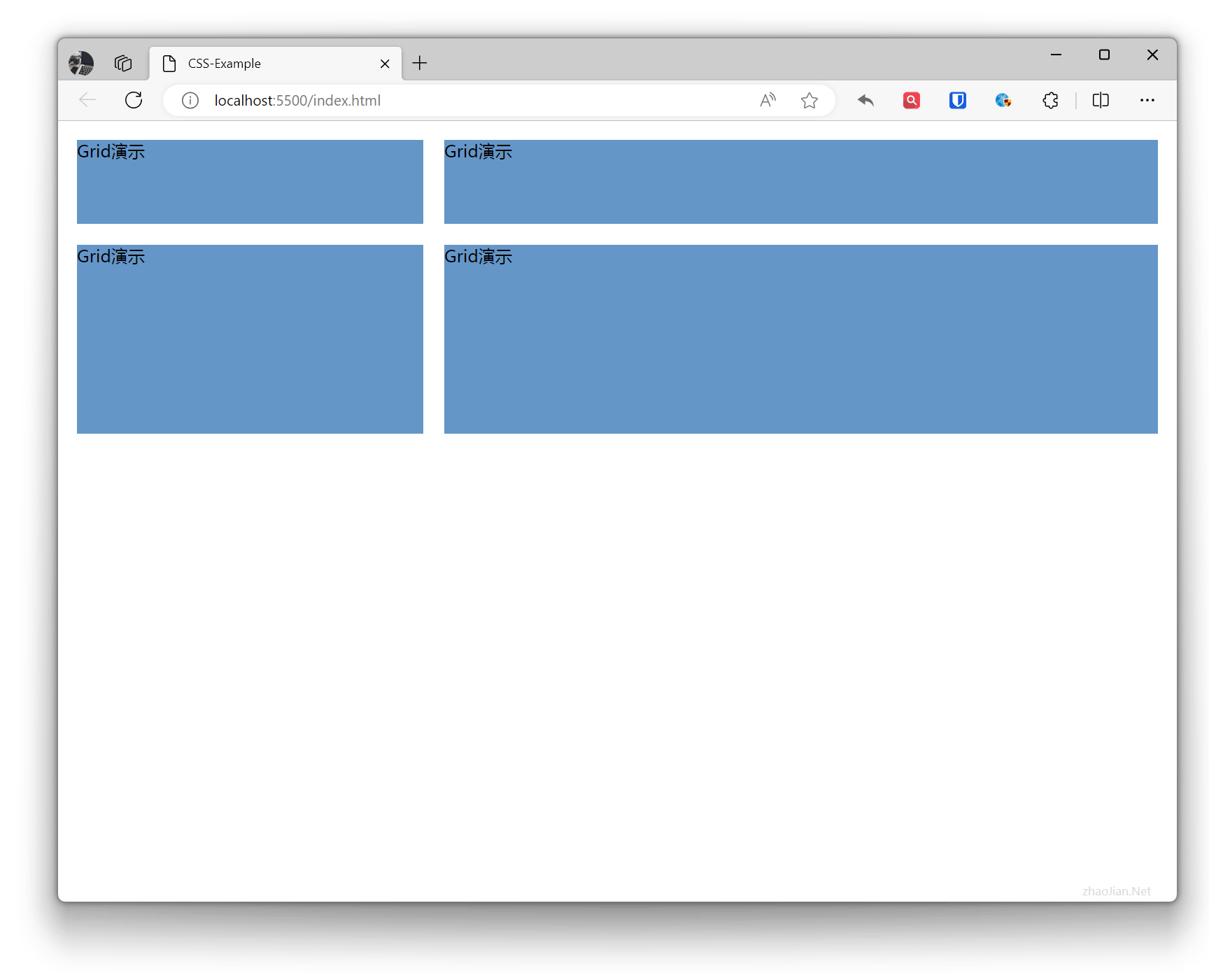
.grid-example{ display: grid; grid-template-columns: repeat(3, 1fr); /* Three equal columns, each column takes one part of remaining space */ grid-template-rows: repeat(3, 1fr); /* Three equal rows, each row takes one part of remaining space */}.item{ margin: 10px; background-color: rgb(100, 150, 200);} <div class="grid-example"> <div class="item">Grid Demo</div> <div class="item">Grid Demo</div> <div class="item">Grid Demo</div> <div class="item">Grid Demo</div> <div class="item">Grid Demo</div> <div class="item">Grid Demo</div> <div class="item">Grid Demo</div> <div class="item">Grid Demo</div> <div class="item">Grid Demo</div> </div>Effect:
 Using
Using minmax to define minimum and maximum width/height for columns and rows
Example:
.grid-example{ display: grid; grid-template-columns: minmax(100px, 1fr) minmax(200px, 2fr); /* First column minimum width 100px, takes one part of remaining space; second column minimum width 200px, takes two parts of remaining space */ grid-template-rows: minmax(100px, 1fr) minmax(200px, 2fr); /* First row minimum height 100px, takes one part of remaining space; second row minimum height 200px, takes two parts of remaining space */}.item{ margin: 10px; background-color: rgb(100, 150, 200);} <div class="grid-example"> <div class="item">Grid Demo</div> <div class="item">Grid Demo</div> <div class="item">Grid Demo</div> <div class="item">Grid Demo</div> </div>Effect:
Grid Gap
Grid gap is controlled by two properties: grid-row-gap and grid-column-gap. Additionally, CSS Grid Level 2 introduced the gap property, which can control both grid-row-gap and grid-column-gap at the same time.
Example:
.grid-example{ display: grid; grid-template-columns: 30% 30% 30%; grid-template-rows: 200px 200px; grid-row-gap: 50px; /* Row gap is 50px */ grid-column-gap: 30px; /* Column gap is 30px */ /* gap: 50px 30px; Row gap is 50px, column gap is 30px */}.item{ margin: 10px; background-color: rgb(100, 150, 200);} <div class="grid-example"> <div class="item">Grid Demo</div> <div class="item">Grid Demo</div> <div class="item">Grid Demo</div> <div class="item">Grid Demo</div> <div class="item">Grid Demo</div> <div class="item">Grid Demo</div> </div>Effect:
Grid Positioning
Grid positioning typically refers to using grid-column, grid-row, and grid-area properties to position items in a grid layout. These properties are used to specify which columns and rows an item occupies in the grid, or to directly specify the area where an item is located.
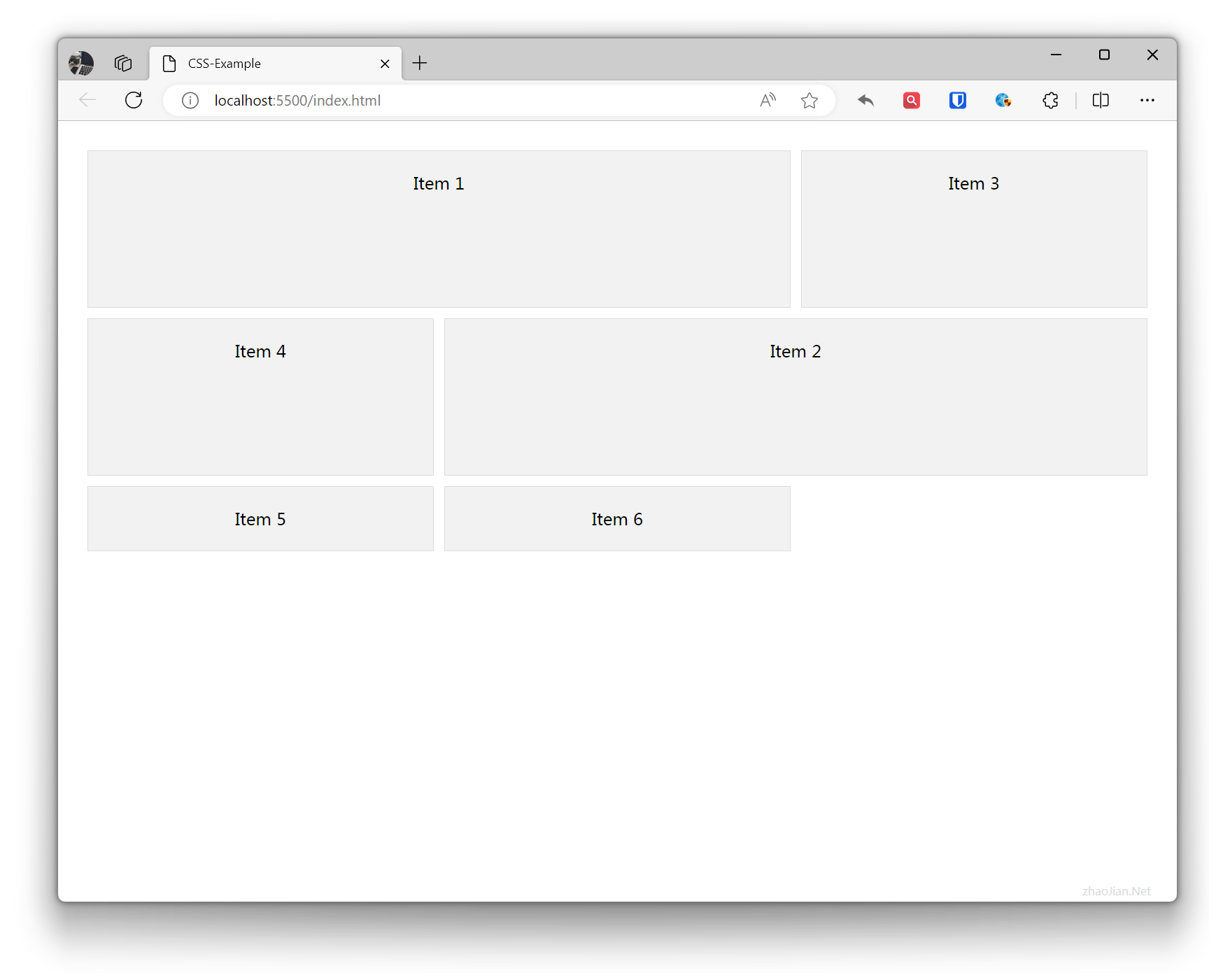
grid-columnis a property used to set the columns a grid item spans. It is a shorthand forgrid-column-startandgrid-column-end. Withgrid-column, you can more conveniently define the position and number of columns a grid item spans in the horizontal direction.grid-rowis a property used to set the rows a grid item spans. It is a shorthand forgrid-row-startandgrid-row-end. Withgrid-row, you can more conveniently define the position and number of rows a grid item spans in the vertical direction.grid-areaproperty is a shorthand property for settinggrid-row-start,grid-column-start,grid-row-end, andgrid-column-endat the same time. Withgrid-area, you can more intuitively define the position and size of a grid item in the grid layout.
Example:
.example { display: grid; grid-template-columns: repeat(3, 1fr); /* Define 3 columns, each column takes 1 part of space */ grid-template-rows: repeat(2, 150px); /* Define 2 rows, each row height is 150px */ gap: 10px; padding: 20px;}.item { background-color: #f2f2f2; padding: 20px; border: 1px solid #ddd; text-align: center;}/* Position using grid-column and grid-row */.item1 { grid-column: 1 / 3; /* From column 1 to column 3 (columns 1+2) */ grid-row: 1 / 2; /* From row 1 to row 2 (row 1) */}/* Position using grid-area */.item2 { grid-area: 2 / 2 / 3 / 4; /* From row 2 column 2 to row 3 column 4 (row 2)(columns 2+3) */}<div class="example"> <div class="item item1">Item 1</div> <div class="item item2">Item 2</div> <div class="item">Item 3</div> <div class="item">Item 4</div> <div class="item">Item 5</div> <div class="item">Item 6</div></div>Effect:
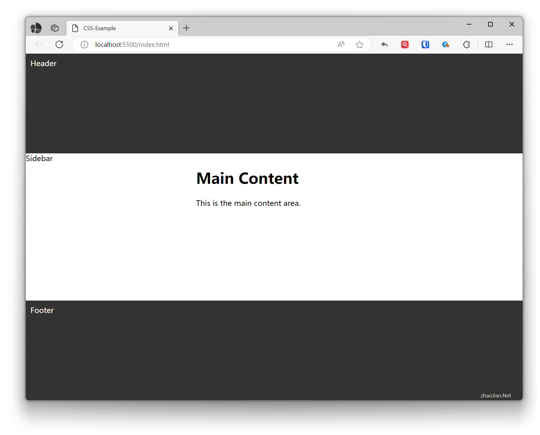
Example:
body { margin: 0; padding: 0;}
.container { display: grid; grid-template-columns: 1fr 2fr; /* Define two columns, first column takes one part, second column takes two parts */ grid-template-rows: auto; /* Define row height, first and third row heights determined by content, second row takes remaining space */ grid-template-areas: "header header" "sidebar main" "footer footer"; /* Define area layout, each area represented by a string, spaces separate cells, newlines indicate new rows */ min-height: 100vh; /* Set minimum height to ensure footer is visible when content height is less than viewport */}
.header { grid-area: header; /* Place .header in the area named "header" */ background-color: #333; color: #fff; padding: 10px;}
.sidebar { grid-area: sidebar; /* Place .sidebar in the area named "sidebar" */ background-color: #f2f2f2; padding: 10px;}
.main { grid-area: main; /* Place .main in the area named "main" */ padding: 10px;}
.footer { grid-area: footer; /* Place .footer in the area named "footer" */ background-color: #333; color: #fff; padding: 10px;} <div class="container"> <div class="header">Header</div> <div class="sidebar">Sidebar</div> <div class="main"> <h1>Main Content</h1> <p>This is the main content area.</p> </div> <div class="footer">Footer</div> </div>Effect: