IT Course CSS Basics 029_Lists and Tables
Lists
In CSS, list styles can be optimized through properties like list-style-type, list-style-image, and list-style-position.
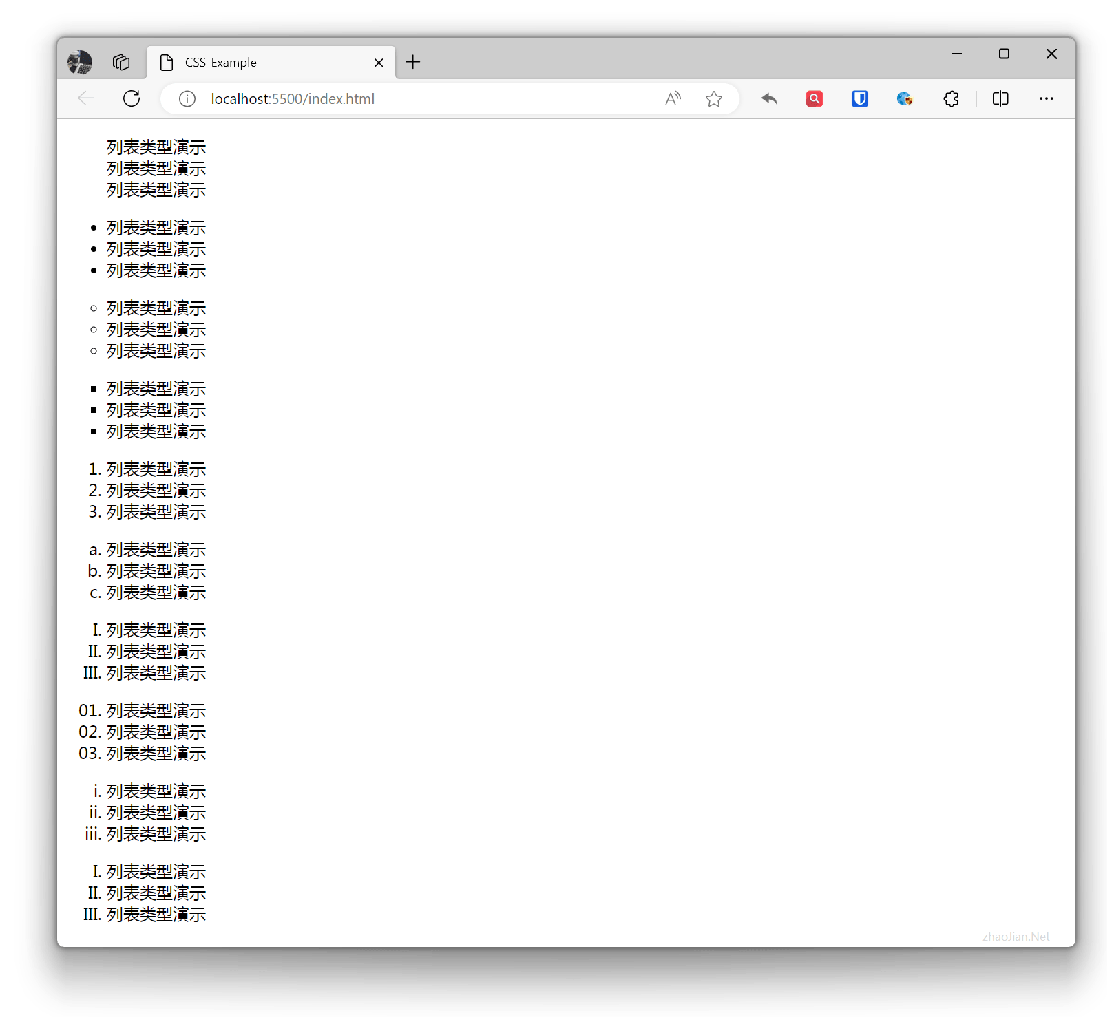
List Type
Define the type of list, including unordered lists, ordered lists, and definition lists. none no display, disc filled circle, circle circle, square square, decimal numbers, lower-alpha lowercase letters, upper-alpha uppercase letters, decimal-leading-zero numbers with leading zeros, lower-roman lowercase roman numerals, upper-roman uppercase roman numerals, etc.
Example:
.ul-none{ list-style-type: none;}.ul-disc{ list-style-type: disc;}.ul-circle{ list-style-type: circle;}.ul-square{ list-style-type: square;}.ul-decimal{ list-style-type: decimal;}.ul-lower-alpha{ list-style-type: lower-alpha;}.ul-upper-alpha{ list-style-type: upper-alpha;}.ul-decimal-leading-zero{ list-style-type: decimal-leading-zero;}.ul-lower-roman{ list-style-type: lower-roman;}.ul-upper-roman{ list-style-type: upper-roman;} <ul class="ul-none"> <li>List type demo</li> <li>List type demo</li> <li>List type demo</li> </ul> <ul class="ul-disc"> <li>List type demo</li> <li>List type demo</li> <li>List type demo</li> </ul> <ul class="ul-circle"> <li>List type demo</li> <li>List type demo</li> <li>List type demo</li> </ul> <ul class="ul-square"> <li>List type demo</li> <li>List type demo</li> <li>List type demo</li> </ul> <ul class="ul-decimal"> <li>List type demo</li> <li>List type demo</li> <li>List type demo</li> </ul> <ul class="ul-lower-alpha"> <li>List type demo</li> <li>List type demo</li> <li>List type demo</li> </ul> <ul class="ul-upper-roman"> <li>List type demo</li> <li>List type demo</li> <li>List type demo</li> </ul> <ul class="ul-decimal-leading-zero"> <li>List type demo</li> <li>List type demo</li> <li>List type demo</li> </ul> <ul class="ul-lower-roman"> <li>List type demo</li> <li>List type demo</li> <li>List type demo</li> </ul> <ul class="ul-upper-roman"> <li>List type demo</li> <li>List type demo</li> <li>List type demo</li> </ul>Effect:
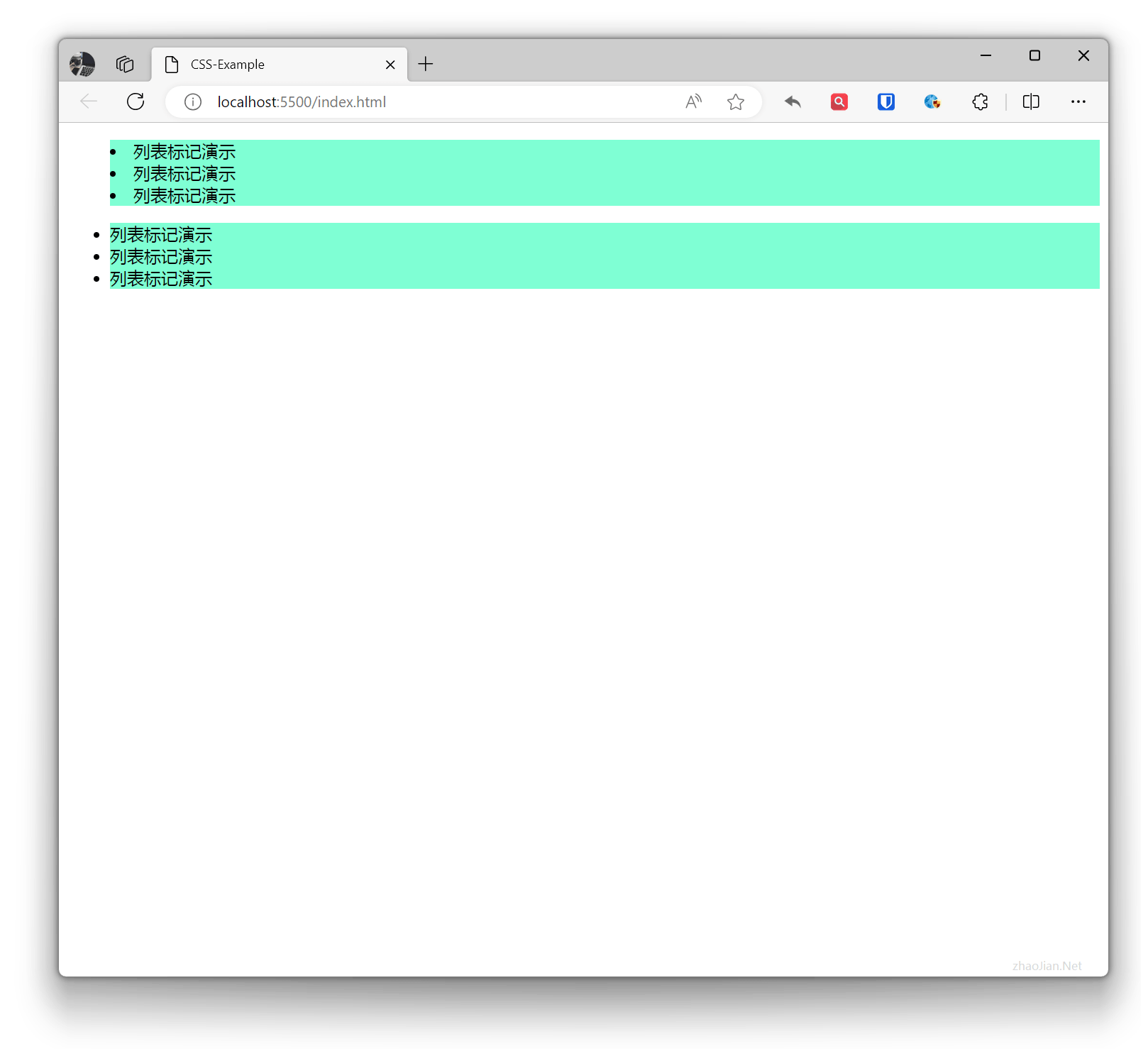
List Marker
Set the marker position of list items (inside or outside). inside inside, outside outside
Example:
.ul-inside{ list-style-position: inside;}.ul-outside{ list-style-position: outside;}li{ background-color: aquamarine;} <ul class="ul-inside"> <li>List marker demo</li> <li>List marker demo</li> <li>List marker demo</li> </ul> <ul class="ul-outside"> <li>List marker demo</li> <li>List marker demo</li> <li>List marker demo</li> </ul>Effect:
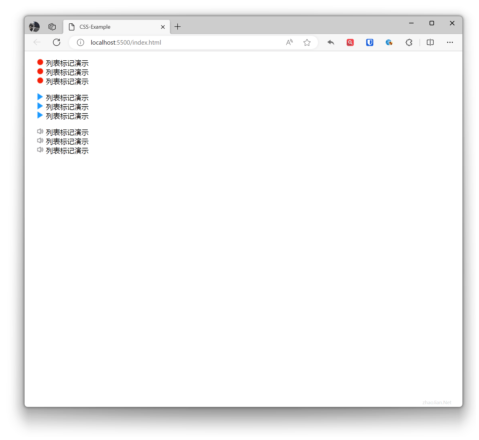
List Image
Set the image for the list marker, which can be set to the URL address of an image.
Example:
.ul-image1{ list-style-image: url("li1.png");}.ul-image2{ list-style-image: url("li2.png");}.ul-image3{ list-style-image: url("li3.png");} <ul class="ul-image1"> <li>List marker demo</li> <li>List marker demo</li> <li>List marker demo</li> </ul> <ul class="ul-image2"> <li>List marker demo</li> <li>List marker demo</li> <li>List marker demo</li> </ul> <ul class="ul-image3"> <li>List marker demo</li> <li>List marker demo</li> <li>List marker demo</li> </ul>Effect:
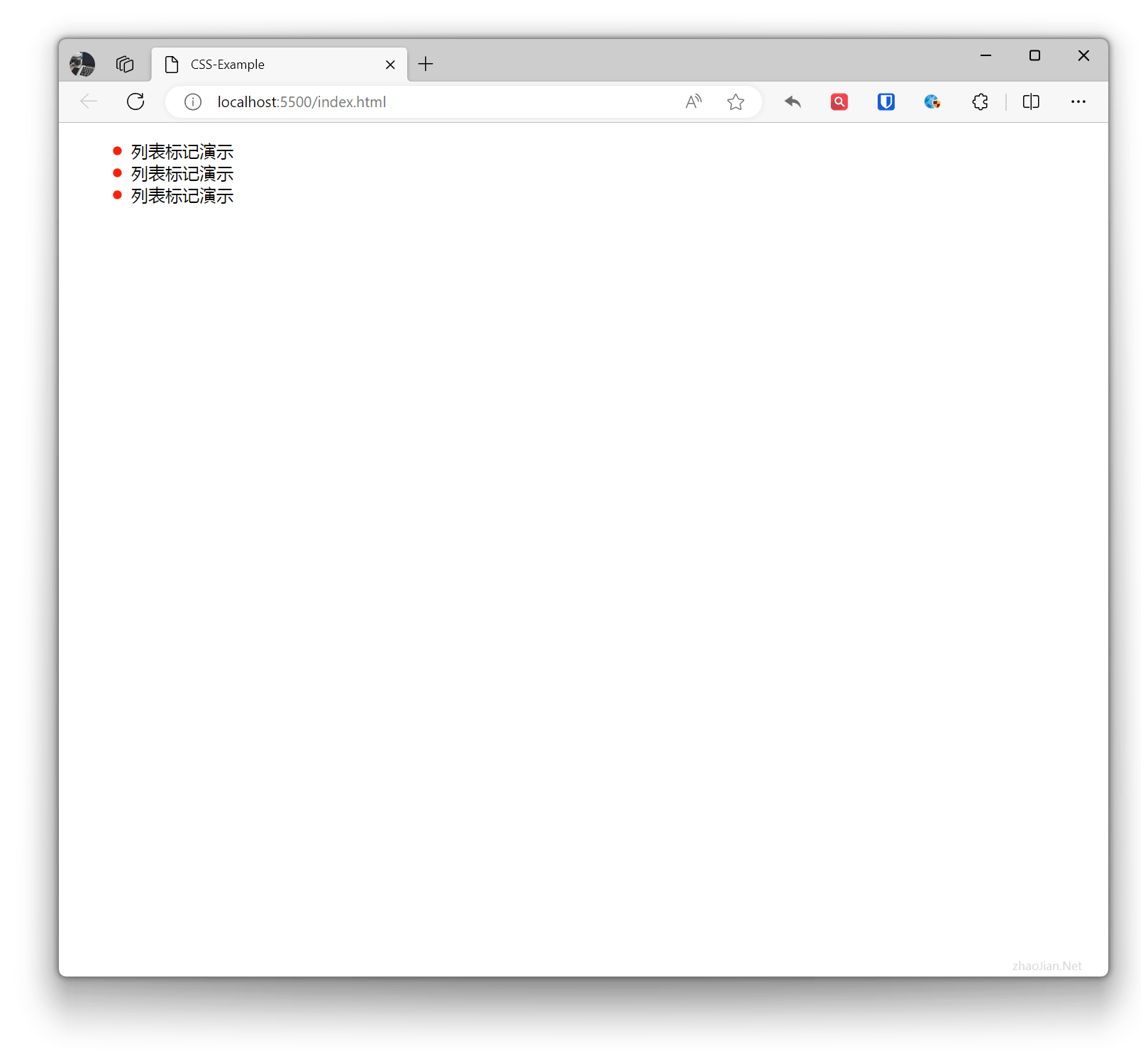
 The size set through ul may cause the image to stretch or compress, so it’s best to use editing tools to set the original size of the image. If you need to adjust the display size of the image in list items without changing the image itself, you can use the
 background-image property of li to flexibly control list images.
Example:
li{ list-style-type: none; background-image: url("li1.png"); background-size: 10px 10px; background-repeat: no-repeat; background-position: 2px center; padding-left: 20px;} <ul> <li>List marker demo</li> <li>List marker demo</li> <li>List marker demo</li> </ul>Effect:
 Shorthand: The
 list-style property is used to set three style properties for list item markers at once: list-style-type, list-style-position, and list-style-image. Values can be omitted, but the order cannot change.
Example:
ul{ list-style: square inside url('li1.png');}Tables
In CSS, the appearance and layout of tables can be controlled through multiple properties such as border.
border
Define the border of the table, which can set the width, color, and style of the border.
Example:
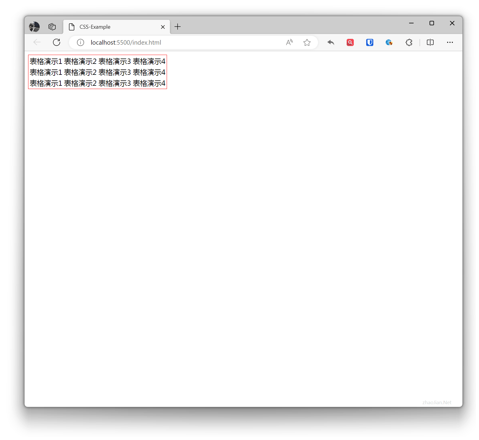
table { border: 1px solid red;}<table> <tr> <td>Table demo 1</td> <td>Table demo 2</td> <td>Table demo 3</td> <td>Table demo 4</td> </tr> <tr> <td>Table demo 1</td> <td>Table demo 2</td> <td>Table demo 3</td> <td>Table demo 4</td> </tr> <tr> <td>Table demo 1</td> <td>Table demo 2</td> <td>Table demo 3</td> <td>Table demo 4</td> </tr></table>Effect:
th td
In CSS, th and td can control the styles of table headers, table rows, and table data cells.
Example:
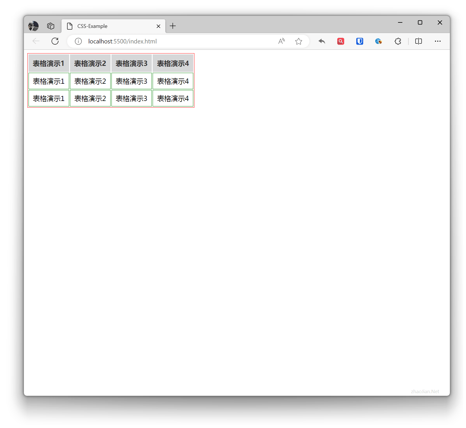
table { border: 1px solid red;}th { background-color: #d6d7d8; /* Set header background color */ color: #333; /* Set header text color */ font-weight: bold; /* Set header text bold */ padding: 10px; /* Set header padding */ text-align: center; /* Set text center alignment */}td { border: 1px solid green; /* Set bottom border between rows */ padding: 8px; /* Set cell padding */ text-align: center; /* Set text center alignment */} <table> <tr> <th>Table demo 1</th> <th>Table demo 2</th> <th>Table demo 3</th> <th>Table demo 4</th> </tr> <tr> <td>Table demo 1</td> <td>Table demo 2</td> <td>Table demo 3</td> <td>Table demo 4</td> </tr> <tr> <td>Table demo 1</td> <td>Table demo 2</td> <td>Table demo 3</td> <td>Table demo 4</td> </tr> </table>Effect:
border-collapse
A property used to control how adjacent borders of a table are merged.
- separate: Do not merge borders, table borders remain independent.
- collapse: Merge borders, table borders are merged together.
Example:
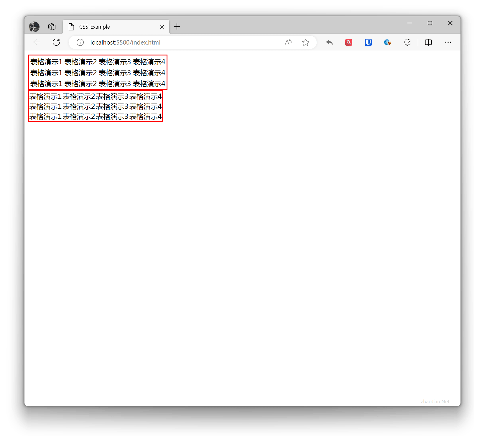
.table1 { border: 2px solid red; border-collapse: separate;}.table2 { border: 2px solid red; border-collapse: collapse;} <table class="table1"> <tr> <td>Table demo 1</td> <td>Table demo 2</td> <td>Table demo 3</td> <td>Table demo 4</td> </tr> <tr> <td>Table demo 1</td> <td>Table demo 2</td> <td>Table demo 3</td> <td>Table demo 4</td> </tr> <tr> <td>Table demo 1</td> <td>Table demo 2</td> <td>Table demo 3</td> <td>Table demo 4</td> </tr> </table> <table class="table2"> <tr> <td>Table demo 1</td> <td>Table demo 2</td> <td>Table demo 3</td> <td>Table demo 4</td> </tr> <tr> <td>Table demo 1</td> <td>Table demo 2</td> <td>Table demo 3</td> <td>Table demo 4</td> </tr> <tr> <td>Table demo 1</td> <td>Table demo 2</td> <td>Table demo 3</td> <td>Table demo 4</td> </tr> </table>Effect:
border-spacing
Define the border spacing of the table, which can set the spacing between borders.
Example:
table { border: 1px solid red; border-spacing: 10px;} <table> <tr> <td>Table demo 1</td> <td>Table demo 2</td> <td>Table demo 3</td> <td>Table demo 4</td> </tr> <tr> <td>Table demo 1</td> <td>Table demo 2</td> <td>Table demo 3</td> <td>Table demo 4</td> </tr> <tr> <td>Table demo 1</td> <td>Table demo 2</td> <td>Table demo 3</td> <td>Table demo 4</td> </tr> </table>Effect:
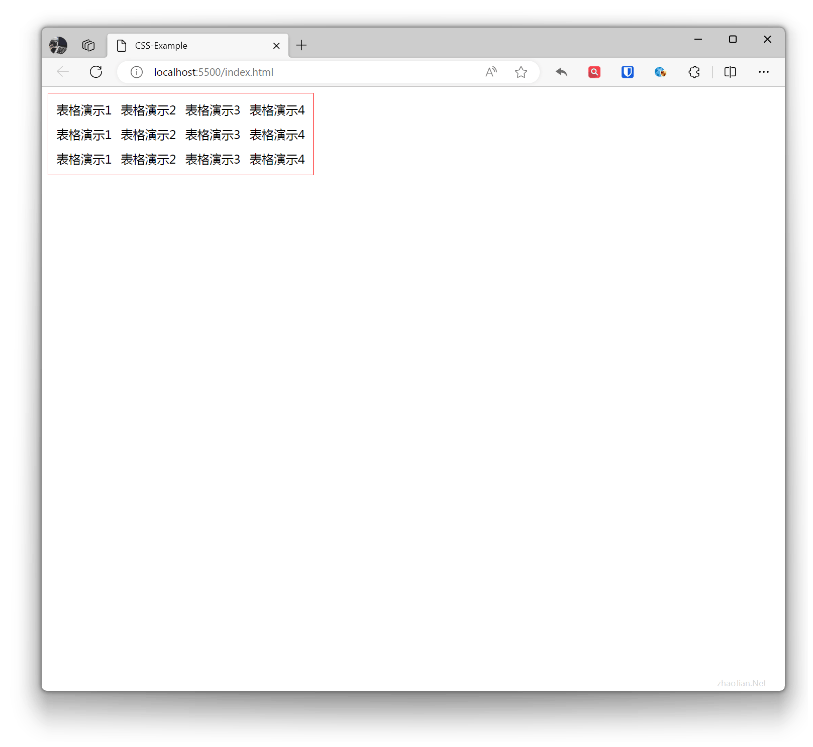
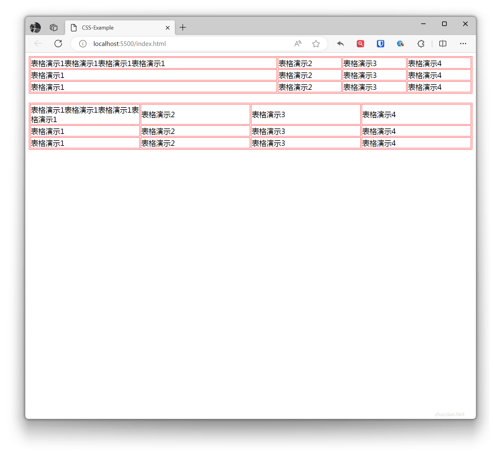
table-layout
Define the layout method of the table.
- auto: Automatic layout, the width and height of the table are determined by the content.
- fixed: Fixed layout, the width and height of the table are determined by specified values.
Example:
.table1 { border: 1px solid red; table-layout: auto; width: 100%;}.table2 { border: 1px solid red; table-layout: fixed; width: 100%;}th, td { border: 1px solid red;} <table class="table1"> <tr> <td>Table demo 1 Table demo 1 Table demo 1 Table demo 1</td> <td>Table demo 2</td> <td>Table demo 3</td> <td>Table demo 4</td> </tr> <tr> <td>Table demo 1</td> <td>Table demo 2</td> <td>Table demo 3</td> <td>Table demo 4</td> </tr> <tr> <td>Table demo 1</td> <td>Table demo 2</td> <td>Table demo 3</td> <td>Table demo 4</td> </tr> </table> <br> <table class="table2"> <tr> <td>Table demo 1 Table demo 1 Table demo 1 Table demo 1</td> <td>Table demo 2</td> <td>Table demo 3</td> <td>Table demo 4</td> </tr> <tr> <td>Table demo 1</td> <td>Table demo 2</td> <td>Table demo 3</td> <td>Table demo 4</td> </tr> <tr> <td>Table demo 1</td> <td>Table demo 2</td> <td>Table demo 3</td> <td>Table demo 4</td> </tr> </table>Effect:
caption-side
Define the position of the table caption, which can be set to the following values:
top: The caption is at the top of the table.bottom: The caption is at the bottom of the table.
Example:
.table1 { border: 1px solid red; caption-side: top;}.table2 { border: 1px solid red; caption-side: bottom;} <table class="table1"> <caption>Caption demo ABC123</caption> <tr> <td>Table demo 1 Table demo 1 Table demo 1 Table demo 1</td> <td>Table demo 2</td> <td>Table demo 3</td> <td>Table demo 4</td> </tr> <tr> <td>Table demo 1</td> <td>Table demo 2</td> <td>Table demo 3</td> <td>Table demo 4</td> </tr> <tr> <td>Table demo 1</td> <td>Table demo 2</td> <td>Table demo 3</td> <td>Table demo 4</td> </tr> </table> <br> <table class="table2"> <caption>Caption demo ABC123</caption> <tr> <td>Table demo 1 Table demo 1 Table demo 1 Table demo 1</td> <td>Table demo 2</td> <td>Table demo 3</td> <td>Table demo 4</td> </tr> <tr> <td>Table demo 1</td> <td>Table demo 2</td> <td>Table demo 3</td> <td>Table demo 4</td> </tr> <tr> <td>Table demo 1</td> <td>Table demo 2</td> <td>Table demo 3</td> <td>Table demo 4</td> </tr> </table>Effect:
