IT Course CSS Basics 023_Images, Backgrounds
Images
Images are a very important media type on web pages. Using images appropriately can make web pages colorful and vivid, no longer limited to cold text.
Image Layout
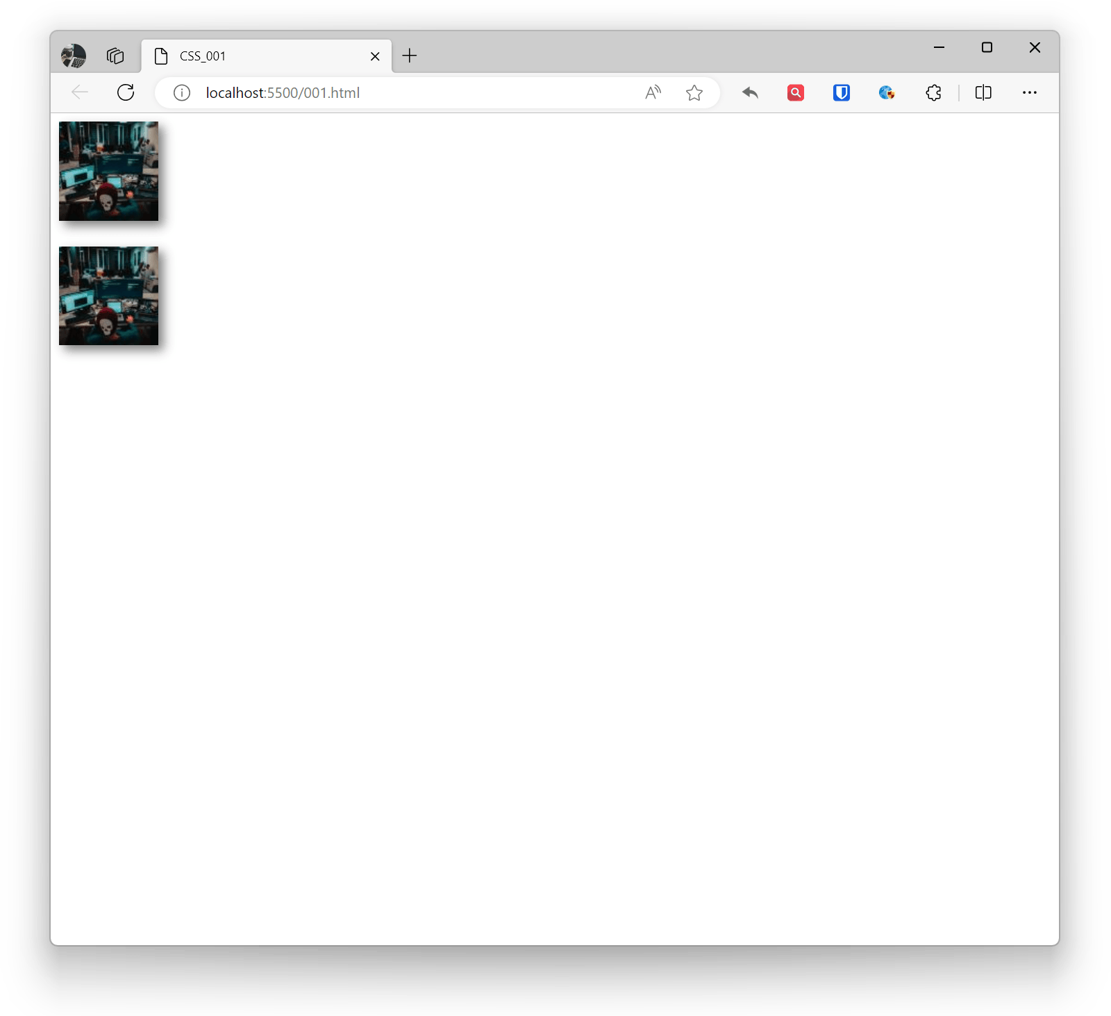
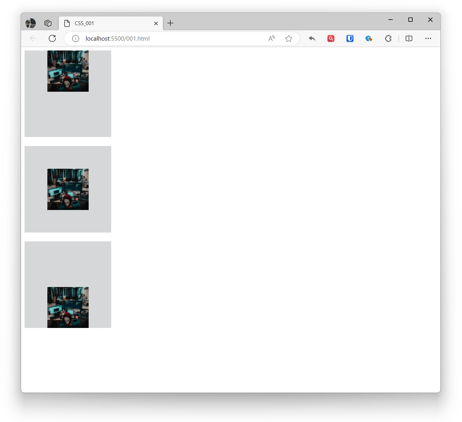
The img element is an inline element by default and has a default 5px margin. By setting it as a block-level element, only one image can be displayed per line. By setting it as an inline element, multiple images can be displayed in one line. Use the margin property for block-level element layout positioning, and use the text-align property for inline element layout positioning.
Example:
<img src="zhaojian1.jpg" alt="" ><img src="zhaojian1.jpg" alt="" ><img src="zhaojian1.jpg" alt="" ><img style="display: block;" src="zhaojian1.jpg" alt="" ><img style="display: block;" src="zhaojian1.jpg" alt="" ><img style="display: block;margin: 0 auto;" src="zhaojian1.jpg" alt="" >Effect:
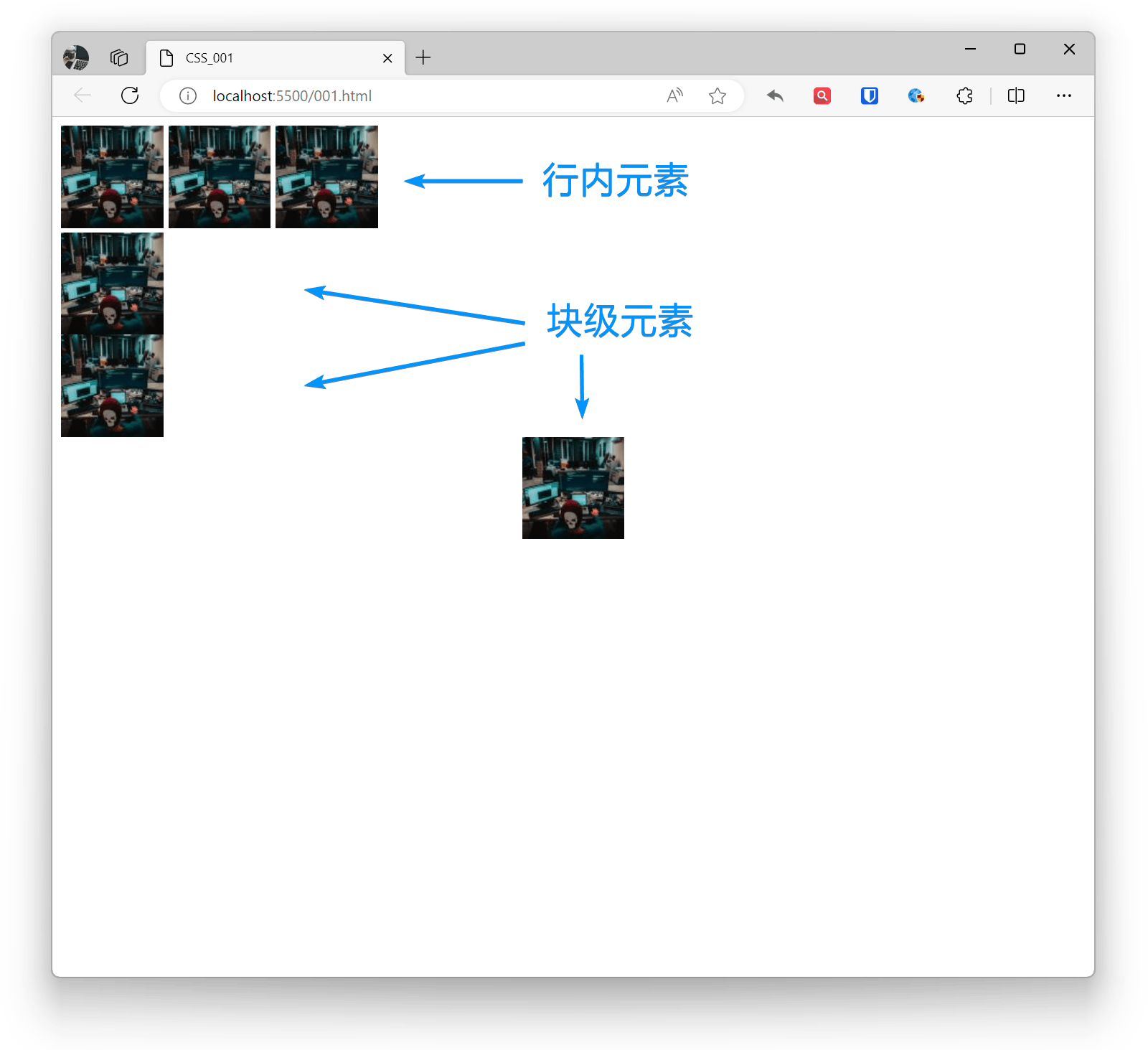
Image Transparency
In CSS, you can use the opacity property to set the transparency of elements (including images). This property accepts a value ranging from 0 (completely transparent) to 1 (completely opaque).
If you only want to make the image background transparent without affecting the content, you can use RGBA color values.
Example:
<img src="zhaojian1.jpg" alt="" ><img style="opacity: 0.5;" src="zhaojian1.jpg" alt="" >Effect:
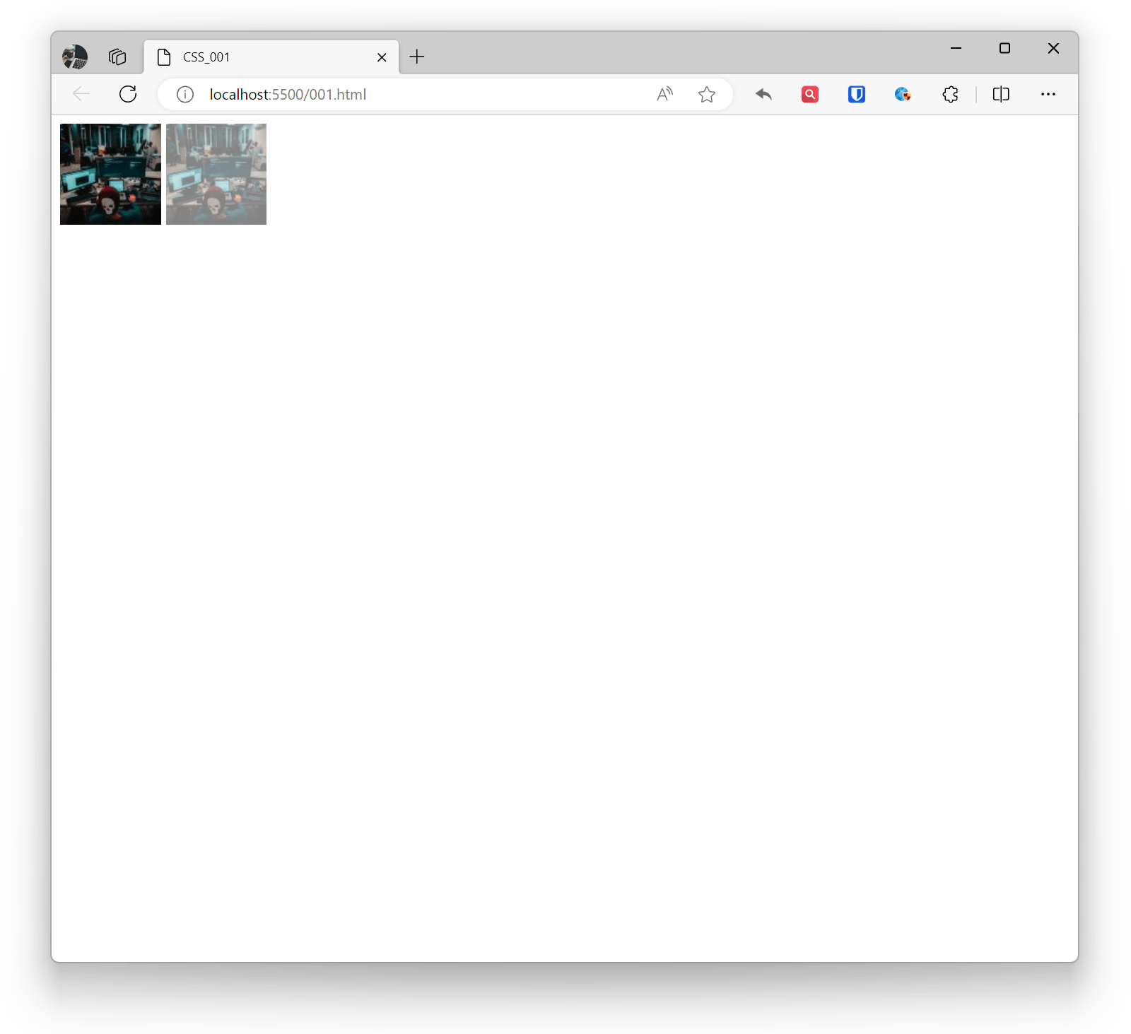
Image Rounded Corners
In CSS, you can use the border-radius property to add rounded corners to images. This property is used to set the curvature of element border corners.
Example:
<img style="border-radius: 10px;" src="zhaojian1.jpg" alt="" ><!-- Set rounded corner radius, can be adjusted as needed --><img style="border-radius: 20px 10px;" src="zhaojian1.jpg" alt="" ><!-- Horizontal radius 20px, vertical radius 10px --><img style="border-radius: 10px 20px 15px 5px;" src="zhaojian1.jpg" alt="" ><!-- Top-left 10px, top-right 20px, bottom-right 15px, bottom-left 5px -->Effect:
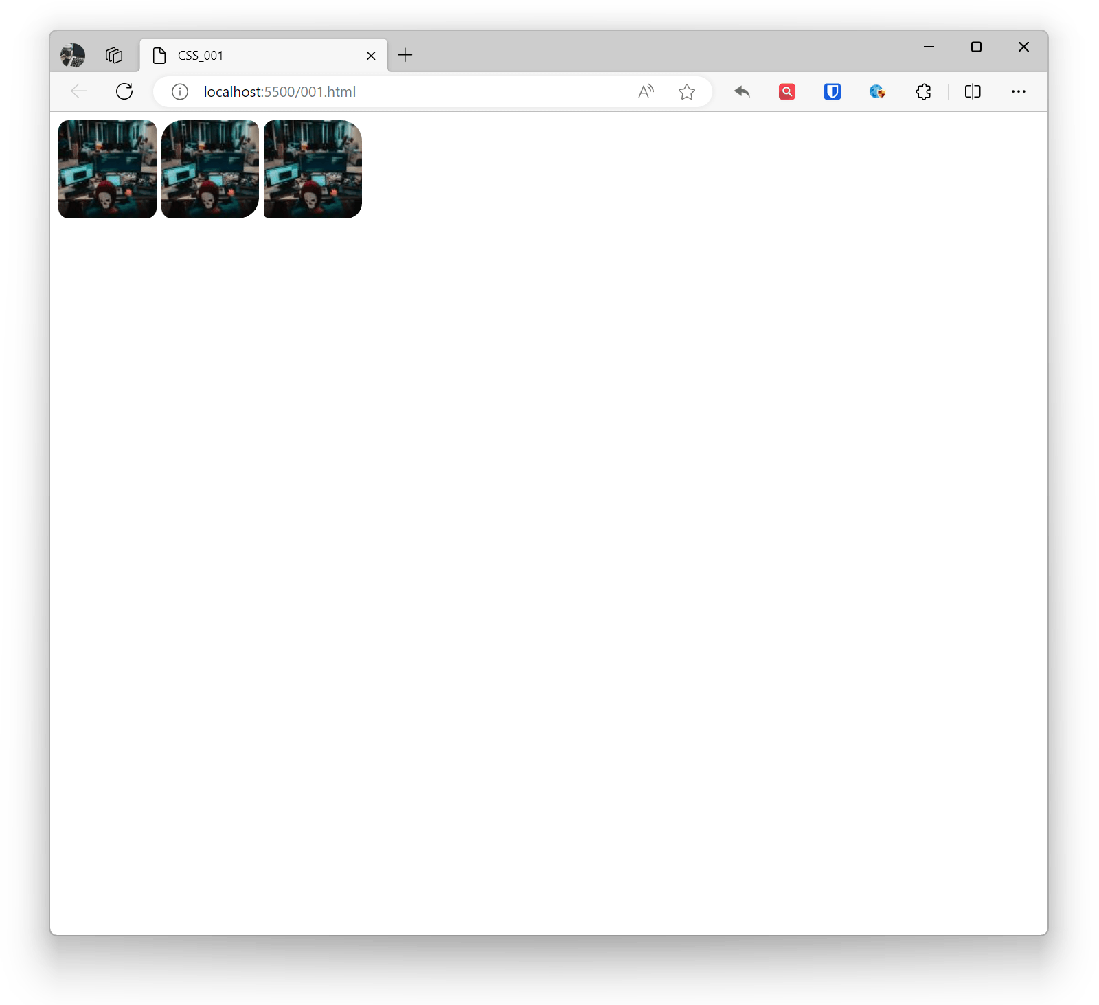
Image Shadow
In CSS, you can use the box-shadow property to add shadow effects to images. This property allows you to add projection effects, including shadow color, blur radius, offset, etc.
Example:
<img style="box-shadow: 5px 5px 10px rgba(0, 0, 0, 0.5);" src="zhaojian1.jpg" alt="" ><br><br><!-- Horizontal offset 5px, vertical offset 5px, blur radius 10px, shadow color is semi-transparent black --><img style="box-shadow: 5px 5px 10px rgba(0, 0, 0, 0.5), -5px -5px 10px rgba(255, 255, 255, 0.7) inset;" src="zhaojian1.jpg" alt="" ><!-- Outer and inner shadow effects, use inset keyword to specify inner shadow -->Effect:
Background
In CSS, background is one of the commonly used styles in web design, used to set the background style of elements.
Background Color
Set element background color through the background-color property.
Example:
.example1 { background-color: #f0f0f0; width: 500px; height: 500px; } <div class="example1"></div>Effect:
Background Image
Set element background image through the background-image property. You can use relative path, absolute path, or URL for images.
Example:
.example1 { background-image: url('zhaojian.jpg'); width: 500px; height: 500px; } <div class="example1"></div>Effect:
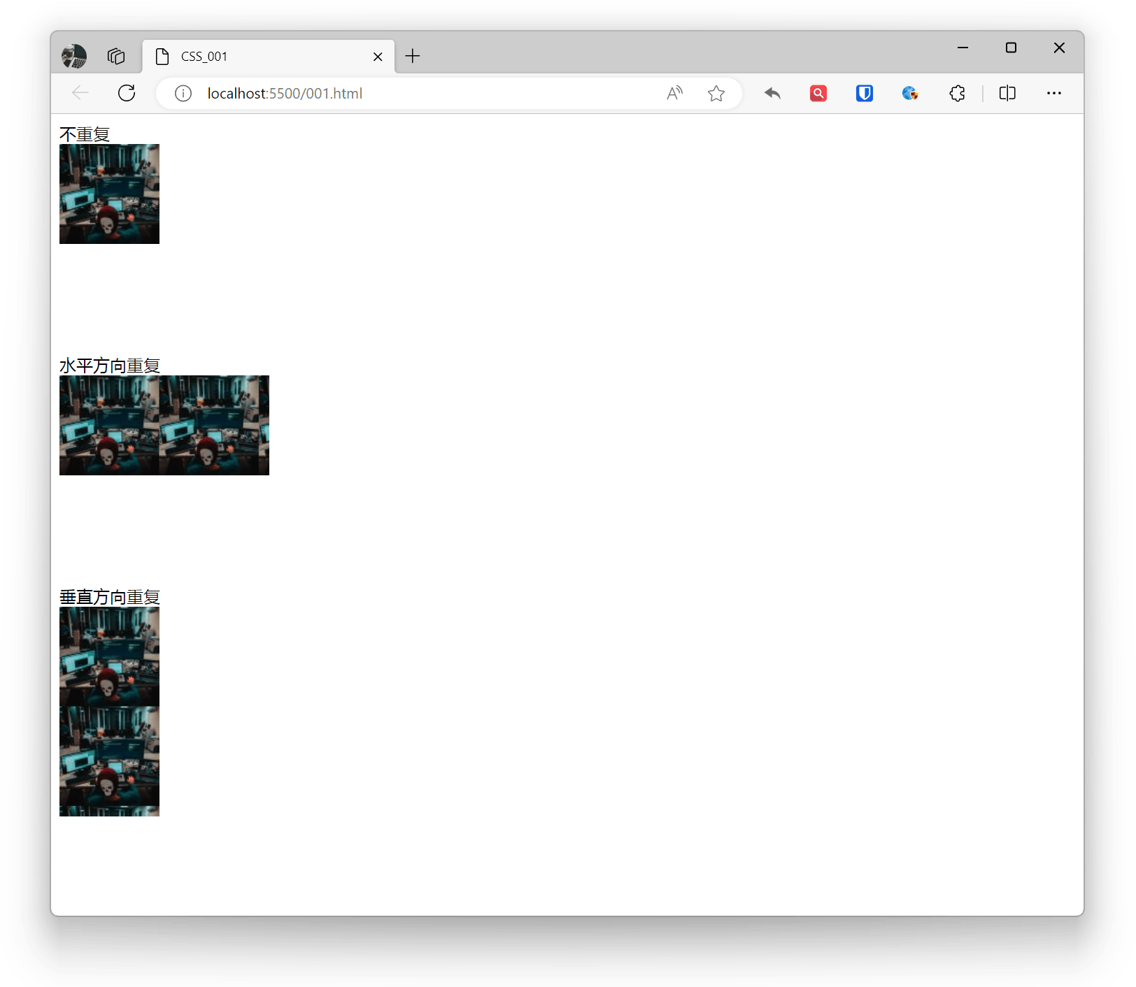
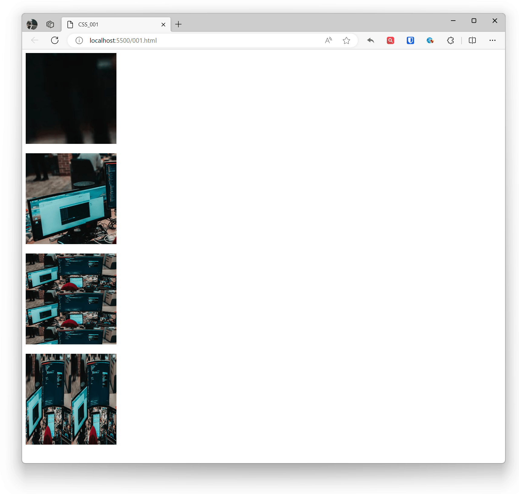
Background Repeat (Tiling)
Set background image repeat mode through the background-repeat property, which can be horizontal, vertical, both directions, or no repeat.
- repeat: Image repeats in both horizontal and vertical directions (default)
- repeat-x: Image repeats in horizontal direction
- repeat-y: Image repeats in vertical direction
- no-repeat: Image only tiles once
Example:
.base { background-image: url('zhaojian1.jpg'); width: 200px; height: 200px; } .example1 { background-repeat: no-repeat; } .example2 { background-repeat: repeat-x; } .example3 { background-repeat: repeat-y; } No repeat <div class="base example1"></div> Horizontal repeat <div class="base example2"></div> Vertical repeat <div class="base example3"></div>Effect:
Background Size
Set background image size through the background-size property, which can be specific pixel values, percentages, or keywords like cover or contain.
- Default: Complete display of original background image.
- auto: Scale as background with image ratio, image will repeat and tile
- cover: Image extends to cover entire area, maintaining ratio. Image may not display completely, with partial overflow.
- contain: Image scales as much as possible while maintaining aspect ratio, making height or width fit the entire background area. Scaling may cause partial blank areas in background, and the container’s blank area will show the background color set by background-color.
Example:
.base { width: 200px; height: 200px; } .example1 { background-image: url('zhaojian.jpg'); background-size: auto; } .example2 { background-image: url('zhaojian2.jpg'); background-size: cover; } .example3 { background-image: url('zhaojian2.jpg'); background-size: contain; } .example4 { background-image: url('zhaojian2.jpg'); background-size: 50% 100%; } <div class="base example1"></div> <br> <div class="base example2"></div> <br> <div class="base example3"></div> <br> <div class="base example4"></div>Effect:
Background Position
Set background image starting position through the background-position property, which can use pixel values, percentages, or keywords.
- Any length unit can be used. If the second position (Y-axis direction) is not declared, default is 50% (if both positions are not set, default is 0% 0%)
- Position keywords (left/right/top/bottom/center), can be used singly or in pairs (if second keyword is not declared, default is center)
- Mixed use
Example:
.base { background-image: url('zhaojian1.jpg'); background-repeat: no-repeat; background-color: #d6d7d8; width: 200px; height: 200px; } .example1 { background-position: center top; } .example2 { background-position: 50% 50%; } .example3 { background-position: 50% bottom; } <div class="base example1"></div> <br> <div class="base example2"></div> <br> <div class="base example3"></div>Effect:
Background Attachment (Fixed)
Set whether background image is fixed or scrolls with content through the background-attachment property.
- scroll: Background image moves with page scroll (default)
- fixed: Background image does not move with page scroll
- local: Background image scrolls with element content scrolling.
Example:
.example1 { background-attachment: scroll;}.example2 { background-attachment: fixed;}.example3 { background-attachment: local;}Effect:
Background Shorthand
The background property can be written in shorthand, which is much more concise than declaring individual sub-properties and requires less code. Since there are many background sub-properties, how to arrange the sub-property shorthand order is also a challenge. CSS2 recommends a sub-property shorthand order rule:
Example:
.example1{ background: color image repeat attachment position/size;}
.example2{ background: #ffffff url('img_tree.png') no-repeat right top;}