IT Course HTML Basics 013_Forms and User Input
Forms
HTML Forms are a very important part of HTML, allowing users to input information on web pages and submit it to the server.
Example:
<form action="/submit" method="post"> <!-- Form elements go here --></form>The <form> element defines the area where users input data, and can contain different types of input elements such as text areas <textarea>, dropdown lists <select>, radio buttons <radio>, checkboxes <checkbox>, and buttons <button>.
Form Attributes:
action: Defines the URL of the file that processes form data after submission to the server.method: Defines the HTTP method used to send data to the server. Common values are “get” and “post”.name: Used to specify the form name. The form name identifies the form and is used when processing form data on the server side.enctype: Used to specify the encoding method for form data. Form data can useapplication/x-www-form-urlencodedormultipart/form-dataencoding.autocomplete: Used to specify whether to enable form autocomplete. If set toon, the browser will automatically fill in previously entered data in the form.novalidate: Used to specify whether to validate form data. If set toon, form data will not be validated before submission.
[!Summary]
- The form itself is not visible.
Text Fields
In forms, we often need users to input text content such as letters and numbers. This can be done with the <input> element with its type attribute set to “text”.
Example:
<form>Name: <input type="text" name="name"><br>Age: <input type="text" name="age"></form>Effect:
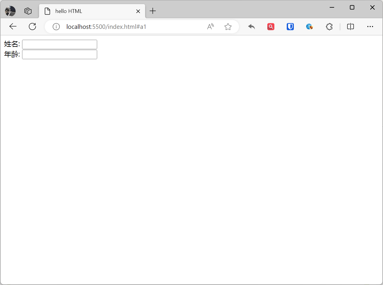
[!Summary]
- In most browsers, the default width of a text field is 20 characters.
Password Fields
If you need users to input a password, set the type attribute of the <input> element to “password”, and the input content will be hidden.
Example:
<form>Password: <input type="password" name="pwd"></form>Effect:
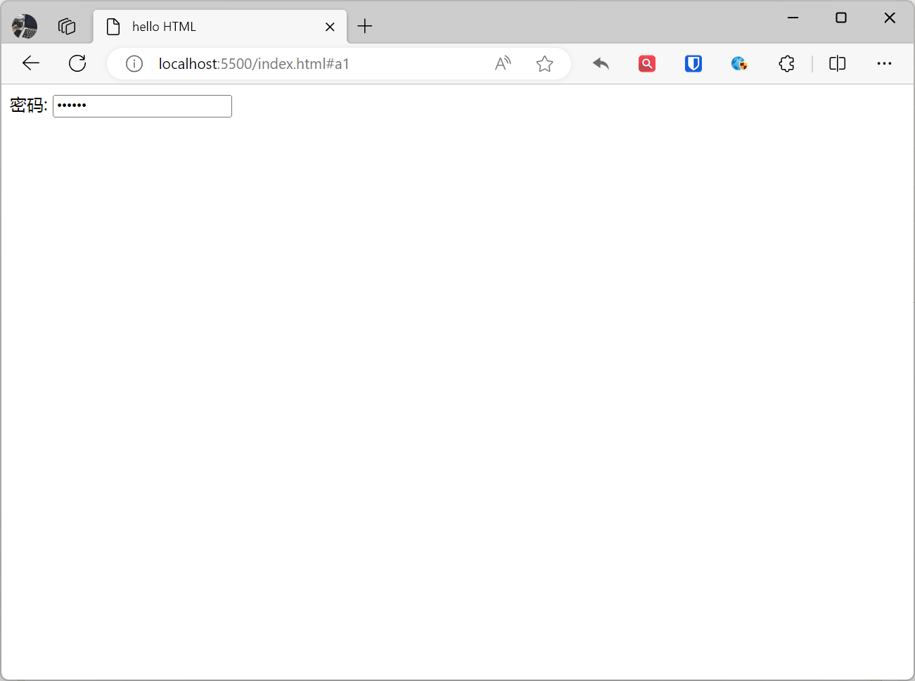
[!Summary]
- Password field characters are not displayed in plain text but replaced with asterisks * or dots .
Radio Buttons
Radio buttons and checkboxes allow users to select one or more options from multiple choices. The type attribute value for radio buttons is “radio”.
Example:
<form action="">Gender:<input type="radio" name="sex" value="male" checked>Male<input type="radio" name="sex" value="female">Female</form>Effect:

[!Summary]
- Radio button
nameattribute values must be the same, otherwise they won’t belong to the same group.- The
checkedattribute is used to specify whether a radio button is selected by default.
Checkboxes
Checkboxes allow selecting one or more options, defined using <input type="checkbox">
Example:
<form> Apps you have used: <input type="checkbox" name="app" value="jd">JD <input type="checkbox" name="app" value="wechat">WeChat <input type="checkbox" name="app" value="qq">QQ <input type="checkbox" name="app" value="douyin">TikTok</form>Effect:
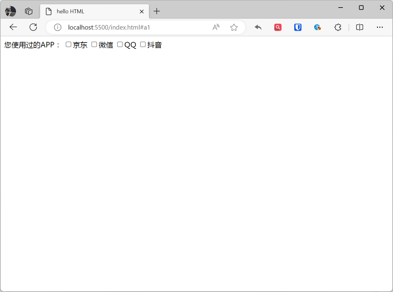
[!Summary]
- The
checkedattribute is used to specify whether a checkbox is selected by default.
Dropdown Lists (select)
Dropdown lists allow users to select one option from multiple choices. They are created with the <select> element and use <option> elements to define options.
Example:
<form action=""> Please select your country: <select name="country"> <option value="china">China</option> <option value="us">USA</option> <option value="japan">Japan</option> </select></form>Effect:
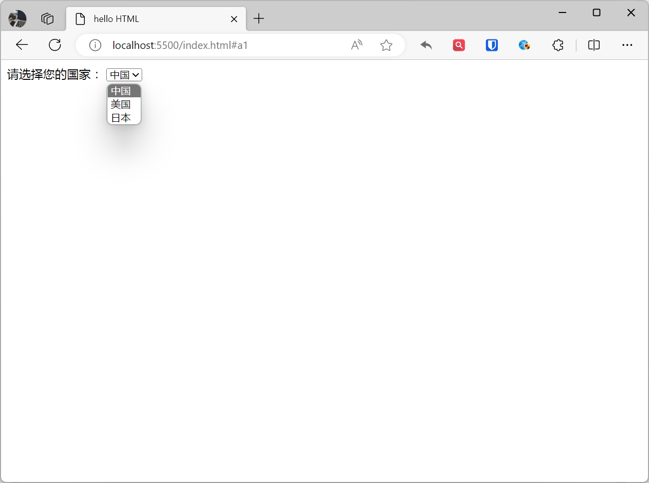
[!Summary]
- The
selectedattribute is used to specify the default option in the dropdown list.- The
disabledattribute is used to specify whether the dropdown list is available.- You can use the
sizeattribute to specify the number of visible options in the dropdown list.
Submit Buttons (Submit, Reset, Button)
Forms usually need a button to submit or confirm user input. submit, reset, and button are all form button elements in HTML.
| Type | Attribute | Function | Use Cases |
|---|---|---|---|
| submit | type="submit" | Submit form data | Submit login form, submit registration form, etc. |
| reset | type="reset" | Reset form data | Reset search form, reset shopping cart, etc. |
| button | type="button" | None | Usually used with JavaScript for executing operations, navigating pages, etc. |
| image | type="image" | Use image to represent button | Execute operations, navigate pages, etc. |
Example:
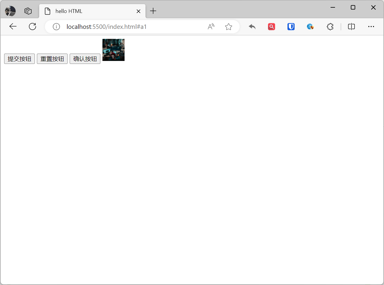
<form action="/submit" method="post"> <input type="submit" value="Submit Button"> <input type="reset" value="Reset Button"> <button type="button" value="Confirm Button">Confirm Button</button> <input type="image" src="[zhaojian-avatar.png (1332×1332)](https://www.zhaojian.net/images/zhaojian-avatar.png)" alt="Image Button" width="50" height="50"></form>Effect:
[!Summary]
- post: Refers to the HTTP POST method, form data is included in the form body and then sent to the server, used for submitting sensitive data such as usernames and passwords.
- get: Default value, refers to the HTTP GET method, form data is appended to the URL in the action attribute with ? as the separator, generally used for non-sensitive information like pagination. Example: https://www.zhaojian.net/?page=1, where page=1 is the data submitted via the get method.
Form Elements and Attributes
| Element | Type | Description | Attributes |
|---|---|---|---|
form | Form | Container element for forms. It specifies the form name, submission method, and submission address. | name, action, method, enctype, accept-charset, target, autocomplete, novalidate |
input | Input | The most commonly used element in forms. It can receive various types of user input such as text, numbers, dates, etc. | type, name, value, placeholder, disabled, readonly, autocomplete, required, pattern, min, max, step |
textarea | Input | Used to receive multi-line user input. | name, cols, rows |
select | Selection | Used to receive user selections, it can contain multiple options. | name, multiple, size |
option | Selection | Used within select elements to define selectable options. | value, selected |
radio | Selection | Used to receive single-choice user input. It can contain multiple radio buttons. | name, value, checked |
checkbox | Selection | Used to receive multi-choice user input. It can contain multiple checkboxes. | name, value, checked |
submit | Button | Used to submit forms. | value |
reset | Button | Used to reset forms. | value |
button | Button | Used to create buttons. It can be used to submit forms, reset forms, or perform other operations. | type, name, value |
label | Label | Used to provide labels for input elements. Labels help users understand the purpose of input elements. | for |
fieldset | Grouping | Used to group form elements. | name, legend |
legend | Title | Used to provide a title for fieldset elements. | |
optgroup | Grouping | Used to group options. | label |