IT Course CSS Basics 033_Responsive Layout
Responsive Layout
Responsive layout is a web design approach that can adapt to different screen sizes and devices. By using responsive layout, you can ensure that web pages maintain a good display effect on different devices, whether on desktop computers, tablets, or mobile phones.
Media Queries
Using CSS media queries, you can apply different styles based on device characteristics (such as screen width, height, device type, etc.). This allows you to define different layouts for different screen sizes.
Example:
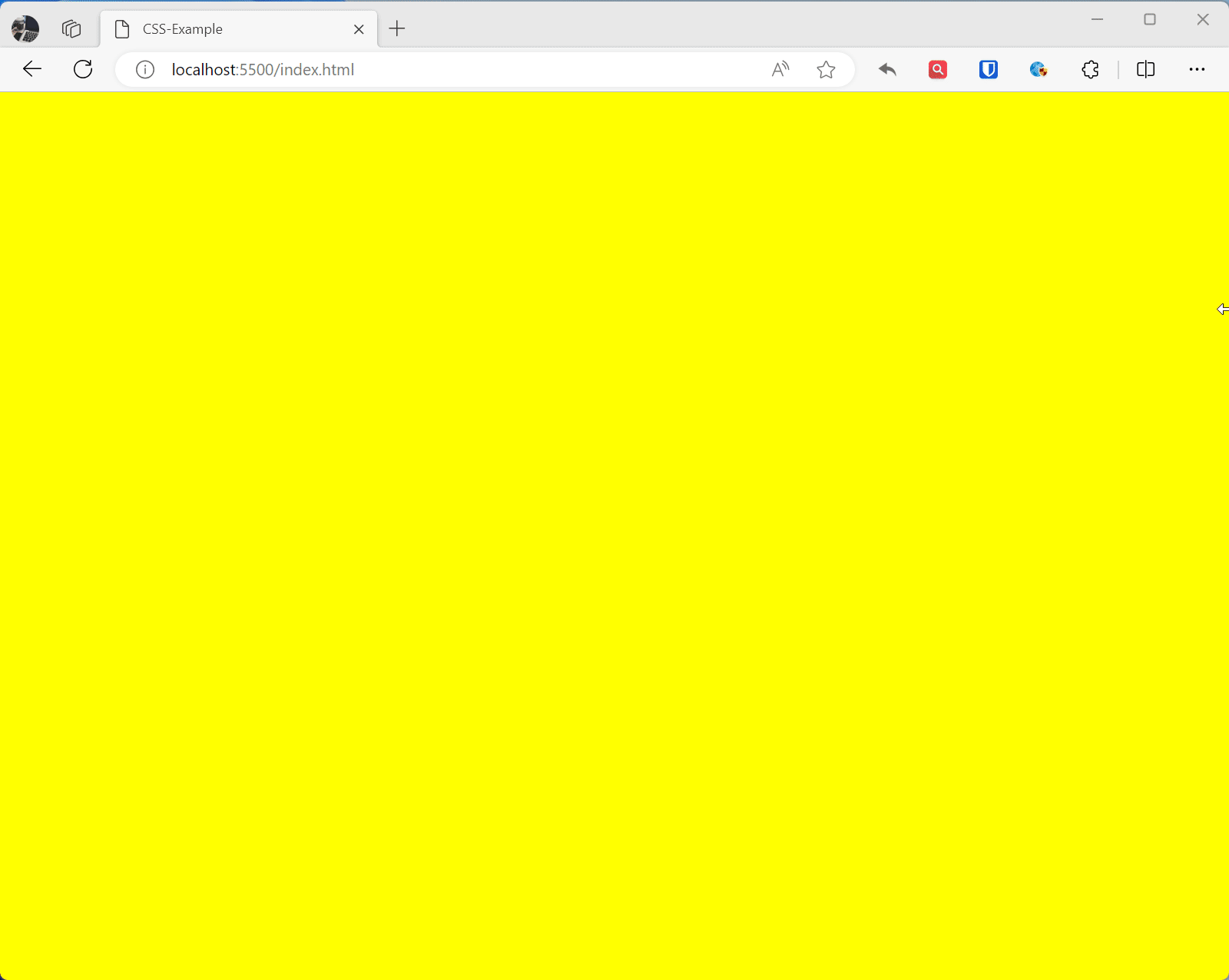
/* PC */@media (min-width: 992px) { * { background: yellow }}/* Tablet */@media (min-width: 768px) and (max-width: 992px) { * { background: red }}/* Regular phone */@media (min-width: 576px) and (max-width: 768px) { * { background: green }}/* Small screen devices */@media (max-width: 576px) { * { background: blue }}Effect:
Responsive Images
Use max-width: 100%; to ensure images and media elements don’t exceed their container on small screens.
Example:
img { max-width: 100%; /* Image max width is 100% of its containing element */ height: auto; /* Maintain aspect ratio to prevent image distortion */ }
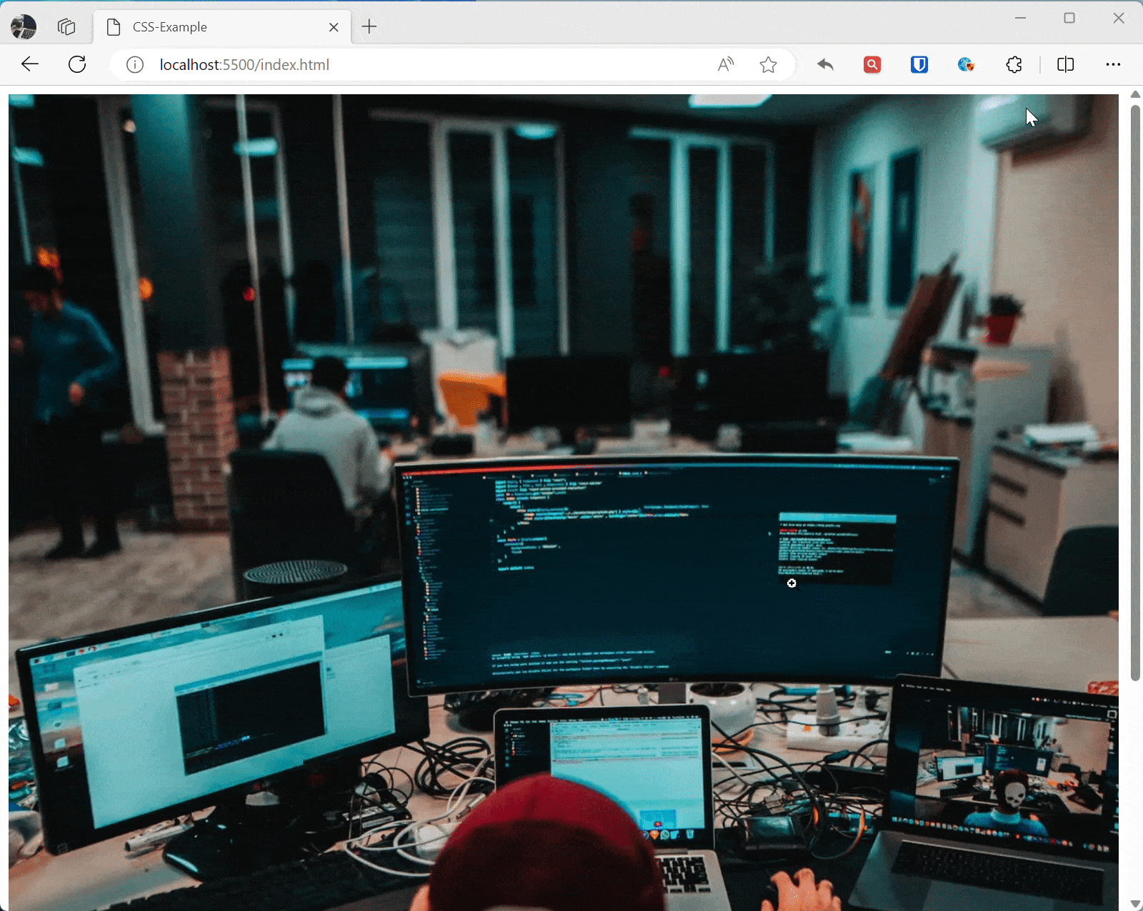
/* Adjust image size on small screens */ @media screen and (max-width: 600px) { img { max-width: 50%; /* Image max width is 50% of its containing element */ } } <img src="zhaojian.jpg" alt="Responsive Image">Effect:
Viewport Settings
Use the <meta> tag to set the viewport to ensure the page scales correctly on mobile devices.
Example:
<meta name="viewport" content="width=device-width, initial-scale=1.0">This meta tag tells mobile browsers that they should set the viewport width to the device width, and scale the document to 100% of its intended size, displaying the document at the mobile-optimized size you want.
Along with the viewport meta tag, you can use several other settings, but generally speaking, the line above is what you want to use.
initial-scale: Sets the initial zoom of the page, we set it to 1.height: Specifically sets a height for the viewport.minimum-scale: Sets the minimum zoom level.maximum-scale: Sets the maximum zoom level.user-scalable: If set to no, prevents zooming.
Avoid using minimum-scale, maximum-scale, especially setting user-scalable to no. This ensures users can zoom in and out on their own.