IT Course CSS Basics 032_Flexbox Layout
Flexbox Layout
For a long time, the only reliable cross-browser compatible tools for creating CSS layouts were float and position. These two tools work well in most cases, but in certain aspects they have limitations that make it difficult to complete tasks.
The following simple layout requirements are difficult or impossible to achieve conveniently and flexibly with these tools (float and position):
- Vertically centering a block of content inside its parent.
- Making all children of a container take up an equal amount of available width/height, regardless of how much width/height is available.
- Making all columns in a multi-column layout adopt the same height, even if they contain different amounts of content.
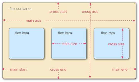
CSS Flexbox is a powerful layout tool in CSS that can be used to create various flexible layouts. To master CSS Flexbox, you need to understand the following concepts:
- Flex container: Flexbox layout consists of flex containers and flex items. A flex container is a container that places flex items into the flex layout. A flex container can be any element, but usually a
divelement is used. - Flex item: A flex item is an element placed in a flex container. A flex item can be any element, but usually a
divelement is used. - Main axis: The main axis is the horizontal or vertical direction of elements in the flex layout.
- Cross axis: The cross axis is the vertical or horizontal direction of elements in the flex layout.
Flex Container Properties
Flex containers have the following properties to control flex layout:
display: Sets the display mode of the flex container. The flex container must be set todisplay: flexordisplay: inline-flexto use flex layout.flex-direction: Sets the main axis direction of the flex layout. Values can beflex-startalign to main axis start,flex-endalign to main axis end,rowhorizontal arrangement on main axis,row-reversereverse horizontal arrangement on main axis,columnvertical arrangement on main axis,column-reversereverse vertical arrangement on main axis.flex-wrap: Controls whether items in the flex container wrap.nowrapdefault value, no wrapping,wrapwrapping,wrap-reversereverse wrapping.flex-flow: Shorthand forflex-directionandflex-wrap, two values corresponding toflex-directionandflex-wraprespectively.justify-content: Sets the alignment of flex items on the main axis in the flex container. Values can beflex-startalign to main axis start,flex-endalign to main axis end,centercenter alignment on main axis,space-betweenevenly distributed on main axis (container edges aligned),space-aroundevenly distributed on main axis (equal spacing between items), orspace-evenlyevenly distributed on main axis (including equal spacing on both ends).align-items: Sets the alignment of flex items on the cross axis in the flex container. Values can beflex-startalign to cross axis start,flex-endalign to cross axis end,centercenter alignment on cross axis,stretchdefault value, orbaselinealign to first line text baseline on cross axis. Only affects child items of the flex container.align-content: Likealign-items, it’s a property for controlling the alignment of child items on the cross axis, only effective when the flex container has multiple axis lines (in multi-row or multi-column situations).
Flex Item Properties
Flex items have the following properties to control the layout of flex items in the flex layout:
flex-grow: Sets the flex item’s expansion ratio on the main axis. Values can be floating point numbers between 0 and 1.flex-shrink: Sets the flex item’s shrink ratio on the main axis. Values can be floating point numbers between 0 and 1.flex-basis: Sets the flex item’s default width or height on the main axis. Values can be length values, percentage values, orauto.order: Sets the flex item’s order on the main axis. Values can be integers between 1 and 65535.
Example:
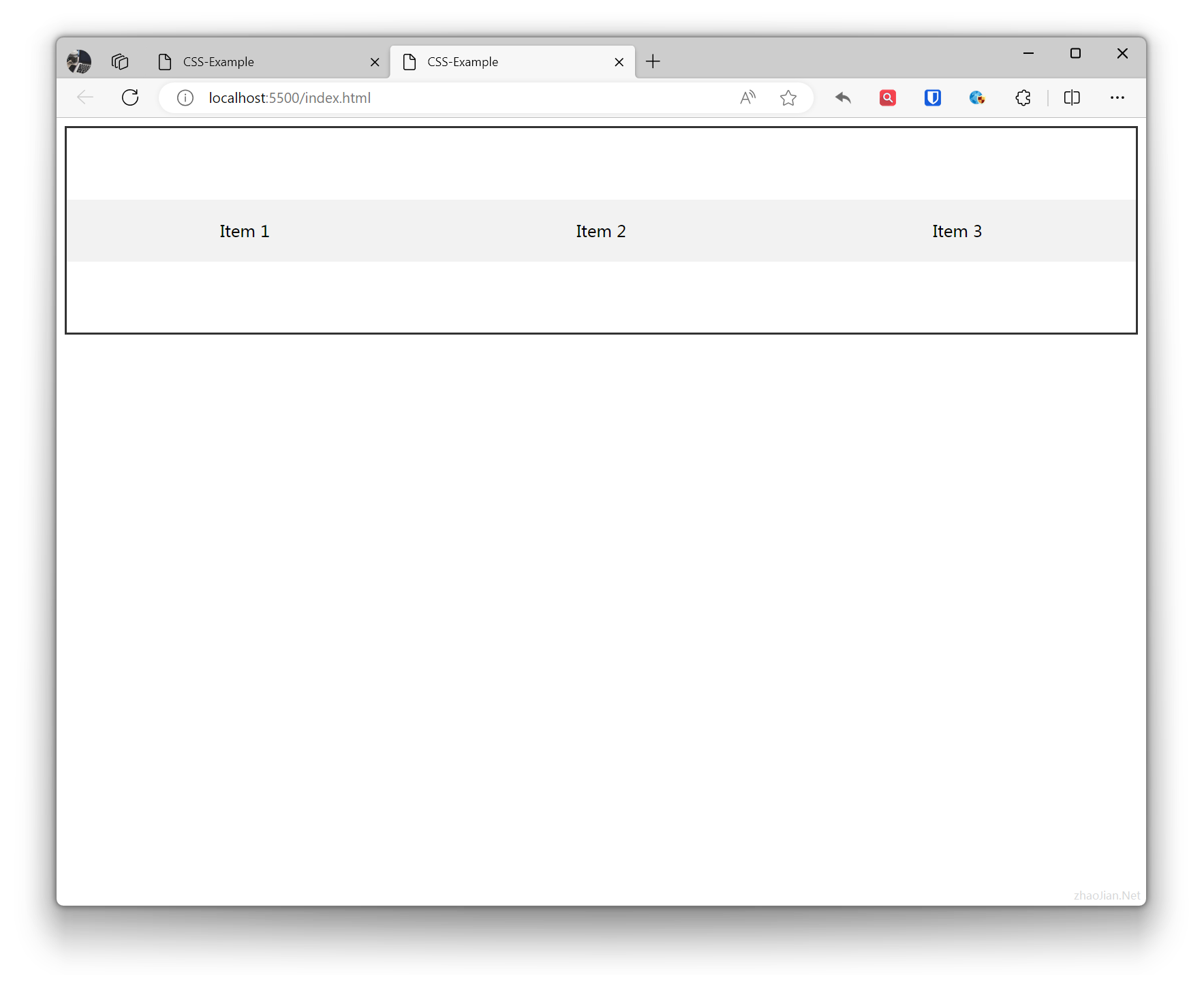
/* Flex container styles */.flex-container { display: flex; flex-direction: row; /* Main axis direction is horizontal */ justify-content: space-around; /* Alignment on main axis */ align-items: center; /* Alignment on cross axis */ height: 200px; /* Set container height */ border: 2px solid #333; /* Add border for better visualization */}/* Flex item styles */.flex-item { flex: 1; /* Equal distribution of main axis space */ text-align: center; padding: 20px; background-color: #f2f2f2;}<!-- Flex container --><div class="flex-container"> <!-- Flex item 1 --> <div class="flex-item">Item 1</div> <!-- Flex item 2 --> <div class="flex-item">Item 2</div> <!-- Flex item 3 --> <div class="flex-item">Item 3</div></div>Effect: