IT Course CSS Basics 030_Multi-column Layout Columns
Multi-column Layout Columns
Columns is a property used to create multiple columns in text layout. By setting the number of columns and column width of a container, text content automatically flows between multiple columns. Columns is not suitable for all types of content, mainly used for multi-column layout of text content, not for the layout of the entire page.
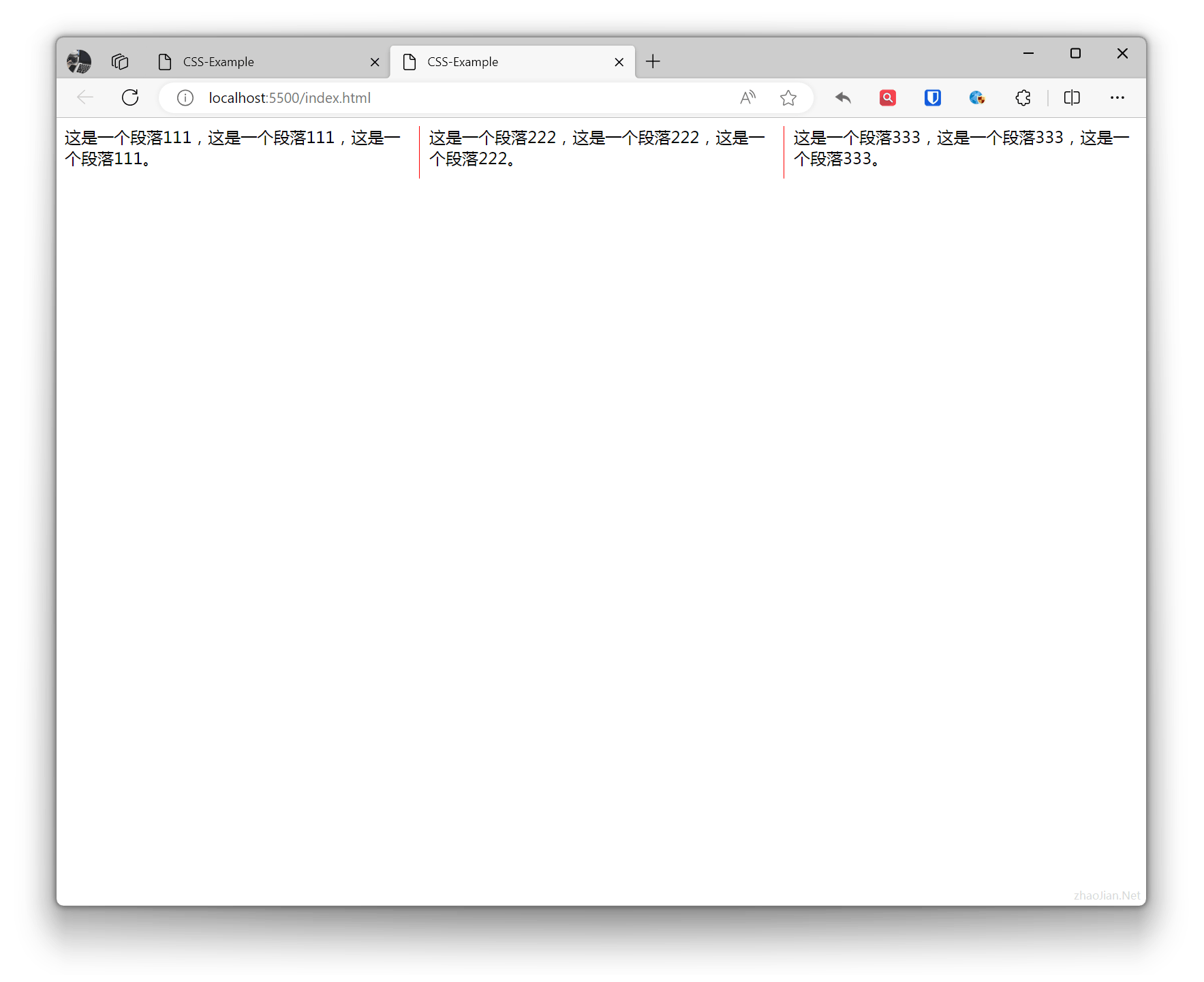
column-count: Specifies the number of columns.column-width: Specifies the width of each column.column-gap: Specifies the gap between columns.column-rule: Sets the rule line (separator) between columns.
Example:
.example{ column-count: 3; /* column-width: 200px; */ column-gap: 20px; column-rule: 1px solid red;}p { margin: 0 0 10px;} <div class="example"> <p>This is paragraph 111, this is paragraph 111, this is paragraph 111.</p> <p>This is paragraph 222, this is paragraph 222, this is paragraph 222.</p> <p>This is paragraph 333, this is paragraph 333, this is paragraph 333.</p> </div>Effect: