IT Course CSS Basics 027_Animation and Transitions
Animation
CSS animation is an effect that can be used to gradually change the property values of elements. Animations can be applied to any CSS property, including width, height, color, background, border, etc.
The syntax of the animation property is as follows:
- name: Specifies the name of the animation.
- duration: Specifies the duration of the animation.
- timing-function: Specifies the speed curve of the animation.
- delay: Specifies the delay of the animation.
- iteration-count: Specifies the number of times the animation plays.
- direction: Specifies the direction of the animation playback.
- fill-mode: Specifies the style of the element after the animation completes or when the animation is paused or stopped.
Example:
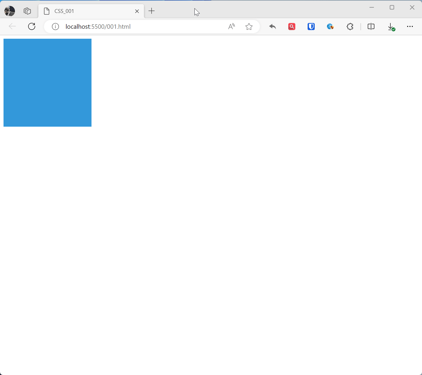
@keyframes animationName{ from { transform: rotate(0deg); } to { transform: rotate(360deg); } } .example1{ width: 100px; height: 100px; background-color: #3498db; animation: animationName 2s linear infinite; /* Apply animation, lasts 2 seconds, infinite loop, linear transition */ } <div class="example1"></div>Effect:
@keyframes rotatedefines a keyframe animation namedrotate, from the initial state (0 degree rotation) to the end state (360 degree rotation).- The
.animated-boxelement applies this animation, specifying the animation name, duration, loop method, etc. through theanimationproperty.
CSS animation and CSS transitions are both effects that can be used to gradually change the property values of elements. The main differences between them are:
- Animations can be played repeatedly, while transitions can only be played once.
- Animations can specify the direction of playback, while transitions cannot.
- Animations can specify the style of the element after the animation completes or when the animation is paused or stopped, while transitions cannot.
Transitions
CSS transitions are effects that can be used to gradually change the property values of elements. Transitions can be applied to any CSS property, including width, height, color, background, border, etc. The effect of transitions may vary depending on the browser and device, and the performance of transitions may vary depending on the complexity of the transition.
Example:
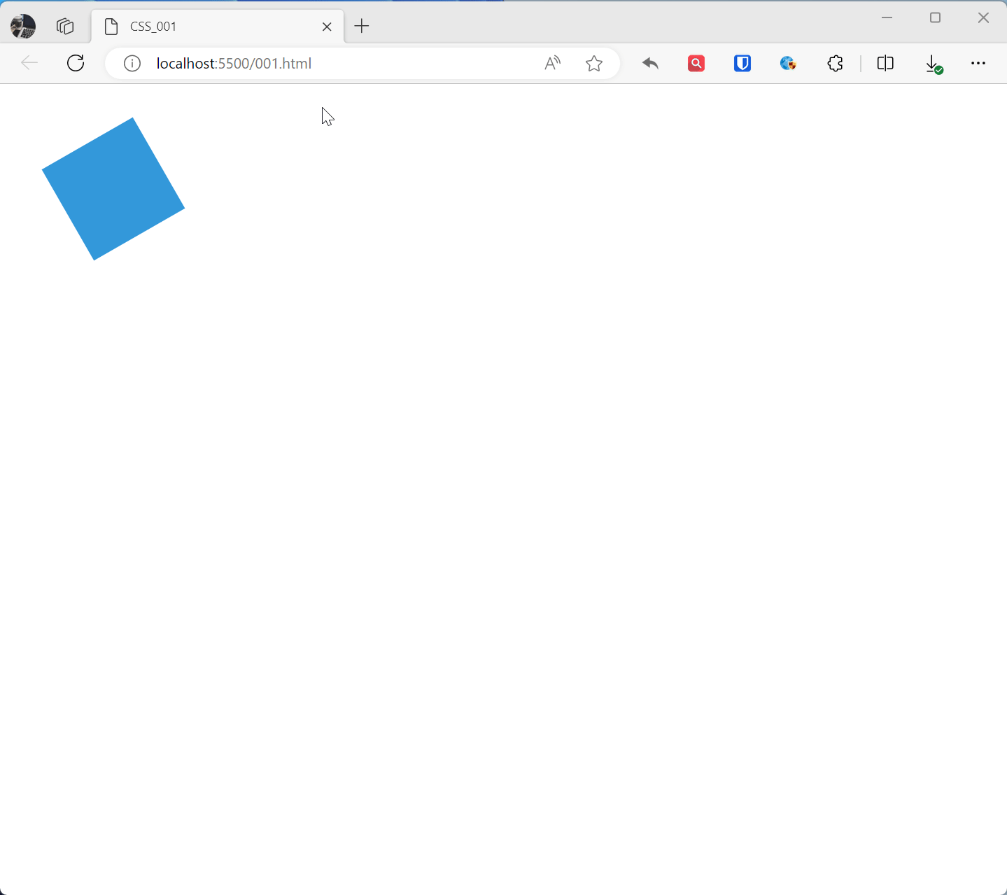
.example1{ width: 200px; height: 200px; background-color: #3498db; transition: background-color 0.5s ease; /* Define transition property and time */ } .example1:hover{ background-color: #e74c3c; } <div class="example1"></div>Effect: