IT Course CSS Basics 026_Display, Visibility, Effects
Display
In CSS, the display property determines how an element is displayed on the page.
display: none;
Hides the element, making it invisible on the page and not taking up space or affecting layout. The element will not be displayed on the page.Example:
.example{ display: none; } <div class="example">Test text</div>ABC123Effect:

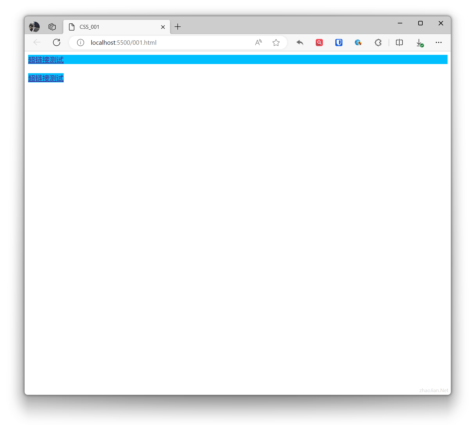
display: block;
Displays the element as a block-level element. It will be displayed as a block on the page, with width defaulting to 100% of the parent container.A block element is an element that takes up the full width, with line breaks before and after.Example:
.base{ background-color: deepskyblue; } .example{ display: block; } <a class="base example" href="">Hyperlink test</a> <br> <a class="base" href="">Hyperlink test</a>Effect:
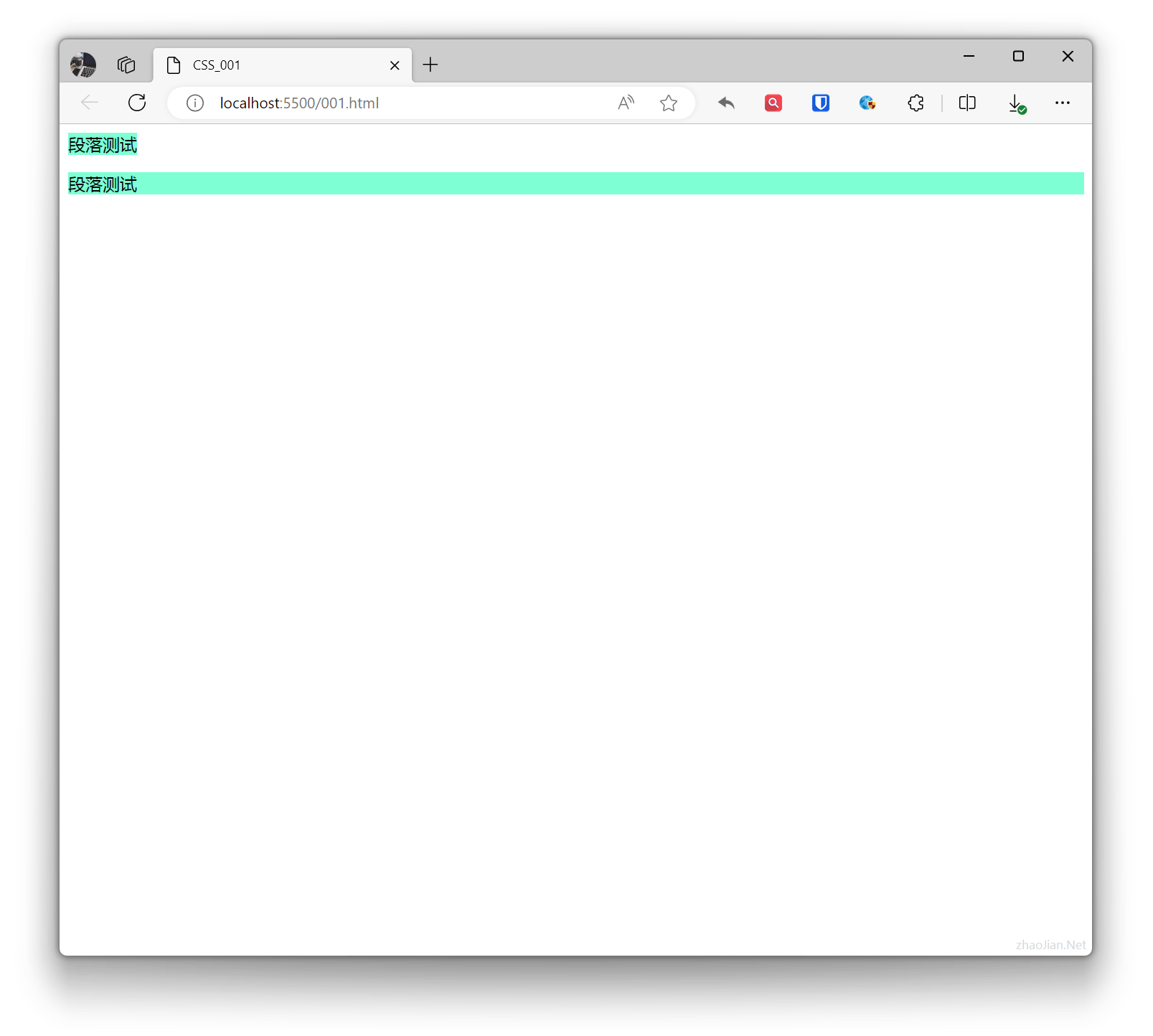
display: inline;
Displays the element as an inline element. Elements are displayed on the same line, do not occupy a line by themselves, and width is determined by content.Inline elements only require the necessary width and do not force line breaks.Example:
.base{ background-color: aquamarine; } .example{ display: inline; } <p class="base example">Paragraph test</p> <p class="base">Paragraph test</p>Effect:
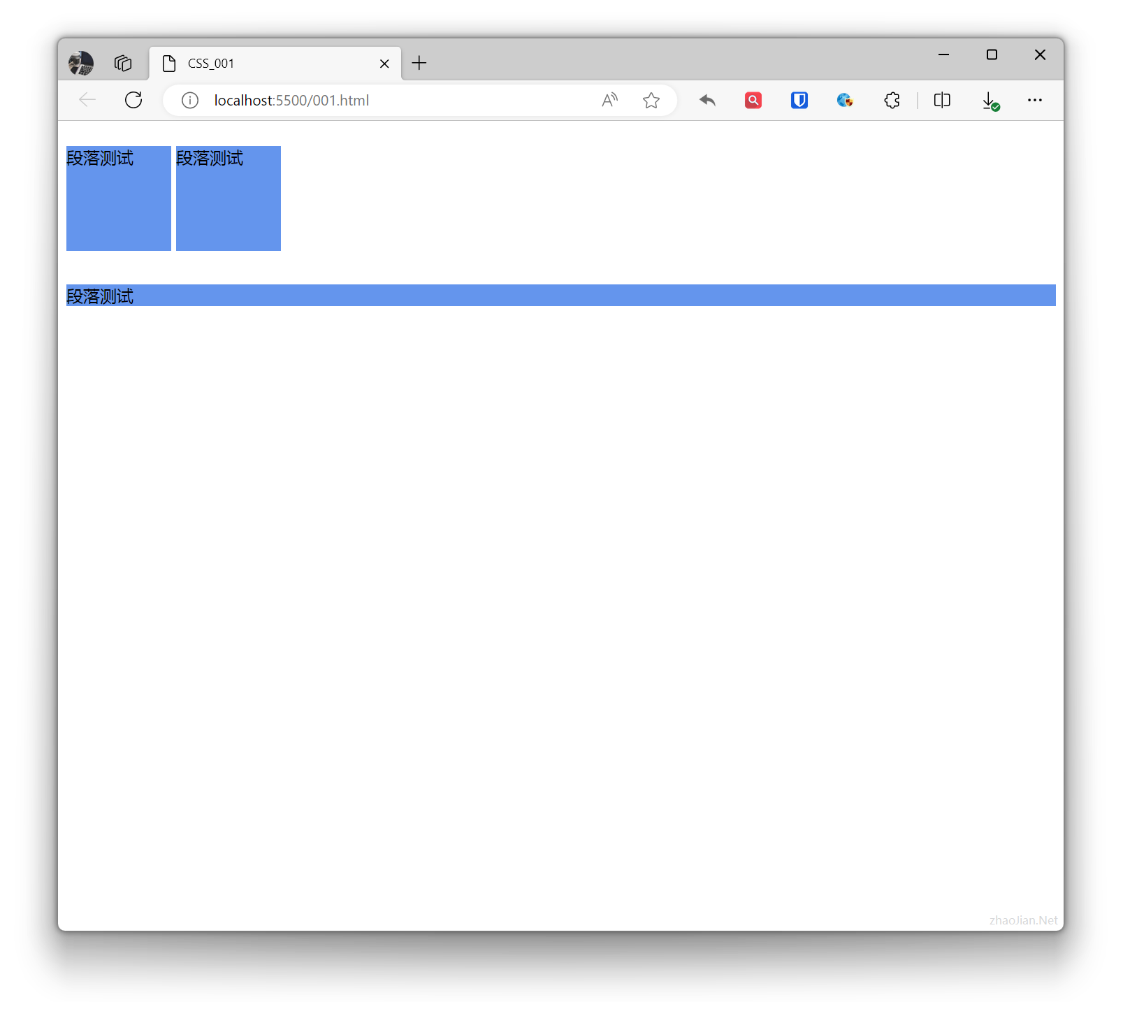
display: inline-block;
Displays the element as an inline-block element. Elements are displayed on the same line, but can have width, height, and other block-level element properties set.Example:
.example1{ display: inline-block; width: 100px; height: 100px; background-color: cornflowerblue; } .example2{ background-color: cornflowerblue; } <p class="example1">Paragraph test</p> <p class="example1">Paragraph test</p> <p class="example2">Paragraph test</p>Effect:
Visibility
In CSS, visibility can be controlled through the visibility property. This property has two main values: visible and hidden.
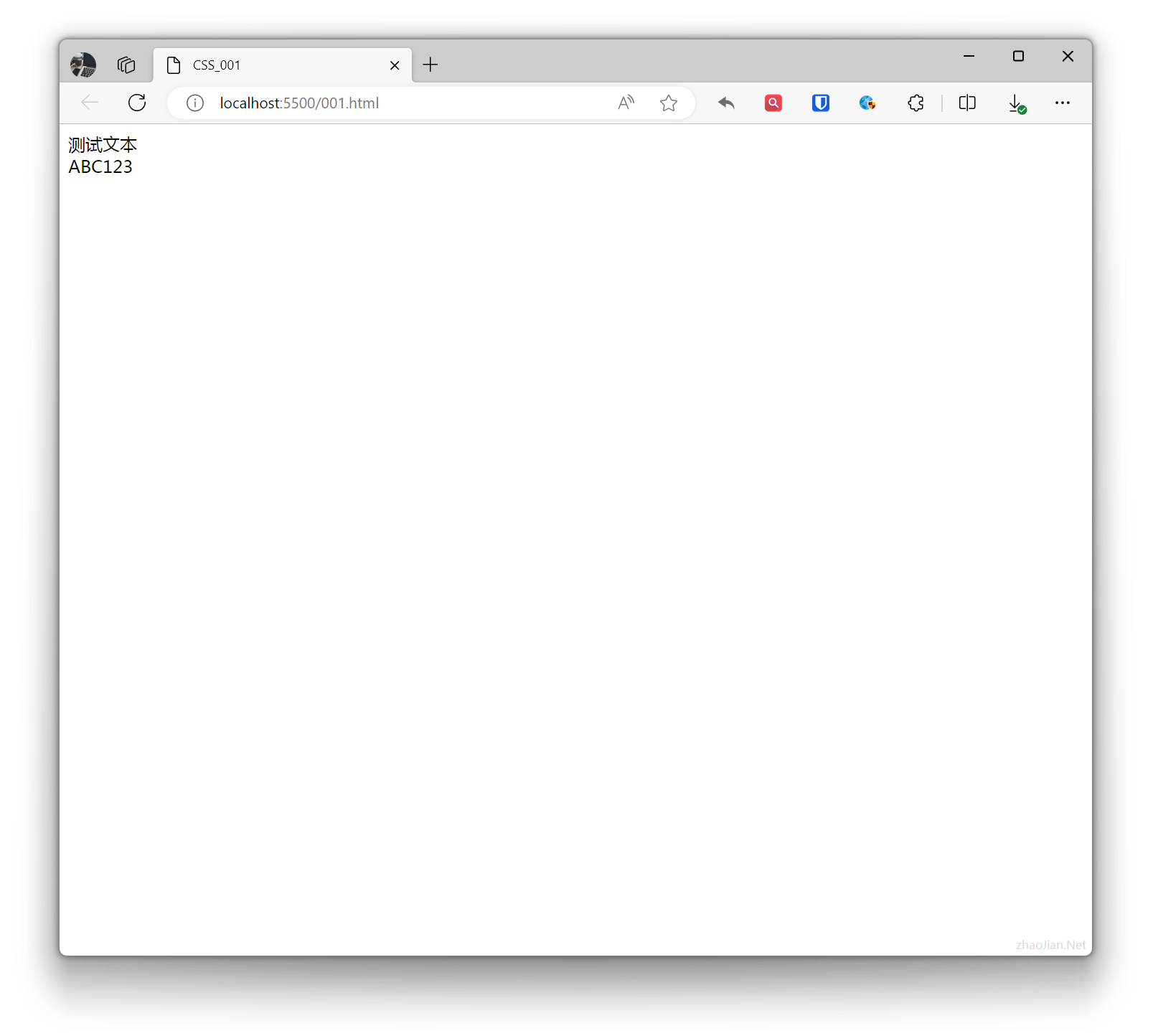
visibility: visible;
Sets the element to be visible.Example:
.example{ visibility: visible; } <div class="example">Test text</div>ABC123Effect:
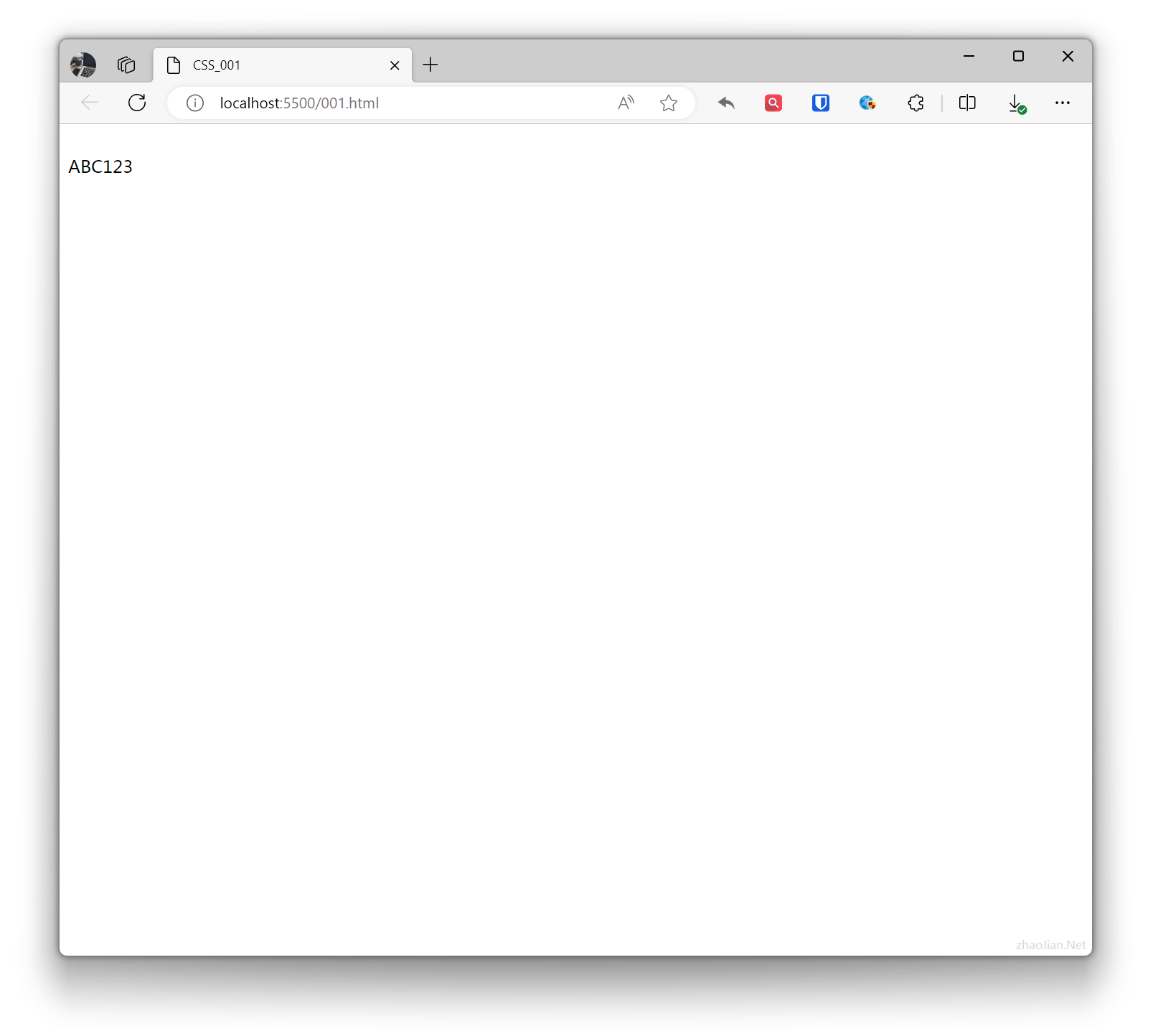
visibility: hidden;
Sets the element to be invisible, but the hidden element still takes up the same space as before it was hidden. In other words, although the element is hidden, it still affects the layout.Example:
.example{ visibility: hidden; } <div class="example">Test text</div>ABC123Effect:
Effects
CSS effects refer to effects that change the appearance or behavior of elements through CSS properties. CSS supports various effects, including: colors, backgrounds, borders, fonts, shadows, gradients, transitions, animations, etc.
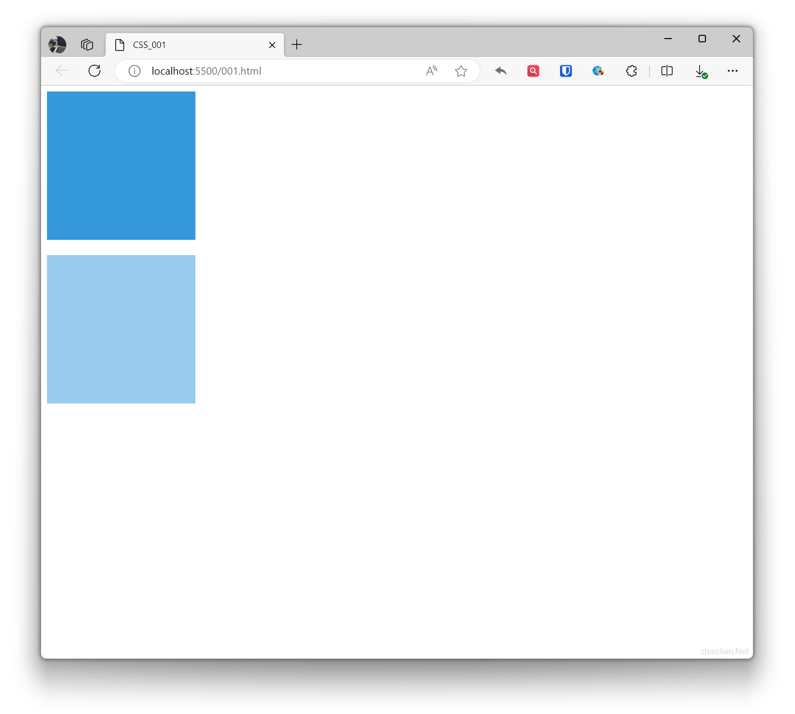
Transparency
In CSS, transparency refers to how much the background behind an element is covered. Transparency can be set using the opacity property. The value range of the opacity property is from 0.0 to 1.0, where 0.0 means completely transparent and 1.0 means completely opaque.
Example:
.base{ width: 200px; height: 200px; background-color: #3498db;}.example{ opacity: 0.5; /* 50% transparency */} <div class="base"></div> <br> <div class="base example"></div>Effect:
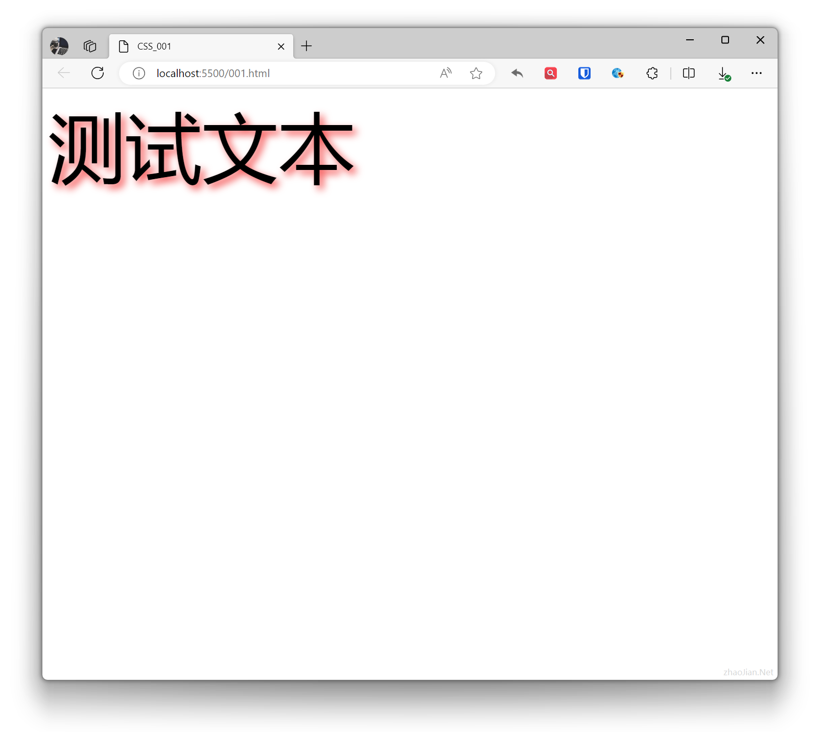
Text Shadow
In CSS, the text-shadow property is used to add shadows to text. Shadows can be blurry or clear, and can be any color.
Example:
.example{ text-shadow: 5px 5px 10px rgba(243, 40, 40, 0.8); /* 2px horizontal offset, 5px vertical offset, 5px blur radius, color rgba(243, 40, 40, 0.8) */ font-size: 100px; } <div class="example">Test text</div>Effect:
Gradients
In CSS, gradients are effects used to create smooth color transitions. Gradients can be applied to element backgrounds, borders, text, etc.
- Linear gradient: Transitions from one position to another.
Example:
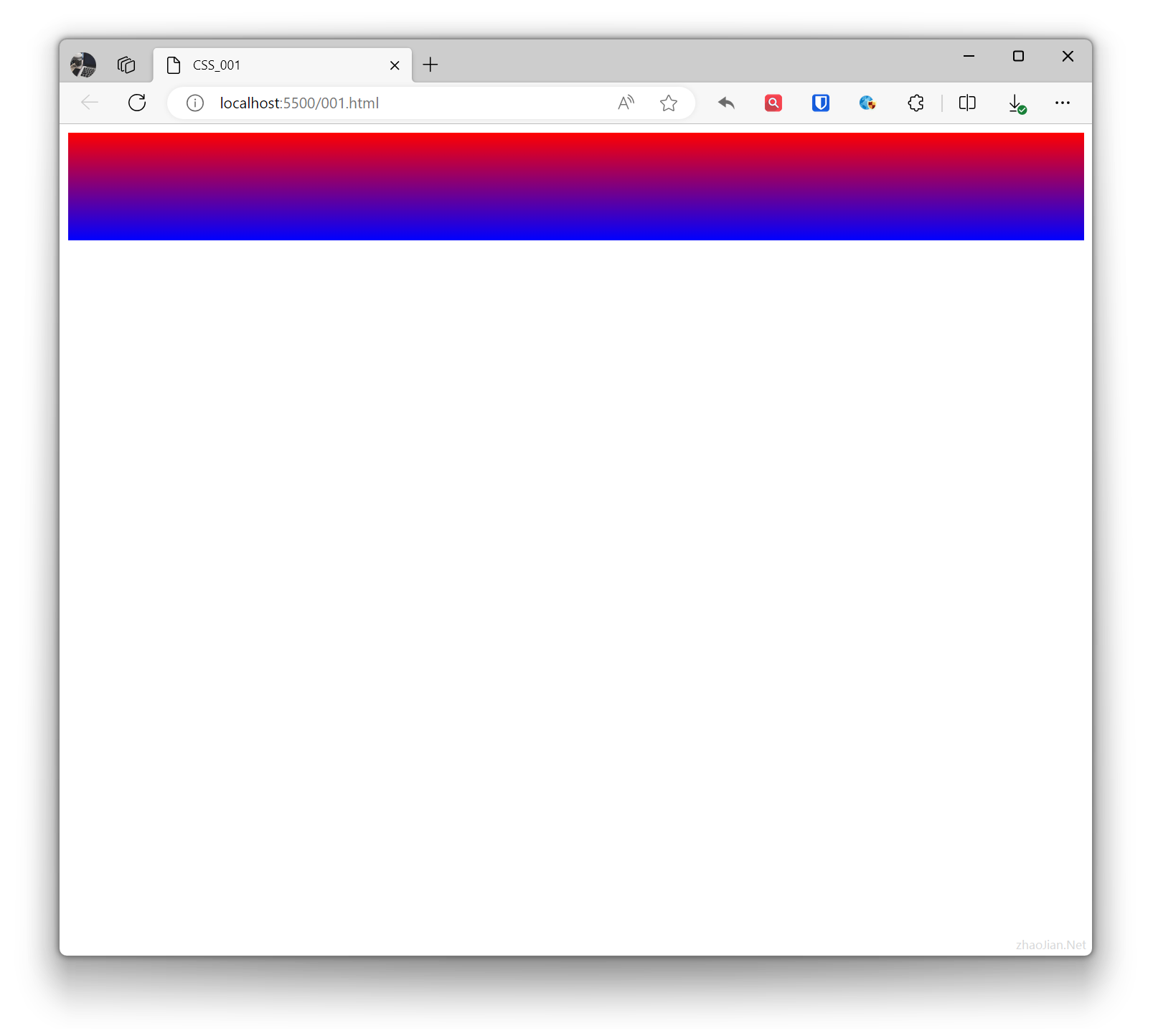
.example{ background: linear-gradient(to bottom, red, blue); /* Gradient from top to bottom, red to blue */ height: 100px; } <div class="example"></div>Effect:
- Radial gradient: Transitions from one point outward in all directions.
Example:
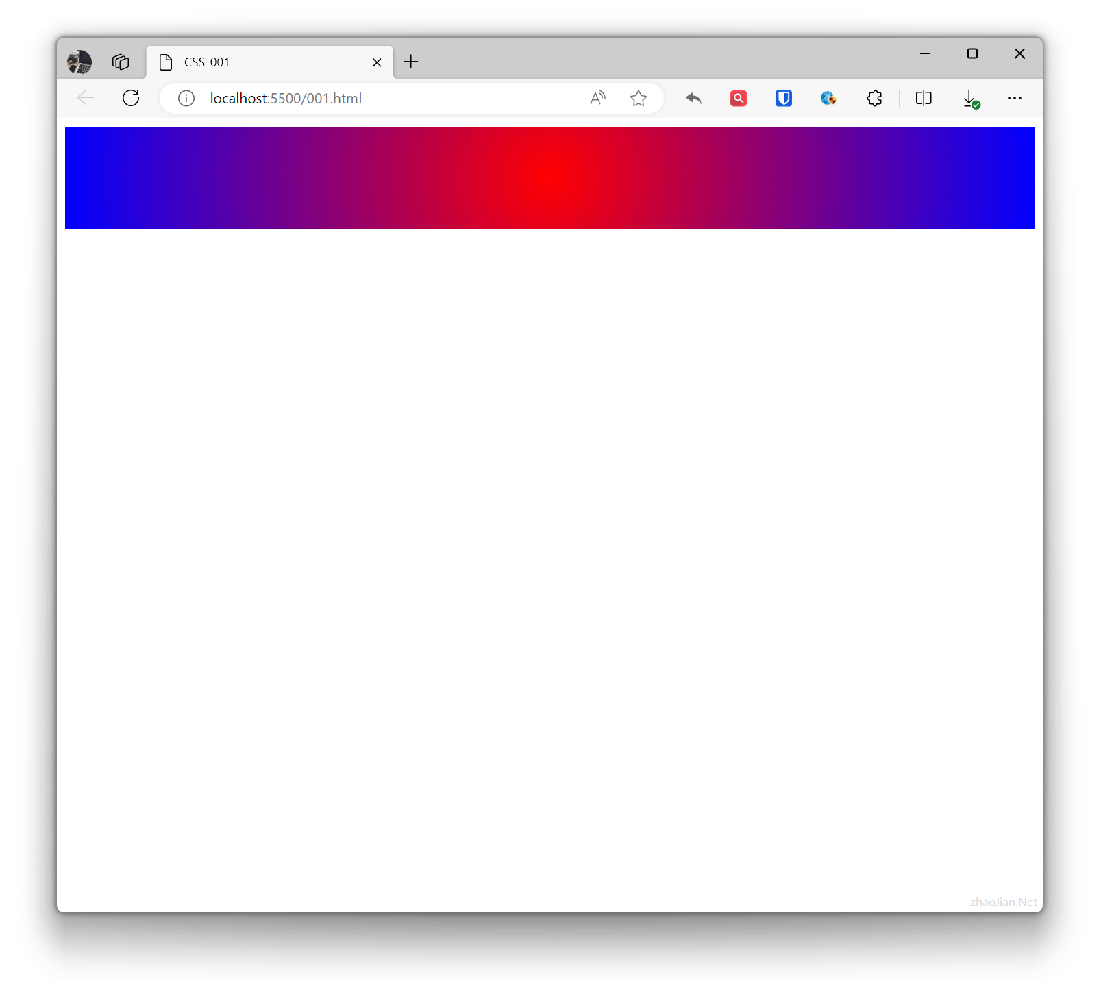
.example{ background: radial-gradient(circle, red, blue); /* Circular gradient, red to blue */ height: 100px; } <div class="example"></div>Effect:
Transform
In CSS, transform refers to effects that change the shape, position, or size of elements.
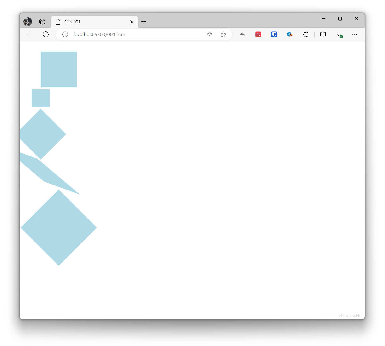
- Translate: Moves the element’s position on a plane.
- Scale: Changes the size of the element.
- Rotate: Rotates around the element’s center point.
- Skew: Tilts the element along horizontal or vertical axes.
- Combined transforms: Combines multiple transforms together.
Example:
.base { height: 100px; width: 100px; background-color: lightblue;}.example1 { transform: translate(50px, 20px); /* Move 50px horizontally, 20px vertically */}.example2 { transform: scale(0.5); /* Scale element to 1.5 times original */}.example3 { transform: rotate(45deg); /* Rotate 45 degrees clockwise */}.example4 { transform: skew(50deg, 20deg); /* Skew 30 degrees horizontally, 20 degrees vertically */}.example5 { transform: translate(50px, 60px) rotate(45deg) scale(1.5);} <div class="base example1"></div> <div class="base example2"></div> <div class="base example3"></div> <div class="base example4"></div> <div class="base example5"></div>Effect: