IT Course CSS Basics 022_Text, Fonts, Links
Text
CSS text control can help us better display text information on web pages and improve the visual effect of web pages.
Indentation
Used to set text first-line indentation, suitable for paragraph first-line indentation scenarios, avoid using on inline elements. The property can accept absolute or relative values. Absolute value units include pixels (px), inches (in), centimeters (cm), millimeters (mm), etc. Relative value units include em, rem, vw, vh, etc.
Example:
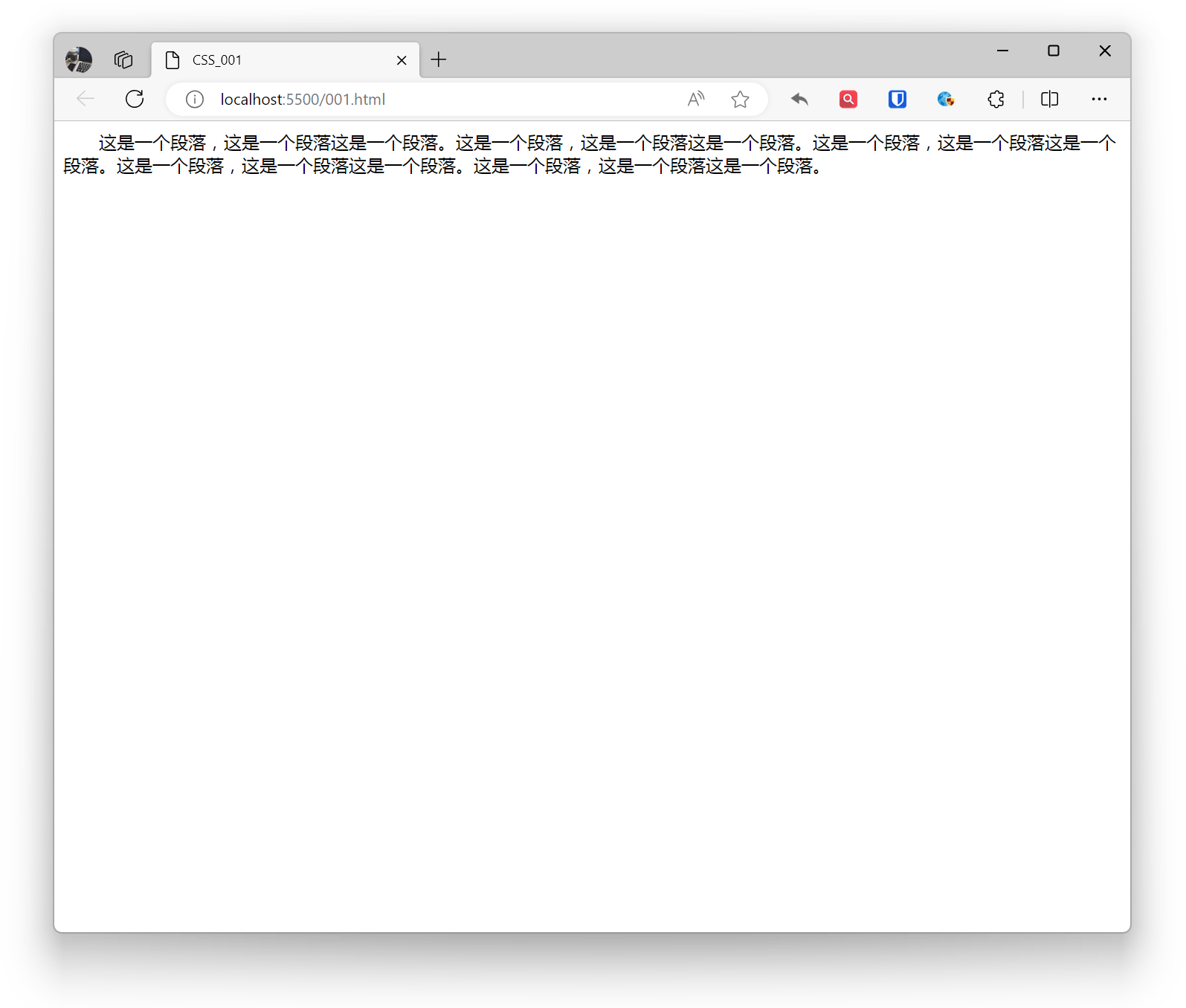
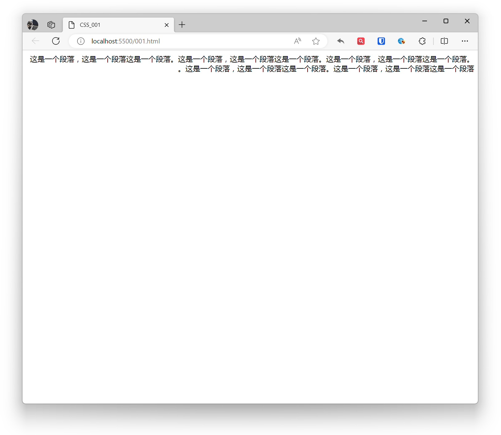
p { text-indent: 2em;}Effect:
Writing Mode
Writing mode in CSS refers to the arrangement direction of text, including horizontal, vertical, and mixed modes. It actually sets the display direction of block-level elements on the page—either top to bottom, right to left, or left to right. This determines the direction of the text.
horizontal-tb: Block flow from top to bottom. The corresponding text direction is horizontal.vertical-rl: Block flow from right to left. The corresponding text direction is vertical.vertical-lr: Block flow from left to right. The corresponding text direction is vertical.
Example:
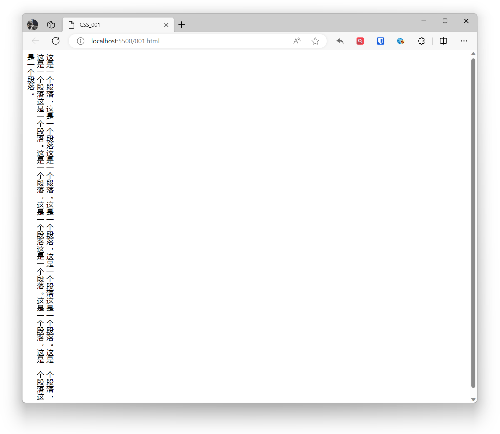
body { writing-mode: vertical-rl;}Effect:
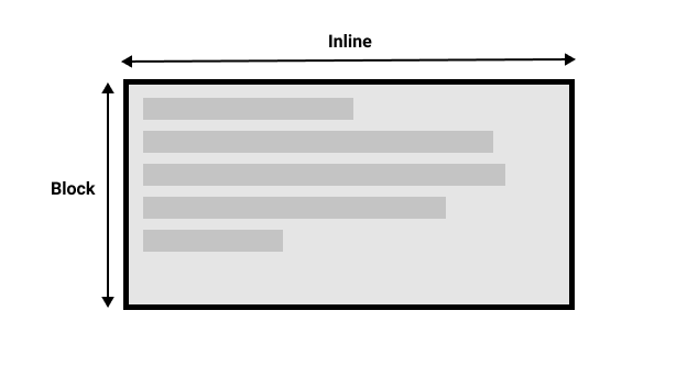
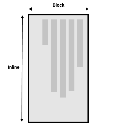
 When we switch writing modes, we are also changing the direction of block and inline text. In
 horizontal-tb writing mode, the block direction is horizontal from top to bottom, while in vertical-rl writing mode, the block direction is vertical from right to left. Therefore, block dimension always refers to the display direction of blocks in the page’s writing mode. And inline dimension always refers to the text direction.
This diagram shows two dimensions in horizontal writing mode.
This picture shows two dimensions in vertical writing mode.
Text Direction
Use the direction property to set the reading direction of text, left to right (ltr), right to left (rtl).
Suitable for multilingual websites, setting reading direction based on text language. Some languages (such as Arabic) are written horizontally but from right to left.
Example:
html { direction: rtl;}Effect:
Text Decoration
Use the text-decoration property to set text line decoration effects.
- none: No line
- overline: Overline
- underline: Underline
- line-through: Strikethrough
Example:
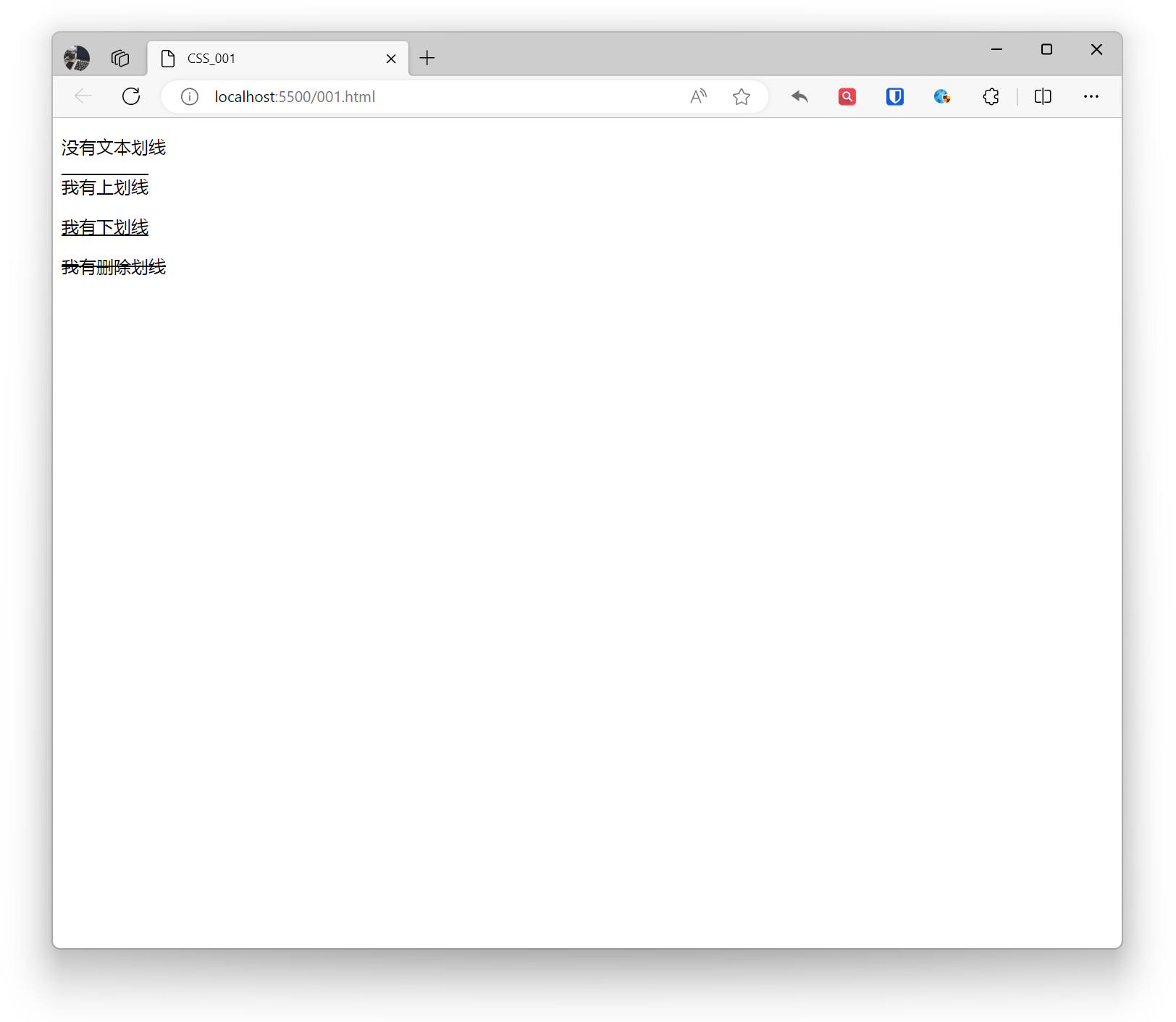
<p style="text-decoration: none;">No text line</p><p style="text-decoration: overline;">I have an overline</p><p style="text-decoration: underline;">I have an underline</p><p style="text-decoration: line-through;">I have a strikethrough</p>Effect:
Text Alignment
Set the horizontal alignment of text.
- left: Text left aligned, this is the default for most languages.
- center: Text horizontally centered
- right: Text right aligned
- justify: Text justified on both sides, filling by adding extra space between lines. Due to text arrangement and container width (short text, lack of spaces, too few lines, single language), the justify effect may not be easily visible in some cases.
- justify-all (less common): Similar to justify, but instead of just adding extra space at line end, it evenly distributes at both line start and end.
- start: Depending on browser’s text direction, indicates text aligned at start (usually left).
- end: Depending on browser’s text direction, indicates text aligned at end (usually right).
Example:
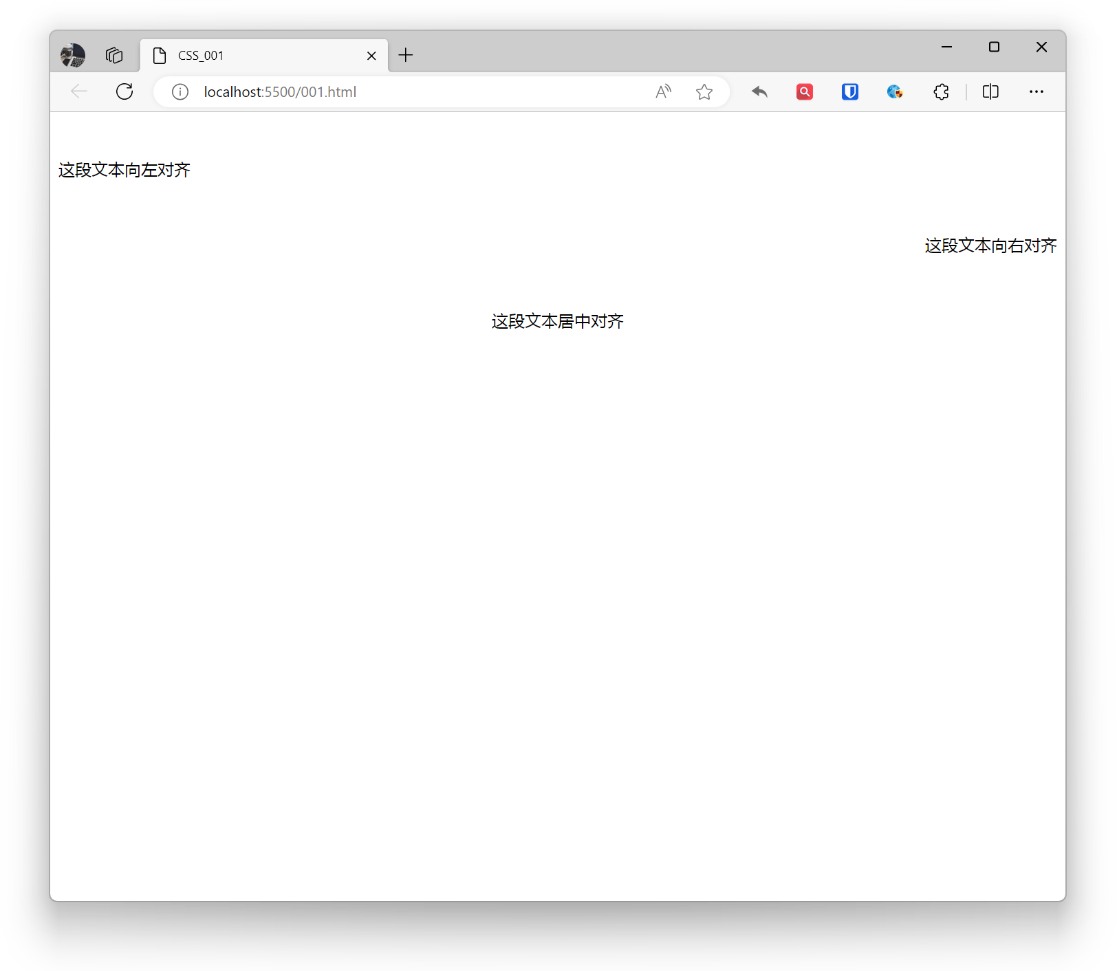
<p style="text-align: left;">This text is left aligned</p><p style="text-align: right;">This text is right aligned</p><p style="text-align: center;">This text is center aligned</p>Effect:
Line Height
Using the line-height property, you can set the height between text lines. Adjusting line height based on font size and design requirements can improve readability.
Example:
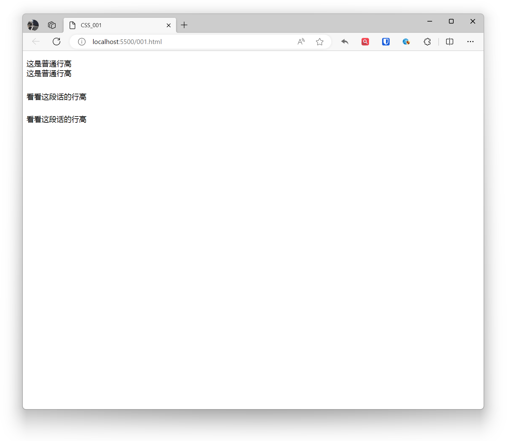
<p>This is normal line height <br>This is normal line height</p><p style="line-height: 3;">Check out this line height <br>Check out this line height</p>Effect:
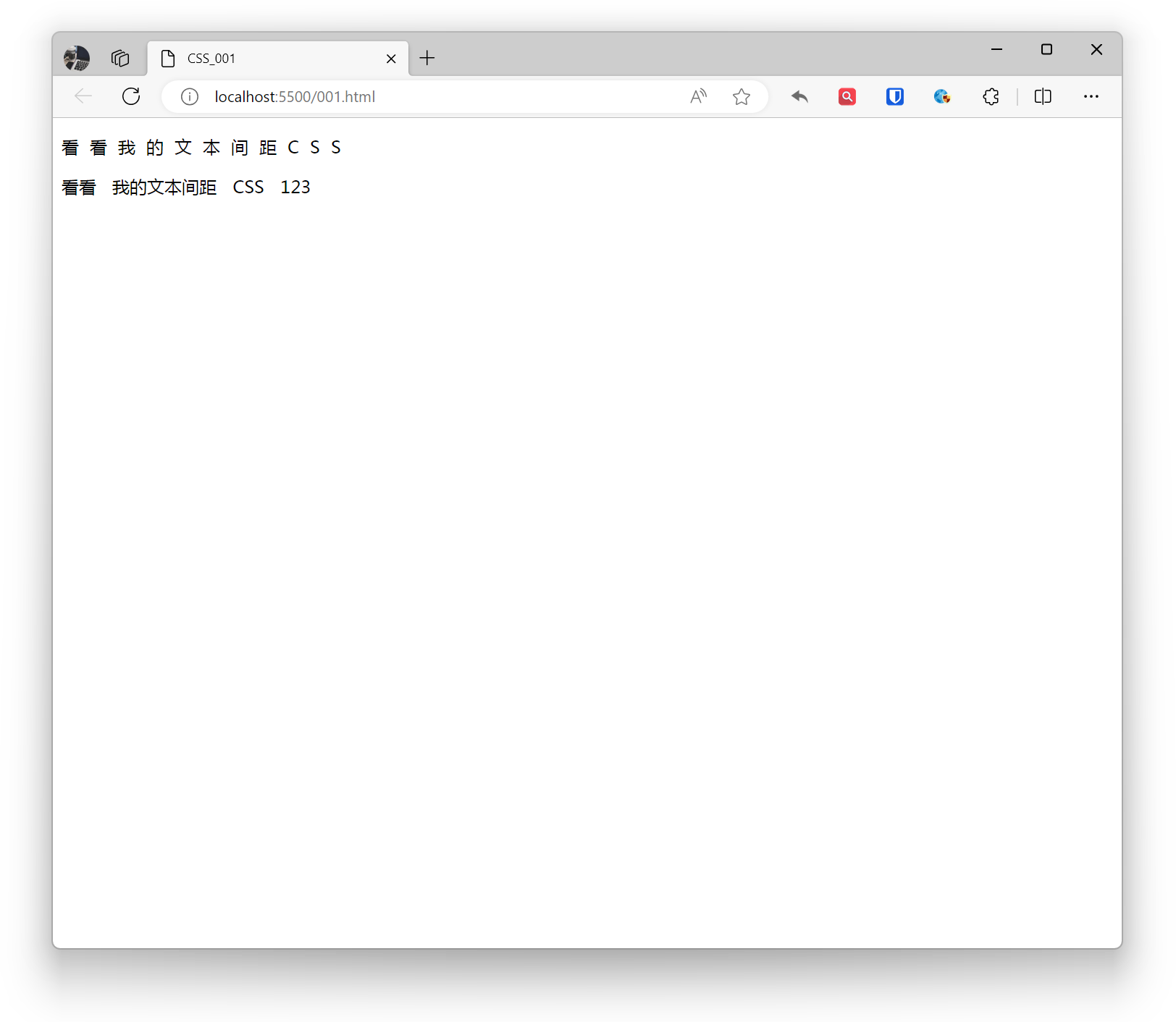
Spacing
Set spacing between text content.
letter-spacingsets spacing between letters, Chinese characters, and numbers.word-spacingsets spacing between words (characters on both sides of spaces).
Example:
<p style="letter-spacing: 10px;">Check out my text spacing CSS</p><p style="word-spacing: 10px;">Check out my text spacing CSS 123</p>Effect:
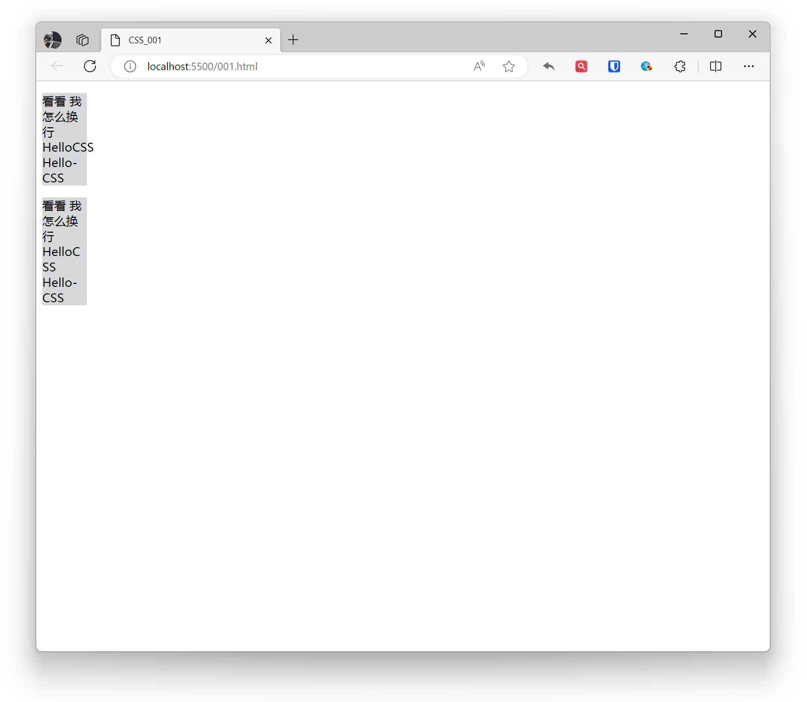
Line Breaking
Control how text wraps.
word-wrap: Mainly used to control how long words or URLs wrap, more suitable for English scenarios.
normal(default): According to normal wrapping rules, no breaking within words.break-word: Allows breaking within words, can force long words or URLs to wrap.
Example:
.base{ background: #d7d8d9; width: 60px;}.example1{ word-wrap: normal;}.example2{ word-wrap: break-word;} <p class="base example1">Check out how I wrap HelloCSS Hello-CSS</p> <p class="base example2">Check out how I wrap HelloCSS Hello-CSS</p>Effect:
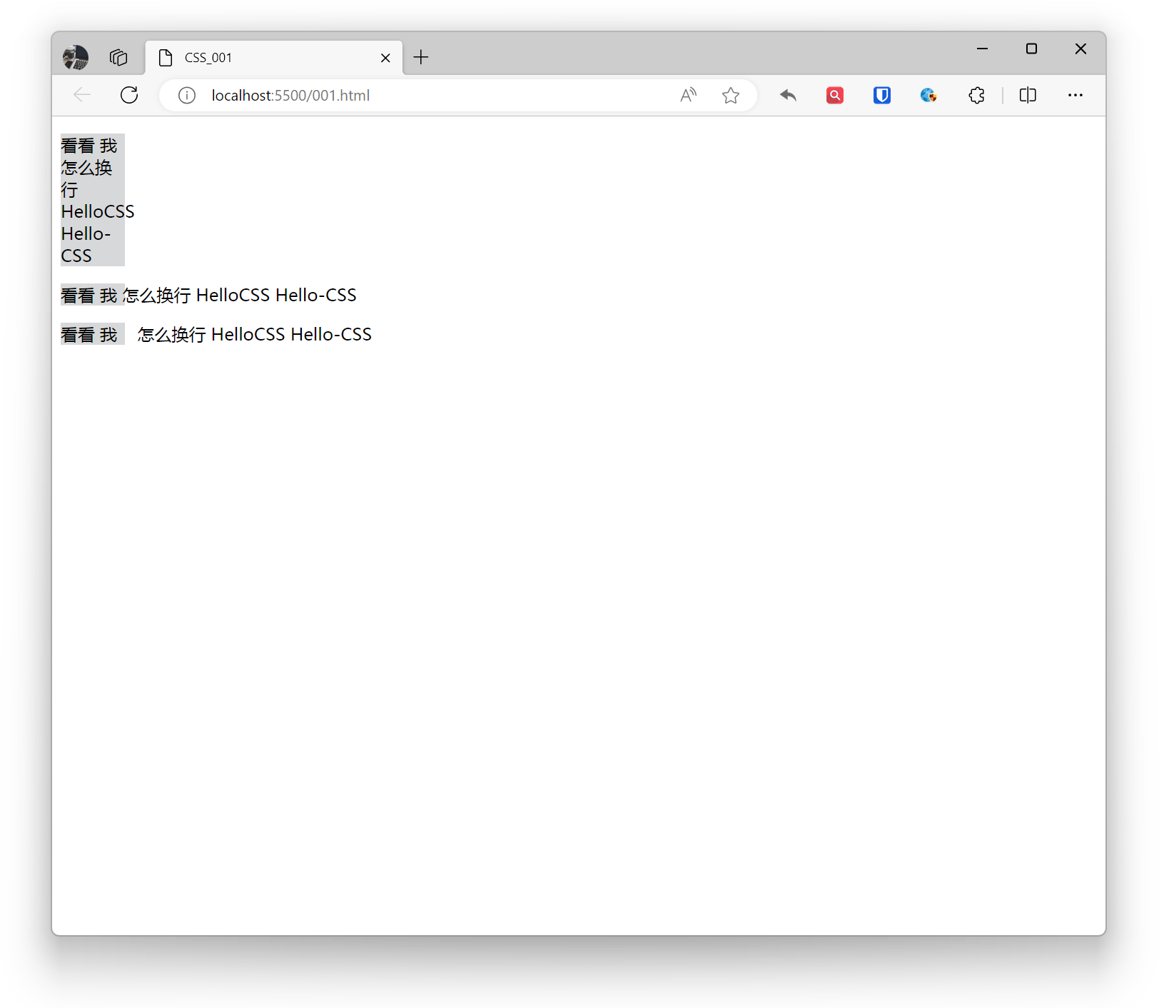
white-space: Used to control how whitespace characters inside elements are handled, including spaces, line breaks, etc.
normal(default): Normal whitespace handling, merging consecutive whitespace characters, and wrapping based on line breaks.nowrap: No text wrapping allowed, ignoring line breaks.pre: Preserve whitespace characters without merging consecutive ones, text displayed in source code format.pre-line: Preserve line breaks, merge consecutive whitespace characters, other whitespace handled according to normal rules.pre-wrap: Preserve whitespace characters, merge consecutive whitespace characters, preserve line breaks.
Example:
.base{ background: #d7d8d9; width: 60px;}.example1{ white-space: normal;}.example2{ white-space: nowrap;}.example3{ white-space: pre;} <p class="base example1">Check out how I wrap HelloCSS Hello-CSS</p> <p class="base example2">Check out how I wrap HelloCSS Hello-CSS</p> <p class="base example3">Check out how I wrap HelloCSS Hello-CSS</p>Effect:
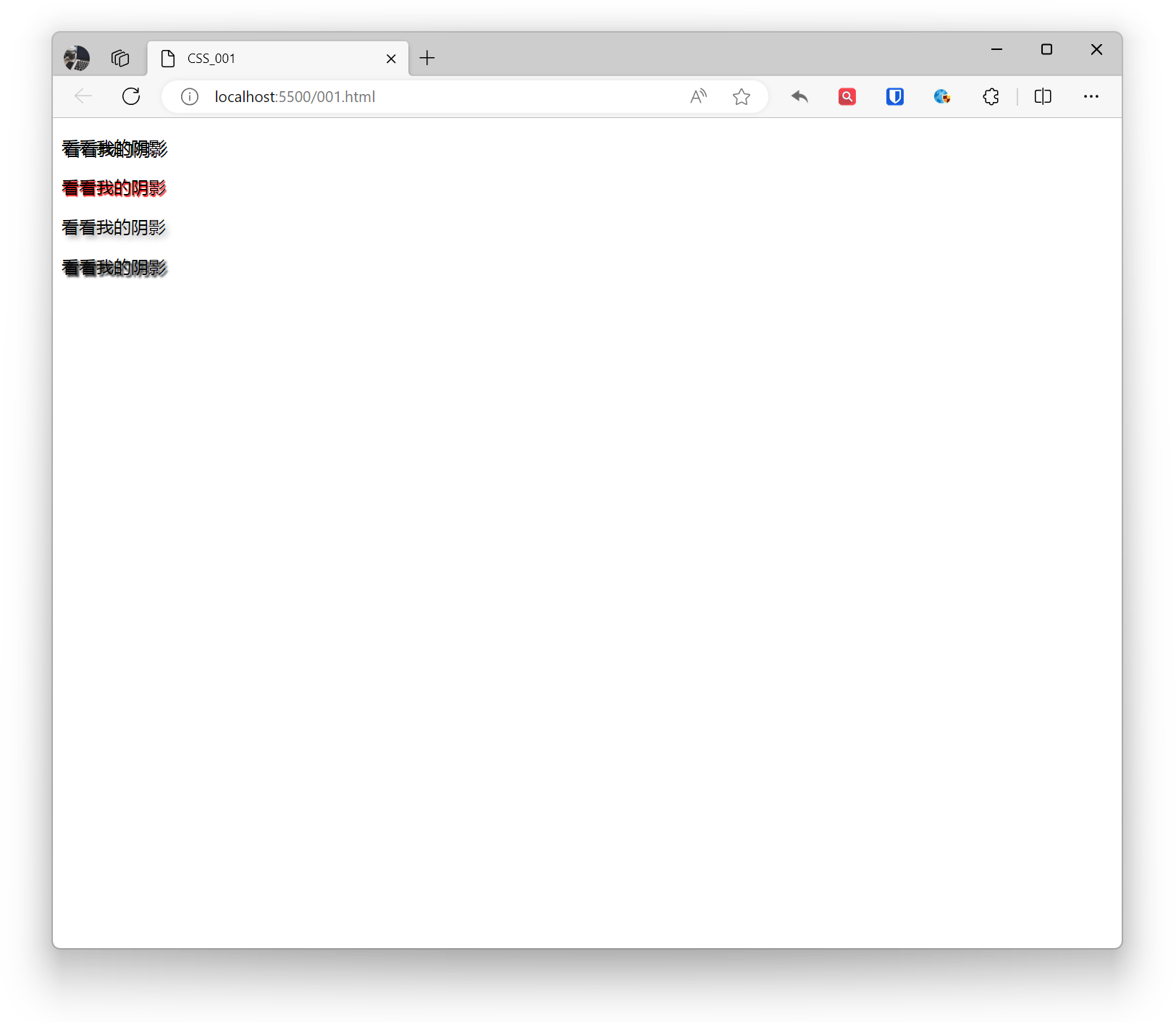
Shadow
You can add one or more (comma-separated) shadow effects to text to enhance text readability or create unique design effects.
h-shadow: Horizontal shadow position. Can be positive (offset right) or negative (offset left).v-shadow: Vertical shadow position. Can be positive (offset down) or negative (offset up).blur: Optional. Indicates shadow blur level, larger values are more blurry. Can be omitted.color: Shadow color. Can be a specific color value, keyword, or RGBA value.
Example:
<p style="text-shadow: 2px 2px black;">Check out my shadow</p><p style="text-shadow: 1px 1px 1px red;">Check out my shadow</p><p style="text-shadow: 3px 3px 5px darkgrey;">Check out my shadow</p><p style="text-shadow: 2px 2px 2px black, -2px -2px 2px white;">Check out my shadow</p>Effect:
Transform
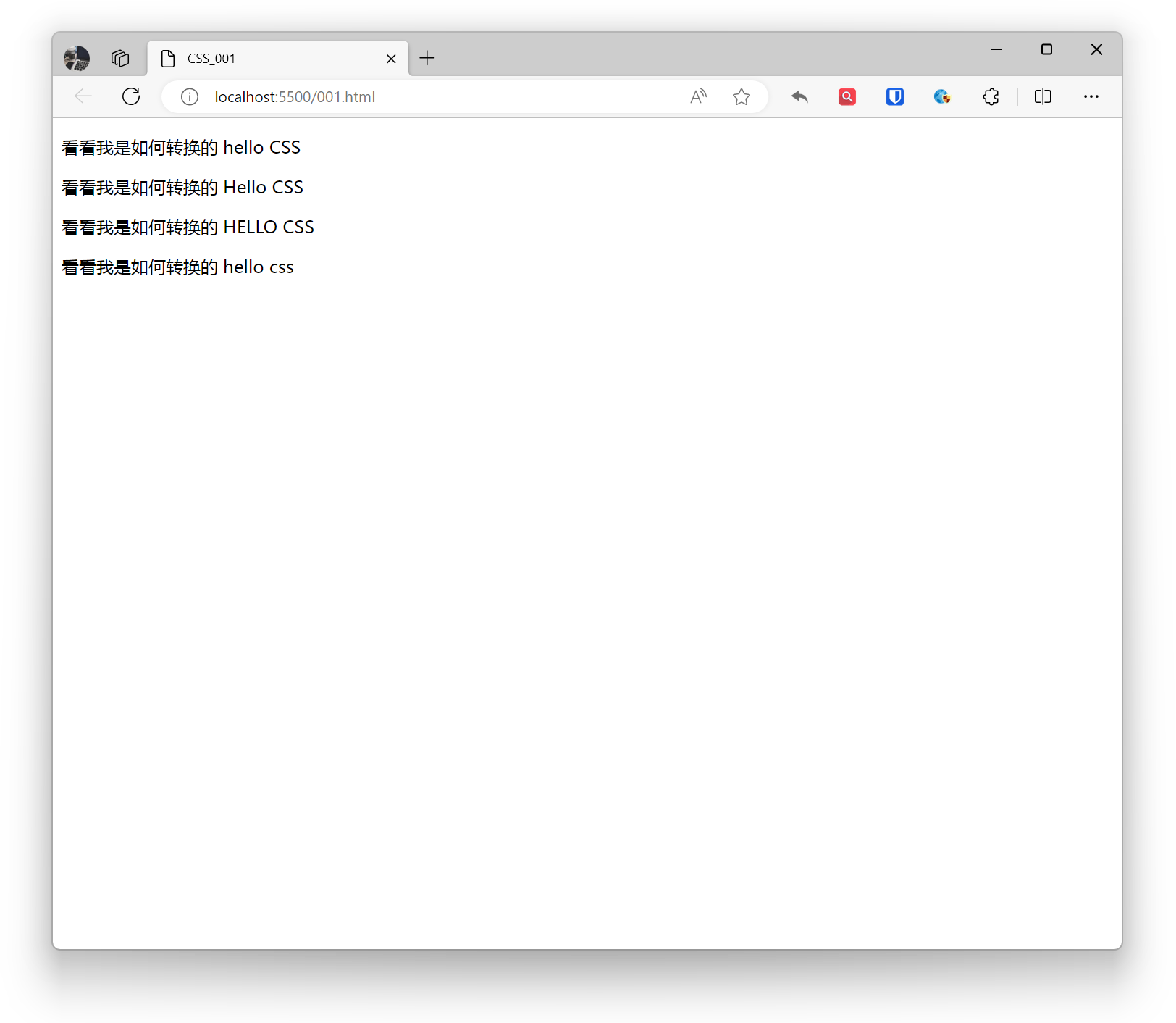
Used to control text case transformation effects.
none: Default, keeps original text case.capitalize: Converts first letter of each word to uppercase.uppercase: Converts all text to uppercase.lowercase: Converts all text to lowercase.
Example:
<p style="text-transform: none;">See how I transform hello CSS</p><p style="text-transform: capitalize;">See how I transform hello CSS</p><p style="text-transform: uppercase;">See how I transform hello CSS</p><p style="text-transform: lowercase;">See how I transform hello CSS</p>Effect:
Text Overflow
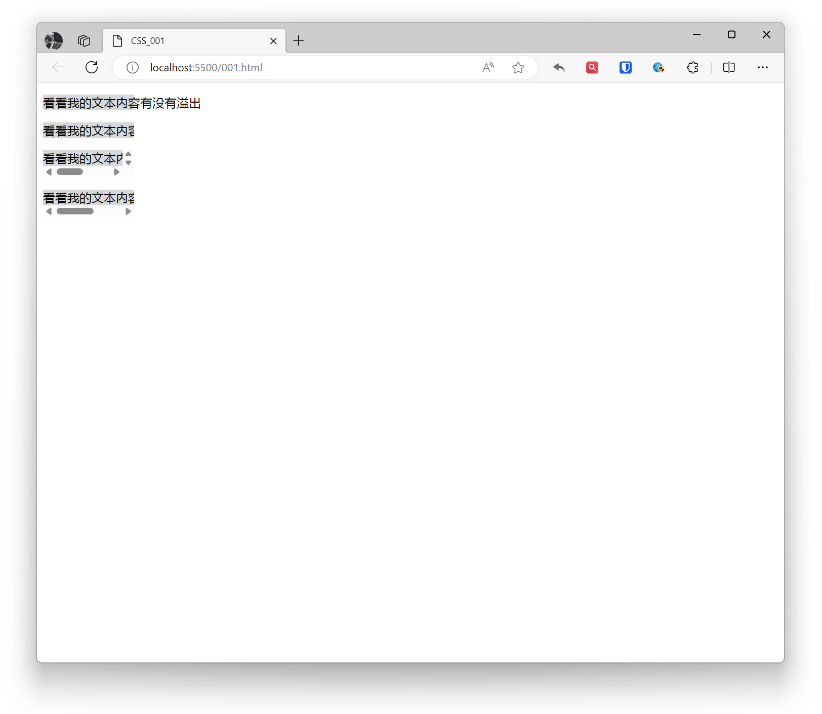
In CSS, you can use the overflow property to handle text overflow.
- visible: Text will not overflow, will be fully displayed.
- hidden: When text overflows, it will be hidden.
- scroll: When text overflows, scrollbars will be displayed, users can scroll to view all content.
- auto: When text overflows, it will decide whether to display scrollbars based on element width and height.
Example:
.base{ white-space: nowrap; background: #d7d8d9; width: 120px;}.example1{ overflow: visible;}.example2{ overflow: hidden;}.example3{ overflow: scroll;}.example4{ overflow: auto;} <p class="base example1">Check if my text content overflows</p> <p class="base example2">Check if my text content overflows</p> <p class="base example3">Check if my text content overflows</p> <p class="base example4">Check if my text content overflows</p>Effect:
Fonts
How to control and define fonts is an important part of web design.
Font Family
Define fonts through the font-family property. font-family can specify one font, it’s recommended to provide multiple fallback fonts. The browser will try these fonts in order of priority until finding an available suitable font. If the font name contains spaces, special characters, or Chinese characters, it’s recommended to use quotes. Web font services can be used, but pay attention to font copyright.
Example:
<p style="font-family: Arial, sans-serif;">hello CSS hello CSS</p><p style="font-family: Gabriola; ">hello CSS hello CSS</p>Effect:

Size
Font size in CSS can be set using the font-size property.
Used to set text font size. Font size can be specified using absolute or relative values.
When using absolute values, font size is fixed and won’t change with screen resolution. Absolute value units include: pixels (px), inches (in), centimeters (cm), millimeters (mm), etc.
When using relative values, font size is relative to the parent element’s font size. Relative value units include: em, rem, vw, vh, etc.
Using keywords to specify font size can improve readability and consistency. Keywords include: xx-small, x-small, small, medium, large, x-large, xx-large.
Example:
body { font-size: 16px;}Responsive Design:
- Font size in responsive design should be relative to ensure good reading experience across different screen sizes and devices.
Accessibility:
- Ensure font size is large enough to meet accessibility standards. It’s recommended to use at least 16px font size in body text.
Font Unit Selection:
- Using relative units (em, rem, %) can better adapt to user’s font size preferences set in browser, increasing website accessibility.
Line Height Setting:
- Set line height appropriately based on font size to improve text readability. Typically, line height can be set to 1.4 to 1.6 times the font size.
Weight
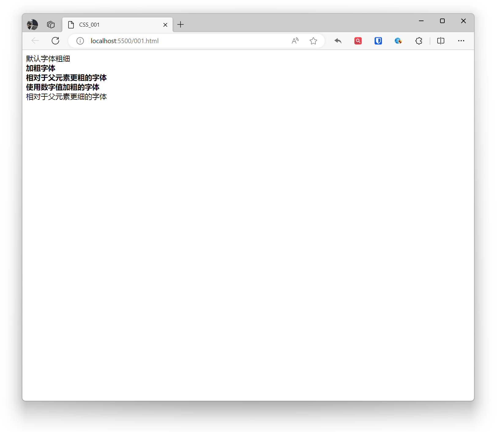
Font weight in CSS can be set using the font-weight property.
normal: Default font weight.bold: Bold font.bolder: Bolder font relative to parent element.lighter: Lighter font relative to parent element.- Numeric values: Use numeric values to set font weight, typically ranging from 100 to 900.
Example:
<div style="font-weight: normal;">Default font weight</div>
<div style="font-weight: bold;"> Bold font <div style="font-weight: bolder;">Bolder font relative to parent</div></div>
<div style="font-weight: 700;"> Font bolded using numeric value <div style="font-weight: lighter;">Lighter font relative to parent</div></div>Effect:
Style
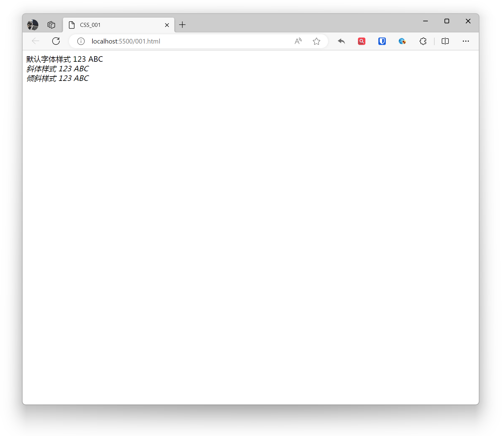
Font style in CSS can be set using the font-style property.
normal: Default font style.italic: Italic font style, using specially designed italic effect from font file.oblique: Oblique font style, similar to italic, when font file doesn’t have specially designed italic effect, it can force normal font to slant.
Example:
<div style="font-style: normal;">Default font style 123 ABC</div><div style="font-style: italic;">Italic style 123 ABC</div><div style="font-style: oblique;">Oblique style 123 ABC</div>Effect:
Color
Font color in CSS can be set using the color property.
- Predefined color names: For example,
red,green,blue, etc. - Hexadecimal color values: For example,
#FF0000,#00FF00,#0000FF, etc. - RGB, RGBA color values: For example,
rgb(255, 0, 0),rgba(0, 255, 0, 0.5), etc. - HSL, HSLA color values: For example,
hsl(0, 100%, 50%),hsla(120, 100%, 50%, 0.7), etc.
Example:
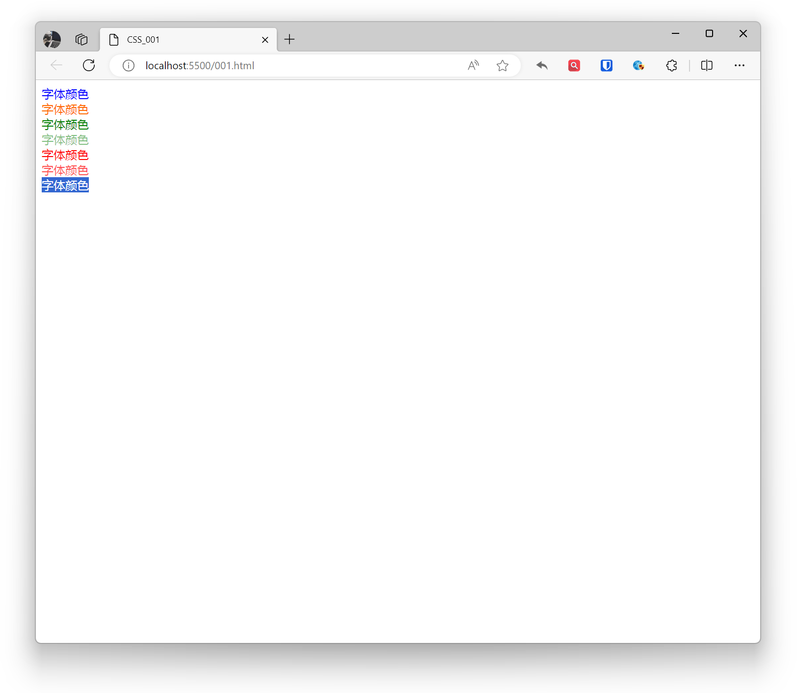
<div style="color: blue;">Font color</div><div style="color: #ff6a00;">Font color</div><div style="color: rgba(0, 128, 0);">Font color</div><div style="color: rgba(0, 128, 0, 0.5);">Font color</div><div style="color: hsla(0, 100%, 50%);">Font color</div><div style="color: hsla(0, 100%, 50%, 0.7);">Font color</div><div style="color: transparent;">Font color</div>Effect:
Links
In CSS, you can use the color property to set font color for links (hyperlinks).
Setting Link Colors
- a - Set global link color
- a:link - Normal, unvisited link
- a:visited - Link user has visited
- a:hover - When user’s mouse is over the link
- a:active - The moment the link is clicked
Example:
/* Global link */a { color: #3498db; /* Blue */}
/* Unvisited link */a:link { color: #3498db; /* Blue */}
/* Visited link */a:visited { color: #884dff; /* Purple */}
/* Link on mouse hover */a:hover { color: #ff6600; /* Orange */}
/* Link when clicked */a:active { color: #ff0000; /* Red */}Setting Link Underline
Example:
a { text-decoration: none; /* Remove underline */}
a:hover { text-decoration: underline; /* Show underline on hover */}